TYPE PLUS
editors: adrian shaughnessy and tony brook
publisher: unit editions
design: spin
pages: 320
size: 216 x 310mm
format: paperback
language: english
ISBN: 978-0-9575114-6-0
price: £45 from unit editions
________________________________________________________________________________________
designboom rating: ![]()
![]()
![]() (very good)
(very good)
________________________________________________________________________________________
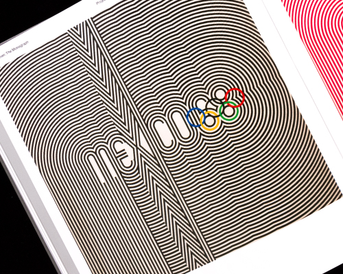
the latest publication from unit editions TYPE PLUS investigates the practice of combining typography with images to increase effectiveness, potency and visual impact. by focusing on a host of contemporary practitioners from around the world the book creates a picture of a new dynamism in typographic expression.
the era of type as a passive, semi-invisible holder of meaning is long gone – today, graphic designers use type in partnership with graphic elements in ways that turbo charge meaning and impact.
type plus image – or images – can greatly enhance typographic expression. and letterforms themselves, when redrawn, combined, distorted, or augmented with decorative embellishments, can enhance meaning and lend emotive qualities to all kinds of typographic communication.
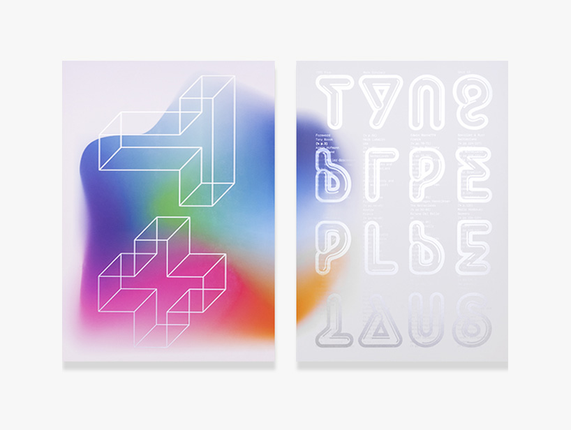
TYPE PLUS – front cover designed by spin
adrian shaughnessy, co-founder of unit editions and co-editor of TYPE PLUS told designboom more about the book…
designboom: what made you want to make the book initially – was there any cross over between making TYPE ONLY and TYPE PLUS?
adrian shaughnessy: we envisaged TYPE PLUS as a companion to TYPE ONLY. they both represent extremes of the same tendency – the desire to see type as a malleable entity that can be used solus or in partnership with imagery, yet simultaneously disobeying the dictums that typography should be invisible and solely at the command of linguistic meaning, and that typography should be subservient to the message.
TYPE PLUS investigates the idea of adding imagery and graphic elements to typography to increase effectiveness, potency and visual impact, but crucially, allowing type to retain its dominant position. as yves peters, who wrote the book’s text, noted: ‘characters vibrate and disintegrate, melt and morph, undulate and flow to the rhythm of obsessive-compulsive graphic patterns and neon rainbows.’
there is some crossover between the two books – which only goes to show the super-eclectic, ultra-magpie nature of modern typography.
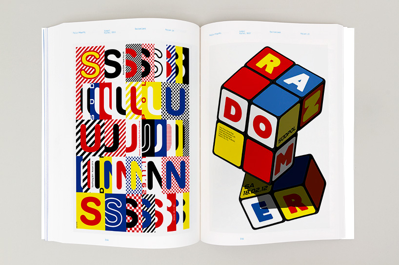
posters by felix pfaeli
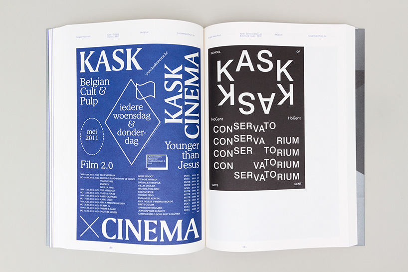
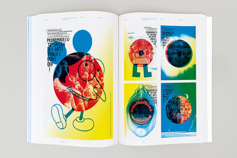
posters by jurgen maelfeyt
DB: what criteria was used to collect and edit the content?
AS: nothing terribly high-minded. first question – did the work excite us. followed by – did the work embody our ambition to show how typography can be used to enhance meaning. and finally – did the work feel as if it was coming from the bleeding edge of the typographic zeitgeist. once we applied these criteria, the work chose itself.
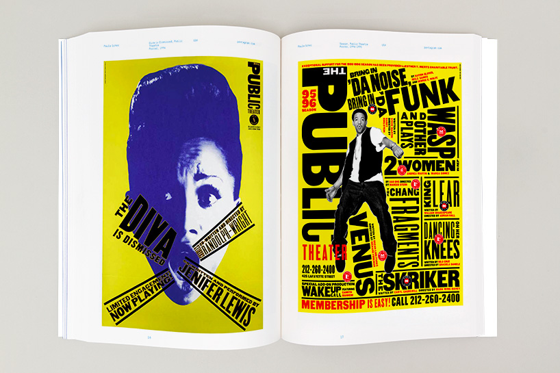
posters by paula scher
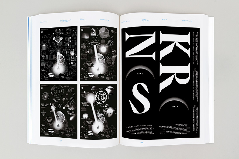
posters by corbin mahieu
DB: what are some of the observations you’ve made on contemporary typography while producing the book and which projects are most exemplary of these trends?
AS: I’m intrigued by the recent discovery and incorporation of 80s memphis imagery: what one critic called the ‘shotgun wedding between bauhaus and fisher-price’. you can see this in the work of the thai designer jackkritt anantakul (p.30).
I also like the way that digital technology and software is being used to create graphic expressions that looks supremely analogue. this can be seen in the work of many of our contributors, but especially in the work of studio jens mennicke (p.288-281).
then there’s the riotous use of software to make work that could only be done with the aid of a computer. I’m thinking here of non-format’s tokyo type directors club poster (p.219). it seems that designers have after 20 years, found a way to use technology in a completely unselfconscious way.
posters by helmo
TYPE PLUS includes work from dozens of international designers and studios, interviews with non format, two points net and erik brandt along with an essay by yves peters.
the book is available online now »
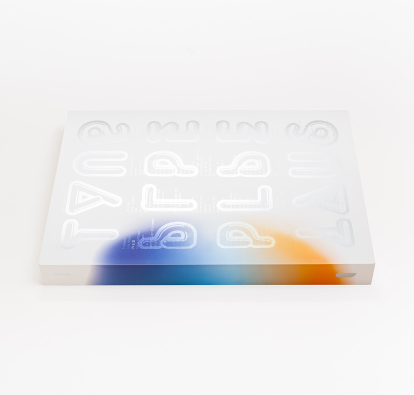
TYPE PLUS – back cover designed by spin
more – read our interviews with unit editions’ founders
adrian shaughnessy »
tony brook »
_______________________________________________________________________
designboom book report ratings:
![]() ……………………. interesting
……………………. interesting![]()
![]() ………………. good read, worth a look
………………. good read, worth a look![]()
![]()
![]() …………. very good
…………. very good![]()
![]()
![]()
![]() ……. excellent, recommended
……. excellent, recommended![]()
![]()
![]()
![]()
![]() . must have
. must have
_______________________________________________________________________
DESIGNBOOM BOOK REPORTS (189)
 Apr 09, 2024
 Mar 31, 2024
 Mar 28, 2024
 Mar 28, 2024
 Feb 27, 2024
UNIT EDITIONS (10)
 Sep 10, 2015
 Dec 05, 2014
 May 15, 2014
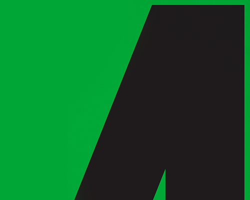 Mar 11, 2014
 Jan 02, 2014
PRODUCT LIBRARY
 Apr 17, 2024
 Apr 15, 2024
 Apr 15, 2024
 Apr 12, 2024