
UK/MEXICO 2015 identity by alphabetical studio
(above) UK/MEXICO 2015 logotype
UK/MEXICO 2015 is the biggest ever cross cultural celebration between mexico and the UK. the year long festival has seen both nations host a landmark programme of high-profile cultural, academic and trade projects. alphabetical studio were asked by the british council to create the identity for the festival.
bob young, co-founder of alphabetical told designboom more about the project…
designboom: how did the project come about?
bob young: the british council had seen our work and we were lucky enough to be asked to pitch for the project against three other agencies. it was a dream brief so we put everything we had into trying to secure it.

animated gif showing the bespoke typeface that alphabetical designed for the identity
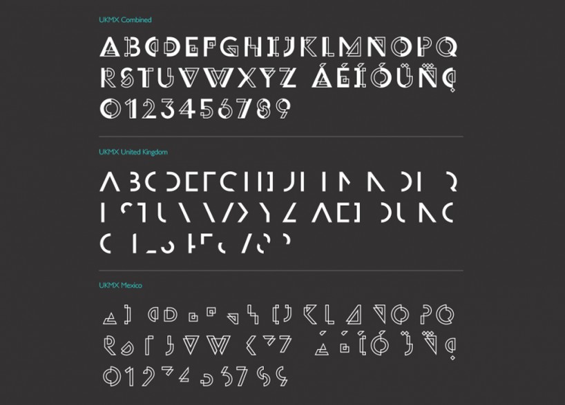
type specimen showing the UK and mexico fonts and how the fuse together
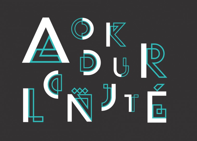
sample letters from the UKMX font
DB: what were some of the routes you explored before settling on this solution?
BY: we explored lots of different territories across the initial stage of the the project, but we began by researching what made each country unique. both the UK and mexico have a rich history and huge significance in modern culture so the deeper we dug the stronger the connections seemed. we brought these links to life in different ways – visually, verbally and even photographically, but in the end we decided to go in with two routes, a textural focussed concept based on traditional and digital patterns that linked both nations past and their place in the modern age. then the route that was chosen and developed that centred the whole identity system around a custom typeface that visually brought together both cultures and allowed them to speak as one no matter the language or the context.
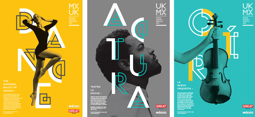
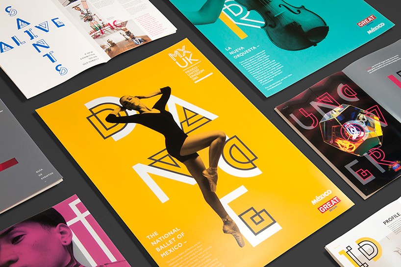
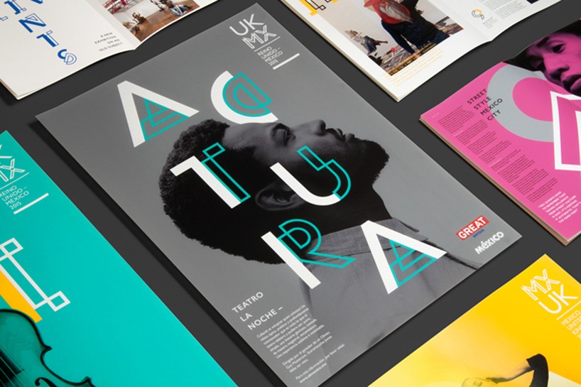
some of the posters designed as part of the programme
DB: why did you settle on this solution and what aspect of it works best for you?
BY: the overarching idea of both nations speaking in one voice was so simple and visually distinctive it worked as a concept but also resolved so may things beneath the surface of the project. the identity had to be taken on and developed by other design teams in mexico and the UK, working on specific events and projects many of them would have no access to imagery. the typeface being the core of the identity system meant that everyone involved could create on brand communications in any language just by accessing the font.
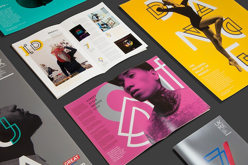
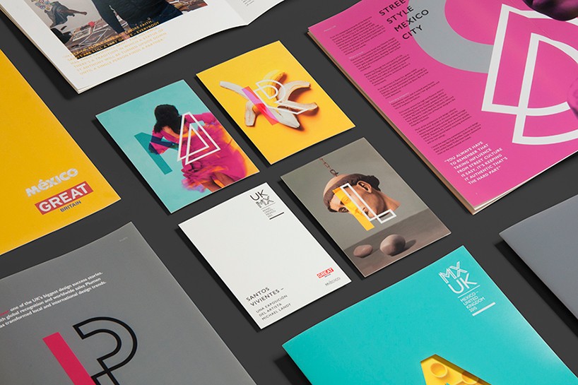
the identity applied to various print materials…
DB: what parts of the project were the most challenging?
BY: the biggest creative challenge was truly understanding both cultures. we knew that our reference of UK culture was going to be strong as it was an insiders view but we were sure to build connections with friends and colleagues in mexico city and monterrey to make sure that we avoided anything contentious and cliched in our work as it’s easy to fall into that trap when you make presumptions on cultures you don’t know.
DB: which aspect of the project has been the most satisfying?
BY: the most amazing part is seeing it come to life, the brand has a life of it’s own – there’s a mexican wrestling poster in the tube at the moment that uses the identity, that was a personal milestone for me.
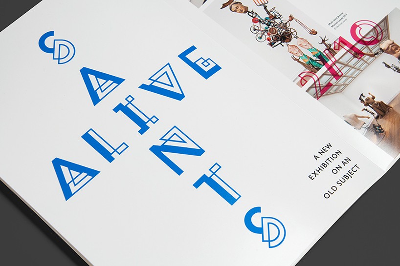
editorial application of the bespoke font created by alphabetical
LOGO DESIGN (244)
 Aug 14, 2023
 Aug 02, 2023
PRODUCT LIBRARY
 Apr 17, 2024
 Apr 15, 2024
 Apr 15, 2024
 Apr 12, 2024