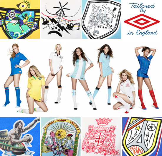
the ‘umbro world champions collection’ are seven new limited edition football shirts, released this week that honour the teams who have won the FIFA world cup previously. each ‘tailored by umbro’ shirt bears a crest designed by an artist from that country. the advertising campaign for the collection, was shot by rankin and features the wives and girlfriends of footballers from the national teams. designboom recently spoke to umbro and the artists involved…
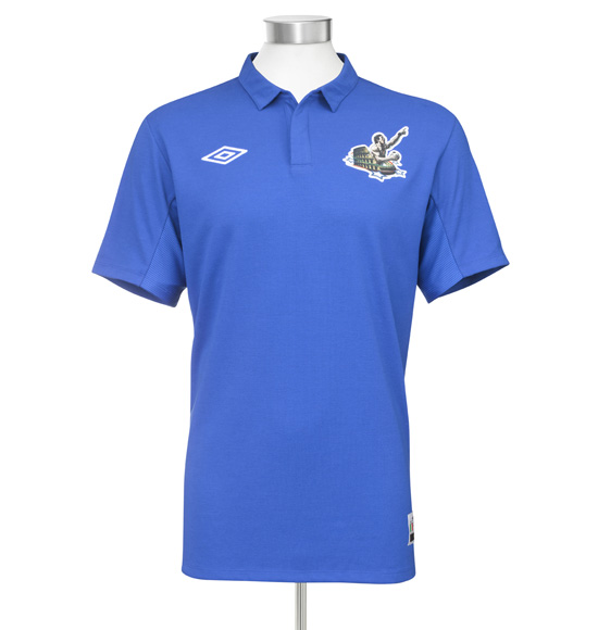
italy by tanino liberatore ‘the raw passion and intensity of the italian nation is captured in liberatore’s powerful representation of player as gladiator. each game is a battle; each pitch a monumental arena. the four stars of success encircle a lust for victory that characterises italy’s approach to football.’ umbro
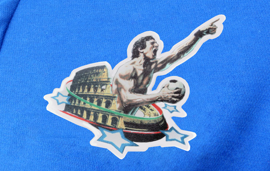
‘the beauty of drawing is that people don’t need any translation to understand it. I’m ‘contaminated’ by my political and cultural background and I think it’s positive. we cannot forget the moral value of our historical past that is never out-of-date. in my crest, I‘ve tried to condense all the symbols that italy still has especially (I hope) in the sport, strong-mindedness, obstinacy and stoicism… I’ve tried to diffuse sport’s positive message.’ tanino liberatore
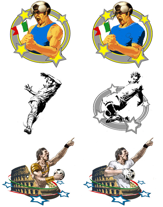
some of liberatore’s development drawings for the italy crest.
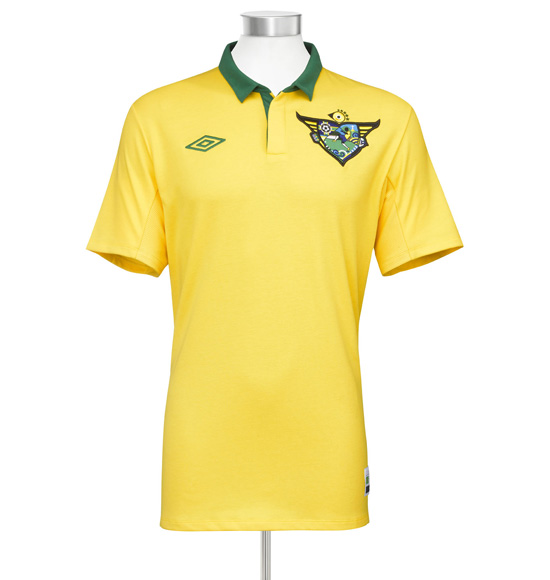
brazil by fernando chamarelli ‘in the middle of the crest there is a player, like he was dancing, light, ready to kick the ball on the volley, this represents that the ability of players is the strongest characteristic of the brazilian team.
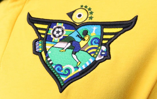
I put the player in conjunction with other elements of brazilian culture as the berimbau, the carnival masks, the monument of cristo redentor, and the waves – because football is also part of our culture. all brazilian boys dream of becoming a professional player. we love football.’ fernando chamarelli
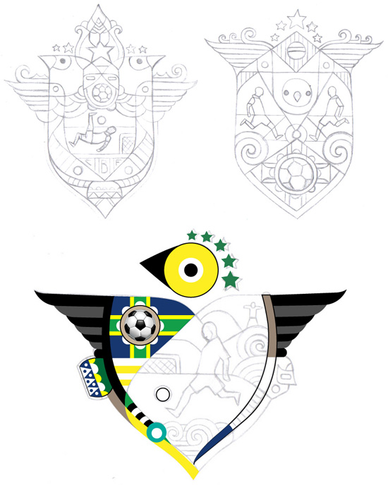
some of chamarelli’s sketches. the outline of the crest forms a ‘canarinho’ — ‘little canary’, which is the nickname of the brazilian team.
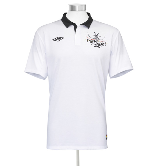
germany by marok ‘I like the thrill of victory and the agony of defeat. sports is the best metaphor to avoid war. the crest is a delicate part of the uniform, and the uniform enhances team spirit.
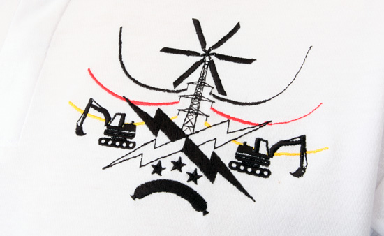
I was looking for something that could reflect my country in a positive way. the dredger is a symbol for the imminent will to construct and destruct. the stars refer to the german world cup triumphs, and the sausage needs no further explanation!’ marok
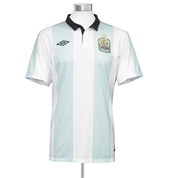
argentina by zzk records / freshcore ‘the design represents passion, love, craziness (the words that feature in the surrounding wreath) emotion, the argentinian street scene, the two world cups argentina have won.
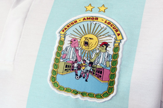
daily life, social life, sports, passion, love, spirit, energy. the message is ‘GOAL!’ grant of ZZK records

uruguay by martin albornoz the crest is based in the most important achievement of uruguayan football, the final of 1950 world cup final, in rio de janeiro, against brasil. it is an unforgettable memory in uruguay history. the main element is the typography, hand made, authentic, a mix of shapes and sizes, with imperfections. that’s the way uruguay is, and its people. and that’s how I represent with the stroke. it’s a personal interpretation of our idiosyncrasy.
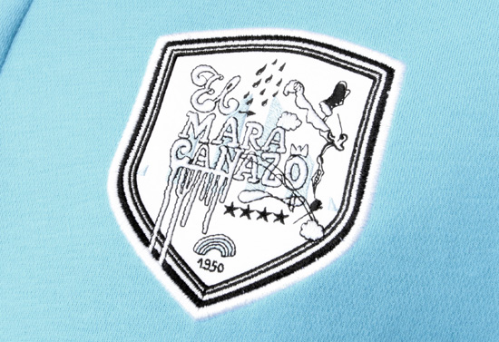
the message = that match in 1950 is known as ‘el maracanazo’. a ‘before and after’ in uruguayan and brasilian football. it was the last match that brasilian team played with white t shirt, they had all the celebrations prepared, it was a unique moment in which a complete stadium remained in silence, it was an opportunity where uruguay showed to the world that a small country can beat a bigger one.’ martin albornoz
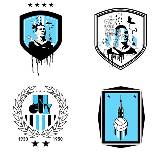
some of the alternative proposals for the uruaguay crest by albornoz.
england by ben eine ’embracing the tradition of english regal crests, the lions and ramparts tell a story of strength, courage, and pride. the insignia on the the shield references english alternative and creative culture, making eine’s crest an irreverent celebration of england: steeped in heritage but never staid.’ umbro
‘football crests are the logo, the brand, the identity, the thing that never changes. the kit gets redesigned every few years, and player’s names come and go, but the crest never changes. they mark a time in history when the club started out. I’m not a massive football fan. I don’t have a team that I follow, but like most of my friends, we all become armchair fanatics every four years. I wanted to do something very traditional, something regal from the days of shining knights and tudor roses. I wanted to show england as a strong, solid and brave team’. ben eine
france by andre ‘andre’s playful approach to the crest combines bright, vivacious colour with a key icon of french identity. nothing is static; everything is alive and active as the ball of the sport and the star of victory bounce within the lines.’ umbro
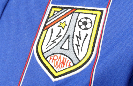
‘umbro represents a classic brand, and I always like to design crests and logos. what do I like about football? I like the round ball. french symbols and the colours of the flag inspired my design, and sometimes I’m inspired by football’s culture and aesthetic. a shirt without a crest is like a woman with no ––—’ andre
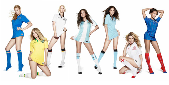
advertising campaign the wives and girlfriends of seven international football stars have been shot by photographer rankin for the global advertising campaign to promote umbro’s new world champions collection. the image rankin produced is based on an campaign run by umbro in 1967, which featured girls wearing football shirts as dresses. for 2010, the campaign has been brought up to date.
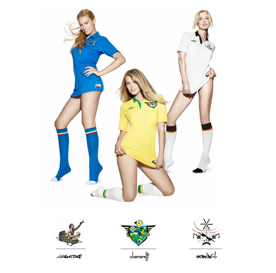
(left to right) italy: alice bregoli, brazil : susana werner, germany: julia godicke.
you can see videos from the campaign photo shoot here.
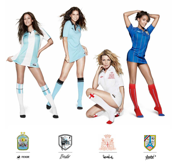 (L to R) argentina: luli fernandez, uruguay: zaira nara, england: abbey clancy, france: charlene suric.
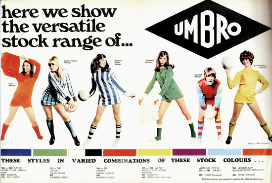
the 1967 umbro ad which inspired the world champions collection campaign.
the umbro world champions collection of football shirts and t-shirts is available from leading independent retailers for stockists check umbro’s website and the umbro blog.
— all images courtesy of umbro
SUPER SPORT (103)
 Feb 09, 2022
 Jul 28, 2017
 Dec 12, 2016
 Oct 24, 2016
 Aug 17, 2016
UMBRO (6)
 Sep 05, 2010
 Sep 01, 2010
 Jul 05, 2010
 Jun 14, 2010
 Mar 16, 2010
PRODUCT LIBRARY
 Apr 17, 2024
 Apr 15, 2024
 Apr 15, 2024
 Apr 12, 2024