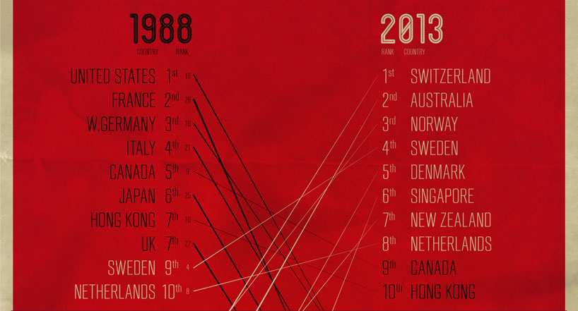
‘where to be born’ infographic – from 1988 to 2013
specializing in infographics and data visualization, UK’s wond studio has sent designboom a copy of their most recent design ‘where to be born’. influenced by an index created by the economist intelligence unit, the graphic looks at a calculation of where it is best to be born in the worldfrom 1988 to 2013.

full infographic
KEEP UP WITH OUR DAILY AND WEEKLY NEWSLETTERS
INFOGRAPHICS (19)
 Aug 06, 2020
 May 02, 2019
 May 07, 2018
 Apr 10, 2016
 Sep 08, 2015
PRODUCT LIBRARY
 Apr 17, 2024
a powerful symbol of the house’s cultural heritage, the jockey silk with colorful geometric motifs is an inspiration for leather goods and textiles.
connections: +670
 Apr 15, 2024
watch our livestream talk with BMW Design at 19:15 CEST on monday 15 april, featuring alice rawsthorn and holger hampf in conversation.
connections: +320
 Apr 15, 2024
the solo show features five collections, each inspired by a natural and often overlooked occurence, like pond dipping and cloud formations.
 Apr 12, 2024
discover our guide to milan design week 2024, the week in the calendar where the design world converges on the italian city.
connections: 50