wigan little theatre indentity by sam lane
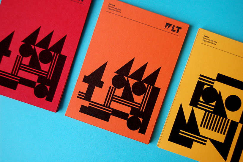
sam lane has created a new identity for the wigan little theatre by dismantling their existing logo and building a new logotype and visual language from the pieces. the venue is a 230-seater located in the heart of the north-west of england. it hosts a mix of traditional and contemporary practice, which the re-brand needed to reflect. the theatre also holds regular comedy nights, guest lectures and acting group workshops. the original brandmark of the building is over 50 years old, so the identity had to be carefully considered. the old logo was refined, then split into a series of shapes, which are reorganized. the letterforms of the company’s initials are generated from these shapes. therefore, the brandmark is interchangeable, meaning that the transition from old to new isn’t lost entirely.
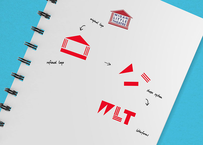
deconstruction and reconstruction process
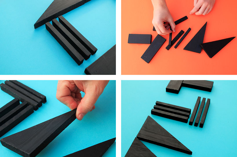
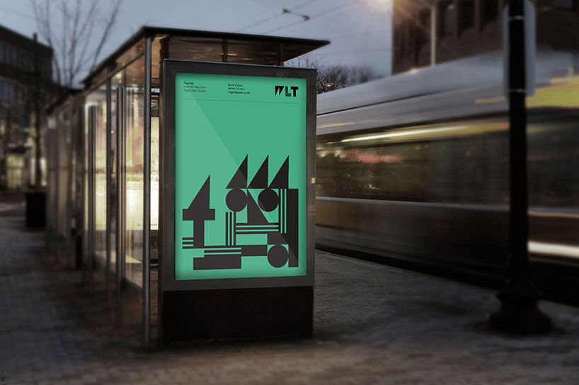
the brand system is built upon a series of interchangeable shapes which have been derived from the original brandmark. these shapes are what we call the ‘brand toolkit’. these components are building blocks, and are always used at the heart of any internal or external campaign.
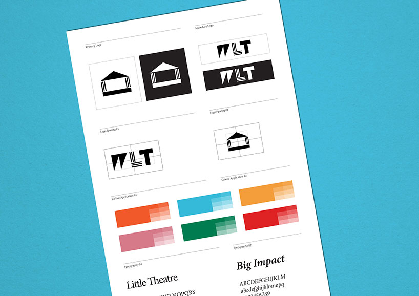
a new color scheme was created, which consists of 3 pairs of complementary colors plus black and white. this will not only help break up different events and sections within the theater, but will also help make that transition from traditional to contemporary a little bit clearer. this was paired with a new slogan and corporate typeface, which plays on the fact that the theater might be small, but it still packs a punch.
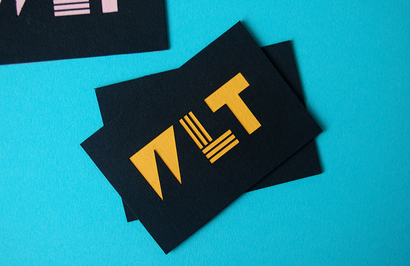
the business cards are triplex printed using a combination of the 6 separate colorways along with a black stock
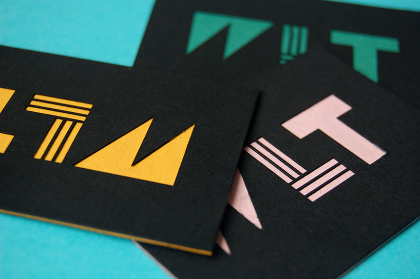
the logo is die cut out of the front part of the business card, allowing for the inside layer of stock to appear in contrast
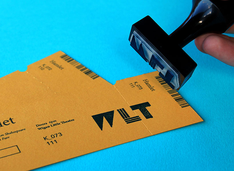
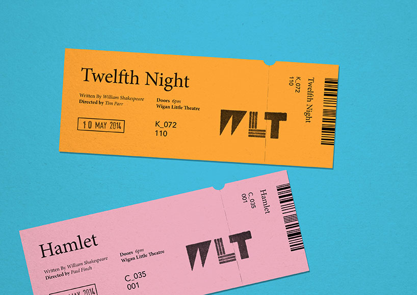
the tickets and promotional material use the stock as the color palette, keeping print costs down only using key as the color to print
the tickets are stamped with the date and brandmark to reduce waste on unsold tickets for particular shows.
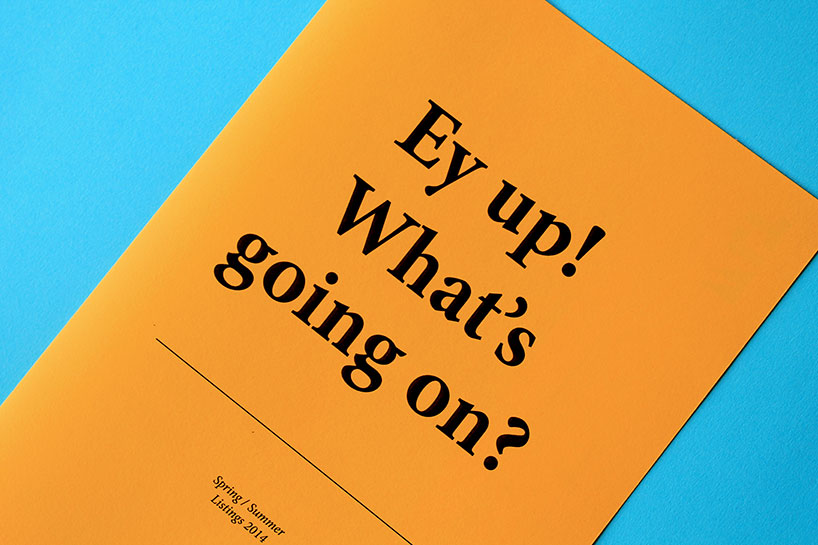
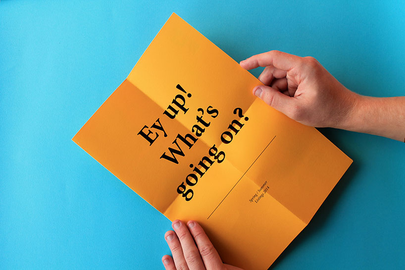
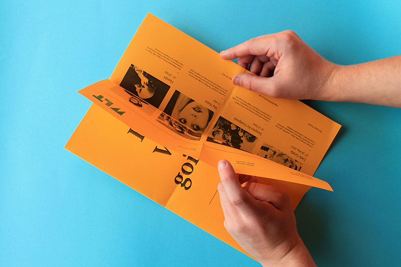
the what’s on guide is a regular feature that is distributed around town to help promote upcoming events
the design will change seasonally, but a basic template has been implemented, and can be altered easily.
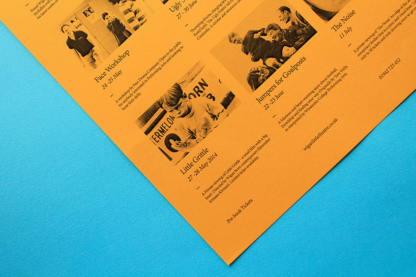
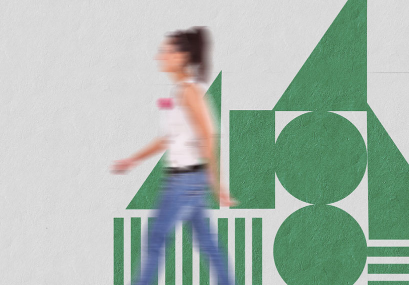
as well as using the shapes as part of the brandmark, imagery is key when it comes to promoting one-off events such as guest speakers and comedians. it was important to create a brand template which can be easily altered to keep a consistent branded look for all events.
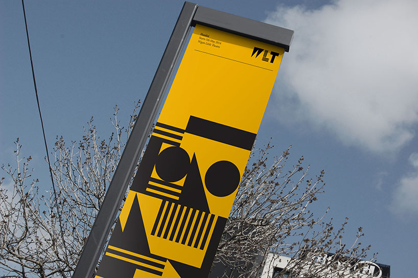
banners and advertising
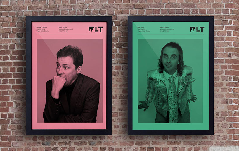
photography is used to help promote the happenings of the theater such as performances, workshops and guest speakers
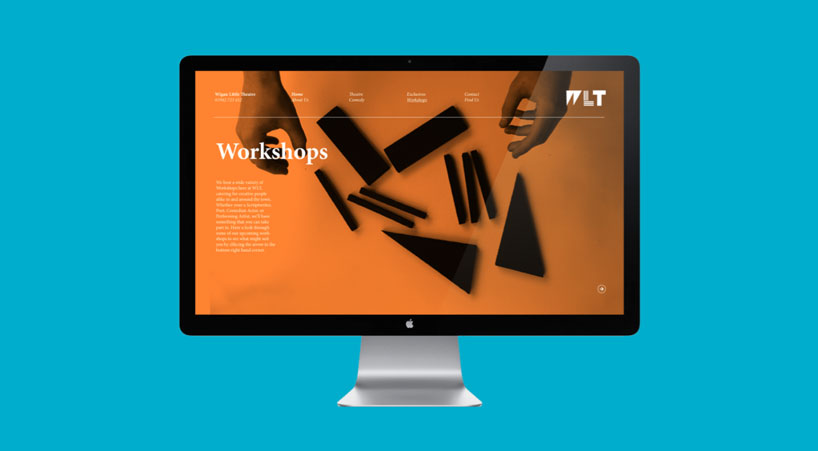
the brand system has been applied to web as well as print, keeping the visual aesthetic consistent across all platforms
the website runs on a constant slideshow, often with a large image as the background, for bold instant impact.
the brand shape system was applied to the wayfinding as wall decor
LOGO DESIGN (244)
 Aug 14, 2023
 Aug 02, 2023
PRODUCT LIBRARY
 Apr 15, 2024
 Apr 15, 2024
 Apr 12, 2024
 Apr 04, 2024