a good death by navitk from usa
designer's own words:
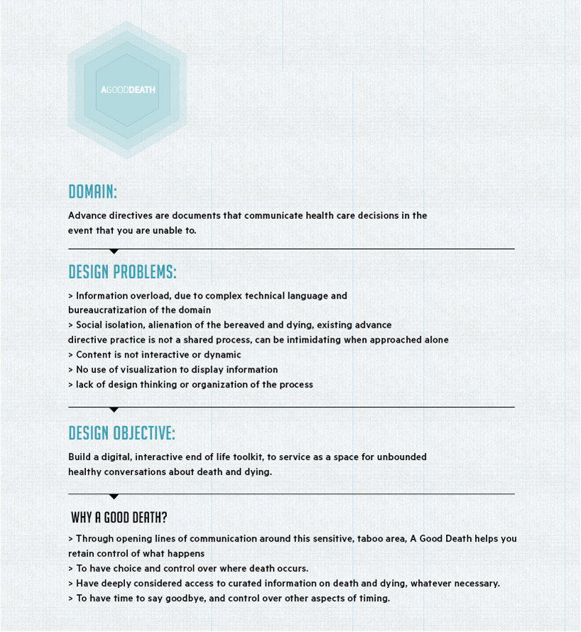
BACKGROUND
My project research dives deep into questions about the process of dying, death and mostly the social denial of them. I am and have been for the last 6 months conducting semi structured and structured interviews with friends, strangers and professionals to acquire knowledge about their personal relationships with death and dying. It is the lack of constructive conversation around this inevitable topic, and its neglect by design thinking, that drew me to seek for deeper problems and attempt to recreate an accessible space for conversation. This demands of me an exploration of the end of life legal forms as a site for technological innovation and intervention.
Attempting to innovate in this domain; I an taking in consideration that people have long been appropriating technologies to accommodate the circumstances of death. The internet is already providing numerous opportunities for the bereaved for social and functional support. Online forums, mailing lists, websites, and social networks as places where individuals can share stories about the dead. For a while now individuals and groups have been constructing online spaces dedicated to exploring issues surrounding death and dying.
DEATH AS A CASE STUDY FOR UX
As a practicing user experience, I am constantly concerned with the usability of things. When engaging in design I am usually lead by usability standards, thinking how this tool that I am making, digital or physical, can be best used by it’s intended users. My encounter with End-of-Life forms and decision making was part of a structured research process, where I learnt about the domain, its current flaws and the possibilities it has to be more visible and approachable. And as a user experience designer I chose to confront it from the most practical yet still experimental point of action. Concerning my self with the most personal, abstract and painful aspect of the living, and developing a new usable concept for it, is the challenge I am facing.
My Intentions are to alter the existing experience humans have when confronting the formal aspect of death through the interactions with legal forms regarding death and dying. I proposed to design an interactive journey through EoL making decisions. In my scope I have listed some ambitious tasks such designing new interactions to incentivize my selected audience to participate in their own End of life planning. To provider the users with a clear terminology and informative facts allowing the experience to be constructive and efficient. To establish a visual communication between the users and the legal forms they encounter when deciding to make arrangements for their death. I aspire to create an open space to allow for healthy, unbounded conversations about death and dying to live. A space where all that I have listed can find there way to exist.
DESIGN STRATEGY
The space, which is a toolkit is structured as an interactive adventurous journey that has a very simple look and feel to it. A merge between the clinical world of health care and a clean iconographic layer of information and statistics. Every screen is a step in the journey. The user is prompt to engage with it by clicking on one of the options offered on the screen. Any click will take the user to the next screen. At any given point the user can click the exit button and leave the journey. The content is divided into one main question, below it several choices and a side bar which often functions as the extra layer of information. The information presented on the side bar is either visual, representing background data or written informing about a medical or a legal term. At the bottom of the side bar there is a source section that names the different sources used to collect the data. Most of the information visualized is minimal and is generally related to the question presented next to it.
As for the aesthetic choices I have made, the idea was to not terrify the users with a morbid motive. Although the conversations are about death and dying, and the choices the user is asked to confront with are enforcing him to think about the end of his life, I made a choice to keep the visual environment relaxing and clean. Creating a cheerful, bright space, would contradict the mood of the serious content, but placing the content in a morbid almost expected visual space, would also not serve the purposes of this journey. The solution was to find the mid point between dark death and responsible, almost pleasant death. Lead by this thought I created a light palette to work with and kept the dark colors away. I used black for the pictograms, to keep them basic and informative. Other aesthetics choices such as the font type or the shapes chosen to represent the data, were also driven by the strategy to keep the visual space light and elegant. In the solution that I have offered to approaching End Of Life issues and discussions, data is represented using graphs and pictograms, with only three colors, each to emphasize different elements. The form of the data was determined by it’s function, to be readable and perceivable in a short amount of time.
Introduction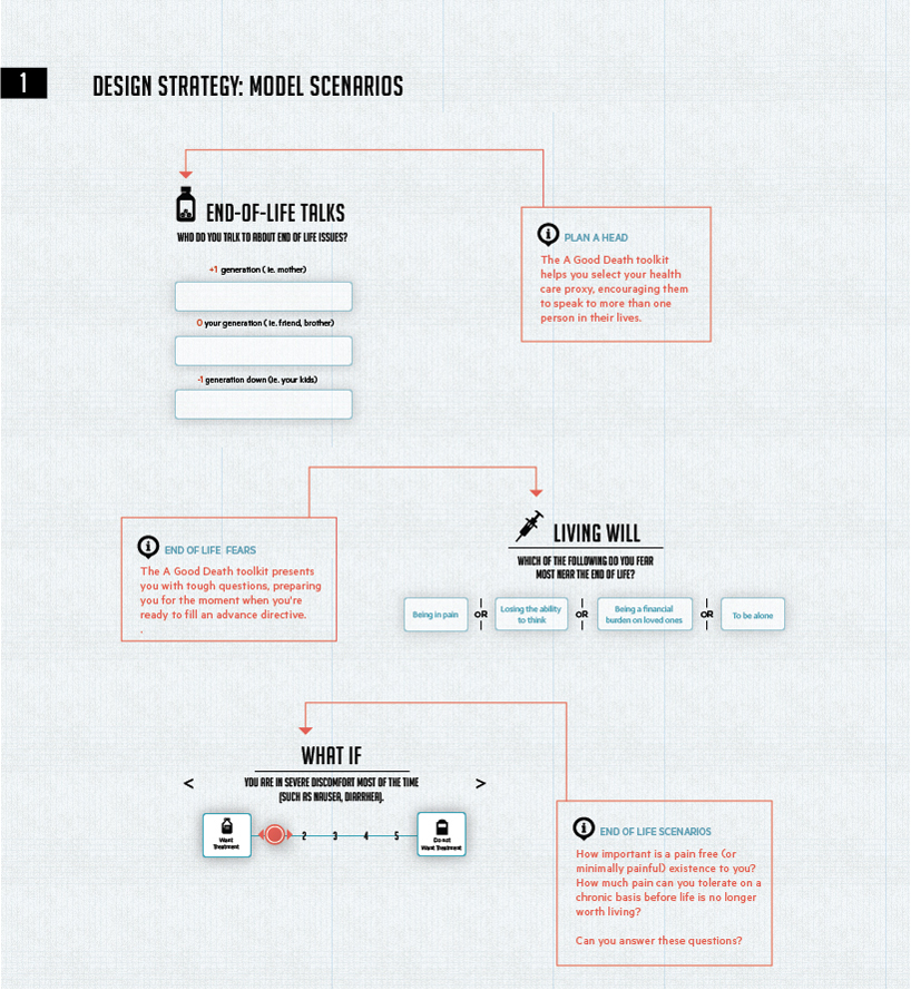 Design Strategy_1
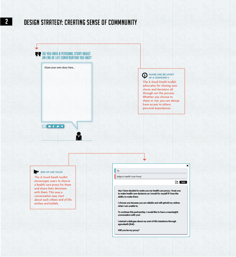 Design Strategy_2
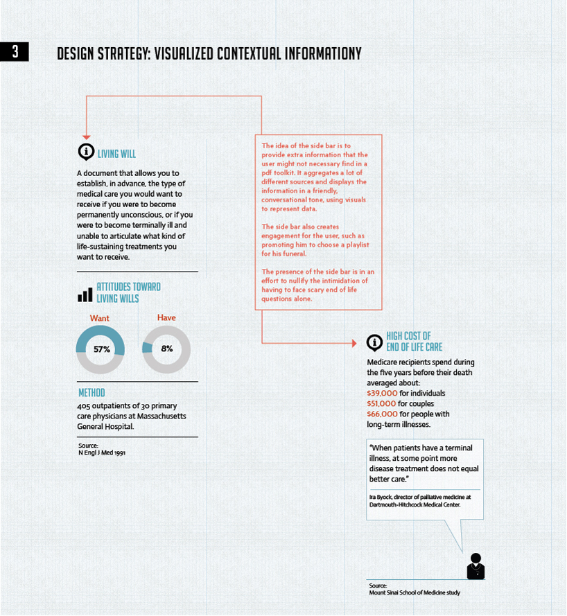 Design Strategy_3
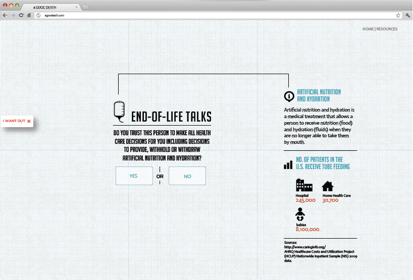 Toolkit Interface_1
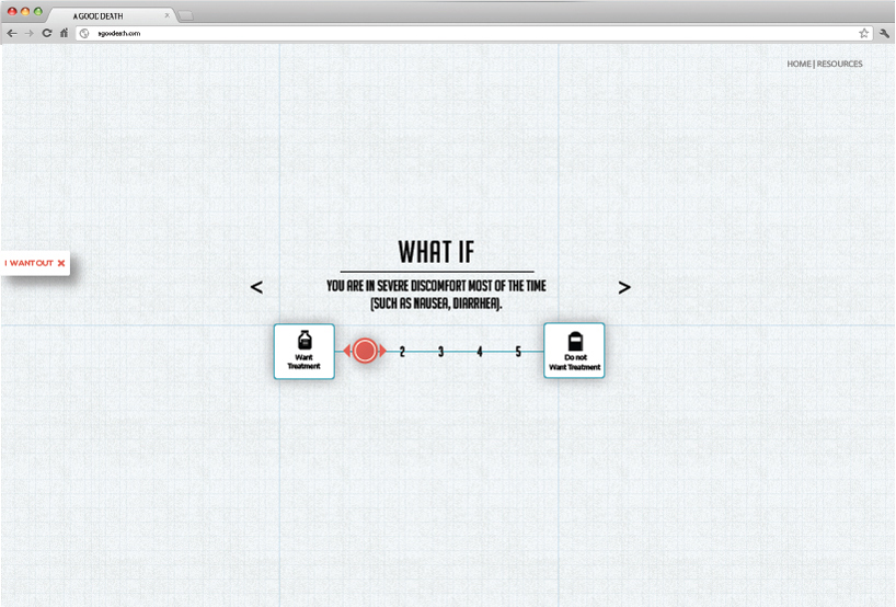 Toolkit Interface_2