kochi metro by Rajeshwari from india
designer's own words:
LOGO STORY
Kochi Metro is one of the change-inspiring developments in Kerala,
which paints the new dynamic face of the state. Inspired from the first
consonant of Malayalam language, the letter ‘ka’ has been used as a
representation of the highly literate state. ‘ka’ also is the first letter of
Kochi and Kerala.
The logo has been crafted in a new-age, fast, fluid and lively avatar.
The form is nimble which connotes a young, electric and an energetic
visual presence. The form is charismatic implying speed, smooth
movement which is synonymous to the metro itself.
The colours green and blue are inspired from Kerala’s natural beauty...
the green trees, mountains, blue sky and the sea. The green and blue
rendition is the Kochi Metro’s commitment towards environment
sustainability and Kerala’s renowned eco-friendliness.
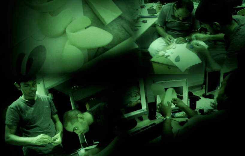
Process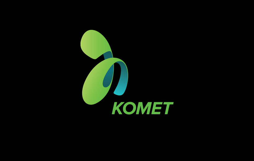 The Identity[jwplayer config=”mplayer” width=”818px” height=”600px” file=”https://static.designboom.com/wp-content/compsub/370832/2013-02-28/video_1_1362060102_7c0074bcd8729ff7ce7fa3c3243706b0.mp4″ html5_file=”https://static.designboom.com/wp-content/compsub/370832/2013-02-28/video_1_1362060102_7c0074bcd8729ff7ce7fa3c3243706b0.mp4″ download_file=”https://static.designboom.com/wp-content/compsub/370832/2013-02-28/video_1_1362060102_7c0074bcd8729ff7ce7fa3c3243706b0.mp4″]video
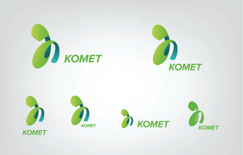 Logo variations
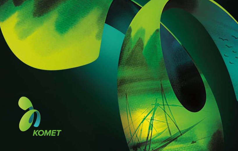 Graphic Language
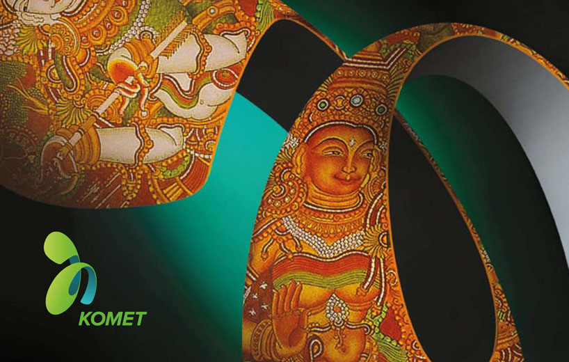 Graphic Language 2
 Application