the cloud collective creates typographical installationall images courtesy of the cloud collective
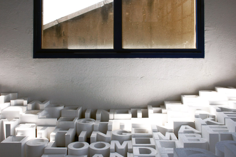
‘towards a poetic morphology’, a temporary installation by the europe-based artist network the cloud collective, fills a small room with a landscape of letters, together forming robert walser’s poem ‘oppressive light’. the piece was installed at la fabrique, a former textile printing factory, for the 22nd international poster and graphic design festival of chaumont in france. in the work, a small opening pathway invites visitors to explore the letters and forms, in a windowed room whose ambiance constantly changes with the sunlight and weather outdoors
 view entering the installation
‘this arrangement in space– strongly affected by sunlight, time and weather– allows the text to slowly detach itself from its intrinsic meaning and to let form, typography and composition take over. the snowy landscape becomes malleable, thus creating a multitude of meanings for the observer.’
 closer view
 additional view
Oppressive light by robert walser
Two trees stand in the snow tired of the light the sky Heads home nothing nearby Where the gloom makes its abode
And behind the trees houses Tower in the dark Now you hear someone speak The dogs begin to bark
The round beloved moonlight Lamp appears in the house But when the light goes out A gaping wound stays in sight
What a small life to know And much nothingness nearby Tired of the light the sky Has given all to the snow
The two trees dance with grace Bend their heads and nod Clouds race across the sod Of the worlds silent face
 process photograph
timelapse video of the installment of the piece
THE CLOUD COLLECTIVE (5)
 Apr 09, 2017
 Sep 18, 2015
 Oct 31, 2014
 Jul 03, 2013
TYPOGRAPHY DESIGN (133)
 Sep 13, 2023
 Feb 23, 2023
 Jan 24, 2023
 Jan 19, 2023
PRODUCT LIBRARY
 Apr 17, 2024
 Apr 09, 2024
 Mar 27, 2024
 Feb 29, 2024