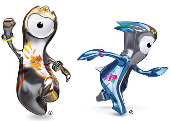
today the mascots for the 2012 olympic games in london were unveiled. the one-eyed characters ‘wenlock’ and ‘mandeville’ were created from the last two drops of british steel used for the london 2012 olympic stadium: ‘that’s why we’re so shiny, reflecting the people, places and things we meet along the way as we travel around the UK’.
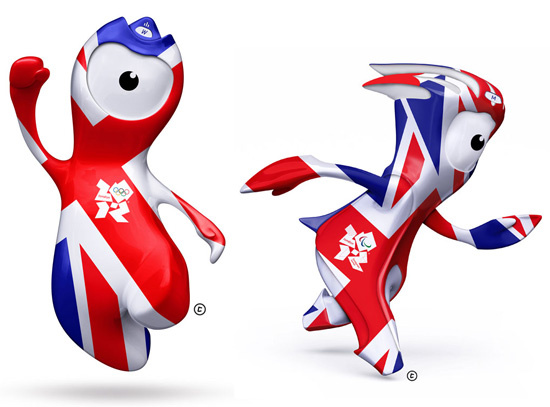
designed by iris, ‘wenlock’ and ‘mandeville’ are just as flexible as the rest of the 2012 identity, with their appearance changing to incorporate different elements of the branding elements.
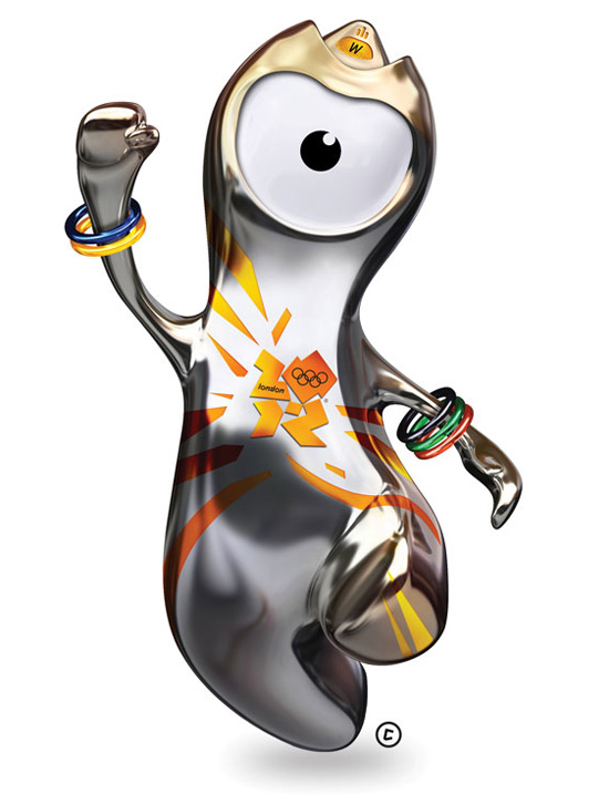
wenlock ‘my name is inspired by much wenlock in shropshire, a town that is at the heart of olympic history. in the 19th century, baron pierre de coubertin was invited there to watch the ‘much wenlock games’ inspired by the olympic games of ancient greece. de coubertin was inspired by the wenlock games too, and went on to found the modern olympic movement. the much wenlock games are still held annually to this day! ‘the light on my head is inspired by the lights on london’s iconic black taxis. the shape of the front of my head is based on the shape of the olympic stadium roof. my eye is a camera lens, capturing everything I see as I go..’
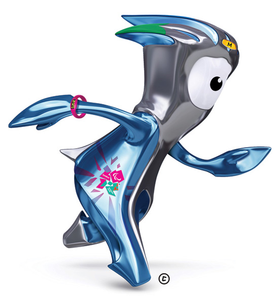
mandeville ‘my name is inspired by stoke mandeville in buckinghamshire, the birthplace of the paralympic games. on the same day as the opening ceremony of the london 1948 olympic games, sir ludwig guttmann held his own sport competition in stoke mandeville for world war II soldiers with spinal injuries. the stoke mandeville games grew and grew until they became the paralympic games.’
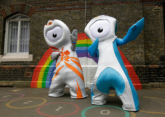 image: AP
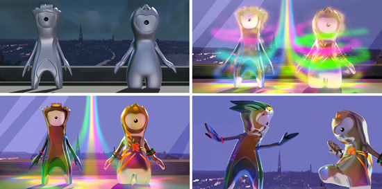
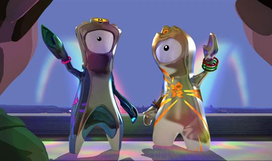
see the video which tells the story of these mascots in full, along with more images and info over at the official london 2012 mascot webiste.
LONDON 2012 OLYMPICS (43)
 Feb 26, 2014
 Aug 13, 2012
 Aug 10, 2012
 Aug 07, 2012
PRODUCT LIBRARY
 Apr 17, 2024
 Apr 15, 2024
 Apr 15, 2024
 Apr 12, 2024