rian hughes proposal for the city of london logo image © rian hughes
designboom met UK-based graphic designer, illustrator, comic artist and the man behind device fonts rian hughes, while in malaysia for kuala lumpur design week 2010, where he presented selected works from the course of his creative career as part of the typo-graphics conference. one of the projects he discussed was his logo proposal for the city of london.
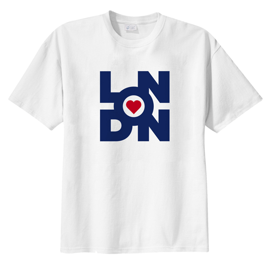
five years ago, hughes wrote to the then-mayor of london, ken livingstone and outlined his idea for a london logo. the idea for his logo pulls on milton glaser’s heart from ‘I (heart) NY’, the RAF symbol which along with being british represents fashion and carnaby street cool, and is combined with the name ‘london’ and the union jack.
 hughes’ equation for his city of london logo image © rian hughes
livingstone sent a letter back to hughes saying, ‘thanks, but we already have a logo for the mayor of london…‘. ‘unfortunately, they had missed the point – this was a logo for the city, not for the mayor!‘, said hughes.
in 2008, when boris johnson became the mayor of the city, hughes sent the design again, but received no response from the office. then, just recently he read that there had been a call for designers to design a logo for london… however, the deadline had already passed!
in any case, he sent the logo again despite this (as technically, the first time he submitted his proposal way before the deadline). this time he received a letter stating that unfortunately, rules were rules and his proposal was too late to be considered.
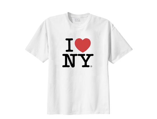
milton glaser’s classic I (heart) NY logo – this is how a logo for a city should be. an iconic logo like this can catch the imagination of the public, get picked up by everyone and come to epitomize a city.
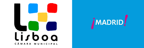 city logos for lisbon, portugal and madrid, spain
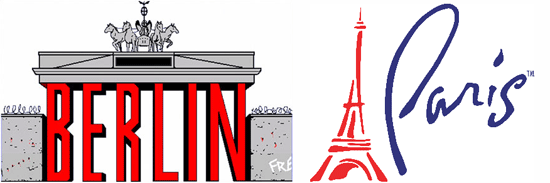 city logos for berlin, germany and paris, france
here are a few examples of other city logos … of how a more corporate logo just doesn’t get taken to heart and isn’t widely adopted by the city’s citizens (and the people who sell tourist tat).
‘I think we’ll probably end up getting something worthy, but a bit dull and corporate, rather than something iconic and fun that would get taken up by knock-off t-shirt sellers and appear on everything from cheap mugs to badges to tea towels – the true gauge of the success of a logo like this.’ rian hughes on the future of the city of london logo
what do you think? stay tuned… more on rian hughes to come!
KUALA LUMPUR DESIGN WEEK 2010 (10)
 Jul 08, 2010
 Jul 07, 2010
 Jun 16, 2010
 May 27, 2010
 May 22, 2010
LOGO DESIGN (244)
 Aug 14, 2023
 Aug 02, 2023
RIAN HUGHES (2)
 Dec 31, 2010
PRODUCT LIBRARY
 Apr 17, 2024
 Apr 15, 2024
 Apr 15, 2024
 Apr 12, 2024