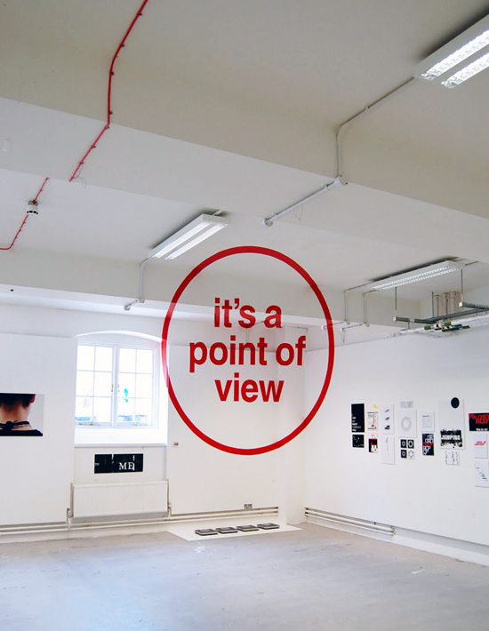
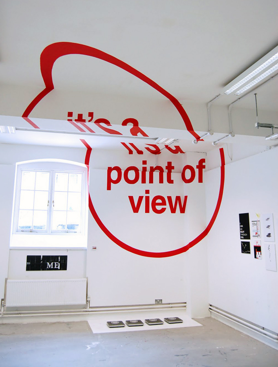
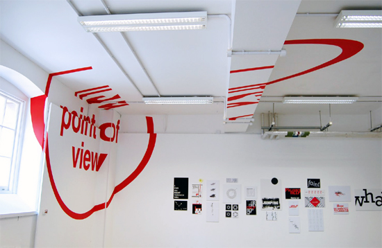
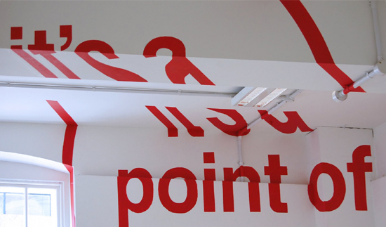
‘it’s a point of view’
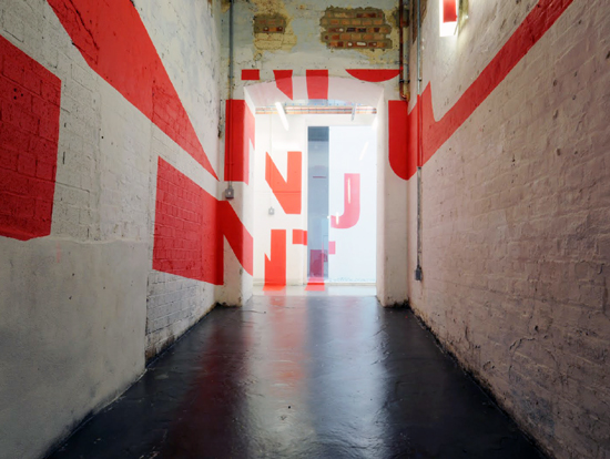
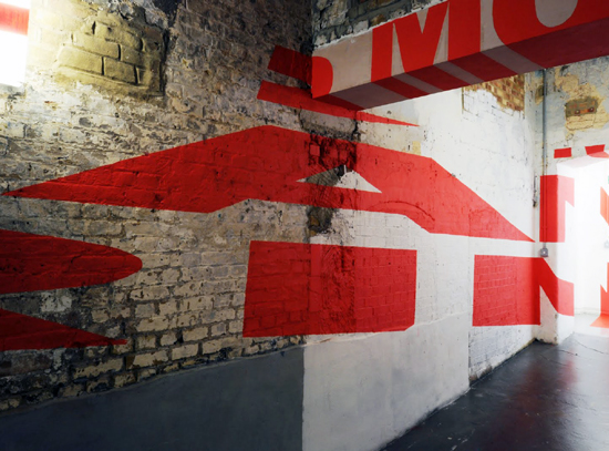
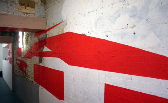
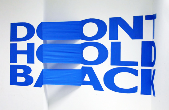
recent british graphic design graduates joseph egan and hunter thomson from the chelsea school of art and design created an anamorphic type installation as part of their final project. initially interested in exploring the relationship between architecture and graphic design, these large scale typographic structures only become legible when viewed from a specific point of view. while some of the letters overlap over various surfaces, others required very little skewing to perfectly align with the other letter forms.
 ‘it’s a point of view’
 ‘it’s a point of view’
 ‘it’s a point of view’
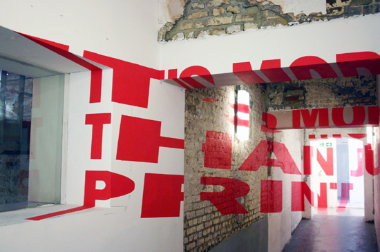
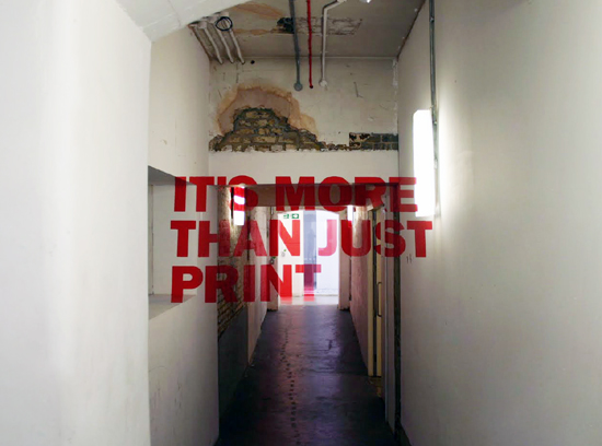 ‘it’s more than just print’
the phrase ‘it’s more than just print’ was specifically chosen in an attempt to challenge conventional thinking of graphic design as a largely 2d oriented art form.
 ‘it’s more than just print’
 ‘it’s more than just print’
 ‘it’s more than just print’
 ‘it’s more than just print’
 ‘it’s more than just print’
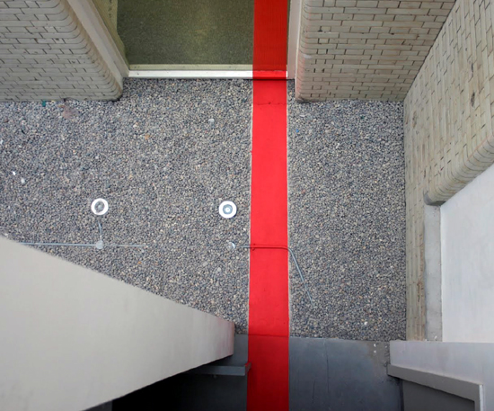 aerial view of installation
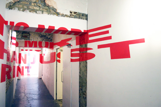
by moving away from the installation, the characters align to showcase the final phrase
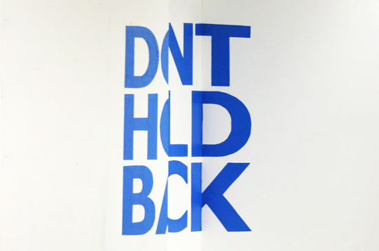 ‘don’t hold back’
 ‘don’t hold back’
via ffffound
TYPOGRAPHY DESIGN (133)
 Sep 13, 2023
 Feb 23, 2023
 Jan 24, 2023
 Jan 19, 2023
PRODUCT LIBRARY
 Apr 17, 2024
 Apr 15, 2024
 Apr 15, 2024
 Apr 12, 2024