dowling duncan US bank note designs

with their vertical format bills, dowling duncan have reignited interest in 'the dollar redesign project'
(which we blogged previously here).
---
following description from dowling duncan:
why the size?
we have kept the width the same as the existing dollars. however we have changed the size of the note so that
the one dollar is shorter and the 100 dollar is the longest. when stacked on top of each other it is easy to see
how much money you have. it also makes it easier for the visually impaired to distinguish between notes.

why a vertical format?
when we researched how notes are used we realized people tend to handle and deal with money vertically
rather than horizontally. you tend to hold a wallet or purse vertically when searching for notes.
the majority of people hand over notes vertically when making purchases. all machines accept notes vertically.
therefore a vertical note makes more sense.
why different colors?
it’s one of the strongest ways graphically to distinguish one note from another.
why these designs?
we wanted a concept behind the imagery so that the image directly relates to the value of each note.
we also wanted the notes to be educational, not only for those living in america but visitors as well.
each note uses a black and white image depicting a particular aspect of american history and culture.
they are then overprinted with informational graphics or a pattern relating to that particular image.

1 dollar bill: the first african american president

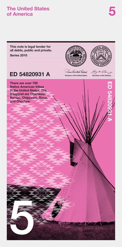
5 dollar bill: the five biggest native american tribes

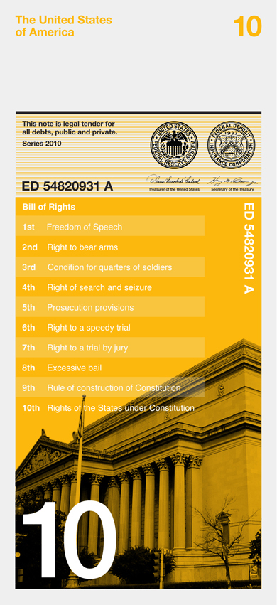
10 dollar bill: the bill of rights, the first 10 amendments to the US constitution

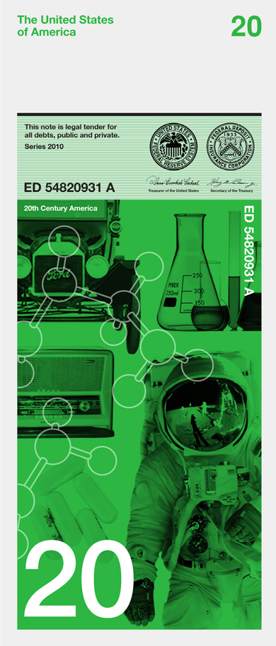
20 dollar bill: 20th century america

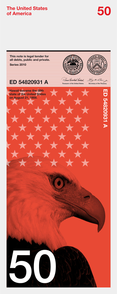
50 dollar bill: the 50 states of america

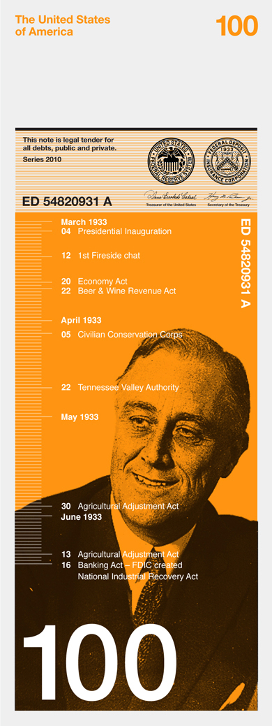
100 dollar bill: the first 100 days of president franklin roosevelt.
during this time he led the congress to pass more important legislations than most presidents pass in their entire term.
this helped fight the economic crises at the time of the great depression. ever since, every new president has been
judged on how well they have done during the first 100 days of their term.
see the project on dowling duncan's website here
But I love the graphic design of the bill. Visually pleasing and functional.
http://www.snb.ch/en/iabout/cash/current/design/id/cash_current_design_principle
here in Australia we have all our notes a different color as well as size to distinguish them.
i can see these notes not being made of 'paper', but of plastic much like the notes here in Australia. This makes it hard to counterfeit. as an extra security measure our notes have a clear window in the corner of the notes. i think a clear window on these notes would work nicely - either that or a foil hologram.
i think it is time for america to change the look of their currency.
We in England also have different coloured money like the Australians and so do do the rest of the Europeans with the Euro. josh@firestorm was right about the notes being made from a plastic. with things like the hologram, metal strip thats only visble in direct light like the English notes it won't need to be as complicated as the current U.S notes.
I've just googled the U.S. notes and they do kind of all look the same where as over here you can't mistake our notes cause of the sizes and colours.
If there's a redesign, why not get rid of the obsolete 1-dollar bill altogether and introduce a coin of that value? In the Euro zone there are one and two Euro coins, and the first bill starts at 5. Which makes much more sense, considering that you can hardly buy anything anymore for a dollar.
We have been using different size notes in South Africa for years.
Other than that the idea is alright. I would like to see a bit more of a historical vestige left intact though. Give it another try. I mean, it is money! Not a pamphlet given out at a US history interpretive center!
The Aussie notes have to be one of the most well-thought out currencies out there - congrats to whoever worked on that and managed to get it into production.
Love this direction - they need tidying of course, but for a starting point to shake things up, awesome.
Lazy.
SECONDLY, redesign costs $$$$$$$$!! Just like we wasted millions on quarters for 50 states, we are going to waste BILLIONS on creating new dies and presses for completely unnecessary "NEW" currency. Especially when we shouldn't be spending at all.
ADDITIONALLY, Jetwax, we cannot drop the penny and nickel from US currency. With that Tax percentages (rates) would increase, and they way we do business would likely change for the worse with an end result of only higher priced products and services on our end, which would only continue to suppress our slow economy.
one idea that i had was to try putting Washington on the one dollar bill. It will link the new bills to the old bills and give the people less receptive of this change to have a sliver of familiarity
as in europe and other countries different colors and sizes are just normal … also the vertical format …
i like the idea of switzerlands national bank, to make a design competition every 10 or twenty years. as you see, they got some nice results five years ago:
entry of norm
the new series is actually based on this drafts and will be released in january 2012.
entry of manuela pfrunder
perhaps this gives you some inspiration … that money does not have to be green and dusty for all time.
Sorry to say Dan, but rather people like him or not....President Obama made history & that will remain.
I only wish the U.S. would change it's ugly currency.
"i think it is time for america to change the look of their currency." Yeah, about that... we just did.
"Great idea and execution, but I don't think that will fly in the US. This super-conservative nation will just want their boring old green money until the end of days." I don't know if you need glasses, but my U.S. money is green, blue, pink, red, yellow, peach, gold, copper, and black... http://www.newmoney.gov/newmoney/default.aspx
"ummm only dead presidents are allowed to be depicted on US currency" When was Benjamin Franklin president?
"Agree with Josh, Jordan & Gabi. U.S. currency is way overdue for a makeover. An attempt was made to have the dollar coin, but as most vending machines would need to be replaced, it didn't go too far." The Sacagawea dollar coin was made with a vending machine company in Reading, Pennsylvania helping to design it so that it would be user and vendor friendly. The problem is that because the Crain Paper Company gives large contributions to elected officials, laws authorizing the minting of dollar coins never authorize the removal of dollar notes from circulation. And given a choice, the public overwhelmingly will pick a dollar bill over a coin everyday.
"SECONDLY, redesign costs $$$$$$$$!! Just like we wasted millions on quarters for 50 states, we are going to waste BILLIONS on creating new dies and presses for completely unnecessary "NEW" currency. Especially when we shouldn't be spending at all." FIRSTLY, the redesign of state quarters never wasted millions. People are employed with that money, which is a good thing. And when money is struck it usually costs less to make than its face value. This is called Seigniorage , the profit made from the difference in production cost verses what the coin is sold for [face value]. Because collects collect new designs, the U. S. Mint actually is making you billions of dollars in profits because everybody and their grandmother have a few state quarters sitting in a top draw at home. Dies strike coins, plates print currency. And the presses do not care about the design they print so the ones we own now do not need to be replaced. And any design cost is recouped when the notes are sold to the Federal Reserve Bank, a private company.
We've always some of the poorest designed currency, and unfortunately I feel these may be a step back. Also, I will assume (since the designer must have quit halfway through his class project) that the backs are a solid field of pantone 802, or more correctly for this guy - 0,255,0.
The design could definitely go further, but I do like the idea of the bill not being so busy. Some of the current bills have letters and numbers that look like carnival stamps. There should almost certainly be more variety in the font. Just Helvetica?
Also, as an Oklahoman, I certainly appreciate a greater inclusion of Indian tribes in American iconography (and the fact that they avoided the obvious but problematic use of the "Five Civilized Tribes"), but really, they ought to have used more than one image for 5 tribes who can be very different from one another. Certainly using just a teepee on a bill celebrating the 5 largest tribes would be taboo.
That said, if some variation of this became the new currency, I'd be pleased. Though, really we probably ought to just do away with printed money all together.
All Americans want colored money.
Of course Obama and FDR would never fly, but the concepts of reorienting the bills, changing the sizes and colors to help differentiate bills, and tying the images to the denominations are all sound.
There are a lot of great concepts here, but the designs could be fleshed out some more.
a prime example of (re)designing just to be different, at any cost (and really bad at it). no real improvement in any way.
complete disaster.
As for the bills...nice idea but needs to continue to be thought out. Both size and color don't need to be changed to make the desired difference between denominations. Size would work better for the visually impaired.
Also the concepts for the imagery is weak at best if the goal is historical ties between the country and the currency. Traditional design with a size OR color change is all that is necessary...if anything at all.
But back on topic: I really like the designs and the concept of the vertical format. Although i think it need some extra security marks and more creative versions of each bill. Keep up the good work.
Australia managed it years ago without incident.
Speaking of Australian currency, it might be a good idea to bring a change to polymer from paper during the redesign. We have all sorts of clever little things on our money - raised designs, special threads, transparent windows, microprint, and a dozen other things that are *very* hard to reproduce, and therefore makes our money very hard to counterfeit. Not to mention that it's very hard to tear an Australian banknote, and they don't deteriorate easily (though they lose colour over time) and won't be damaged much by water or fires. The notes also have metallic security threads in them which can be picked up by metal detectors which makes it nearly impossible to smuggle them. Plus the polymer can be recycled to make another banknote if it becomes too damaged for use as legal tender.
Fact as defined by Princeston.edu: a piece of information about circumstances that exist or events that have occurred.
a statement or assertion of verified information about something that is the case or has happened.
an event known to have happened or something known to have existed.
a concept whose truth can be proved.
and just for good measure, lets have a looksie at the word faith as defined by the American Heritage Dictionary:
Confident belief in the truth, value, or trustworthiness of a person, idea, or thing.
Belief that does not rest on logical proof or material evidence.
Seems according to the actual definition of these words, God is in fact the antithesis of fact.
Very balanced, which is some thing of trial and error with modern design. I think you did very well. I also think the idea of having facts about the US is a very good concept, It gives the notes a bit of life. I really love the neat and clean looks of the and the .
for 10% unemployment rate.
Whatever happened to separation of State and Church?
I also love the excitement and angry that it has managed to generate and have not seen so many comments posted on one, innocent design boom article!
Andre from Amsterdam there is not a lot of similarity to the Swiss notes. Those are way busier, which is another reason these potentially (at this point of development) the proposal doesn't really work as too clear and too simple
Oh and how I had to laugh at the Obama '1' bring out the inevitable Rednecks! No, not looking at you Mike of Texas, Brian, or any other of the boys at the back of the class
Everyone know the American’s love their money the way it is and that they are easy to counterfeit, but if they don't care then let’s leave them to it
stacey lee webber: coin tools
the artist manipulates american coins into basic workingman's tools, bringing new value and meaning to loose change.
scott campbell: bless this mess
the meticulously detailed collection of egg shell drawings and laser-cut currency sculptural works are on display.
money portraits by senseteam
at first look resembling fabric patchworks, the portraits are actually created by the careful cutting and assembling of currencies from around the world.
ugo architecture + design: 100 tree
due to the architects' aim to have every room of this summer house boast a lake view, the building has been formed in a U-shape...
10 design: dalian library
the library is intended to be a transformative environment that pulls visitors into a unique landscape.
RENAULT 4 ever behind-the-scenes
'horsey' by eungi kim
SELFPROMO - january 17 - march 17
POP UP - january 17 - march 17
keep up to date with recent articles and upcoming events.
to receive both newsletters please check 2 boxes.
no contents, including text, photographs, videos, etc. may be reproduced in whole or in part without the written consent of designboom. in addition,
no material or contents may be reproduced on the world wide web by techniques of mirroring, framing, posting, etc. without the written consent of designboom.

submit a project
publish a project
email
RSS
facebook
twitter


