starbucks logo update

starbucks logo update


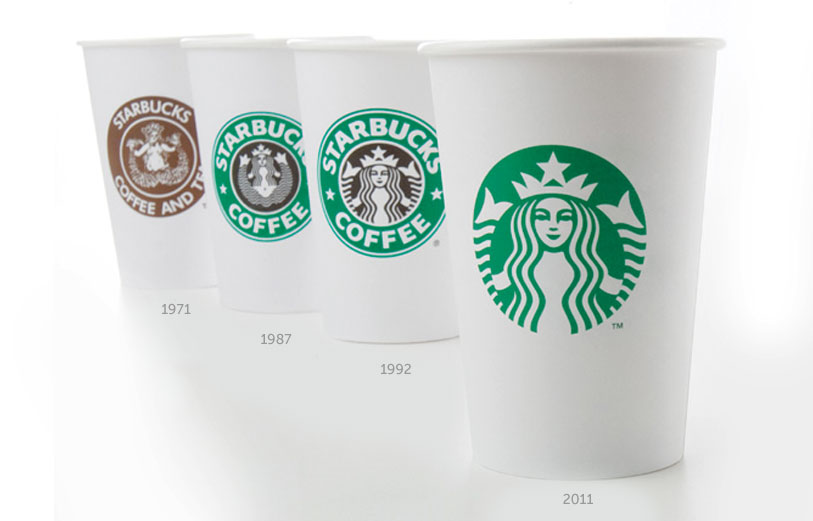
yesterday the most powerful brand in coffee, starbucks, unveiled a new simplified logo,
which it will start using from march 2011 to coincide with the 40th anniversary of company.
the new logo which was designed by starbucks in-house team together with lippincott
does away with the starbucks coffee' text and the outer ring - leaving only the siren in green.


---
following text from starbucks


'when we first heard about the possibility of modifying the starbucks brand identity,
our minds went wild with the possibilities. this was the project of a lifetime.
the designers here at starbucks have such a love for this brand - it’s what drives
our creativity.'

'from the start, we wanted to recognize and honor the important equities of the iconic
starbucks logo. so we broke down the four main parts of the mark – color, shape,
typeface and the siren. after hundreds of explorations, we found the answer in simplicity.
removing the words from the mark, bringing in the green, and taking the siren out of her ring.
for forty years she’s represented coffee, and now she is the star.'


'the details came next. the 20-year old logo was built in the early days of autotrace
and it showed – points everywhere. we improved composition, brought in more
sophisticated stroke width and spacing and a smoother line flow. when it came to her
– the siren – we enhanced her form in subtle ways, smoothing her hair, refining her
facial features, weighting the scales on her tail to bring the focus to her face. we
enlisted the branding firm of lippincott to help with these refinements, and give us a
better global perspective on the entire identity system.'

'the result is an evolved logo that celebrates the siren in a much bolder way – it’s more
expressive and energetic and still uses the same vibrant green circle that is so well
recognized by our customers around the world.'
mike p., senior creative manager, starbucks


more information on the new starbucks image and reaction to it can be found here.


designboom design aerobics online courses


logo design is part of our upcoming design-aerobics 'self-promotion' course which begins january 15th, 2011.
see how to enroll here.
andy db
01.06.11  
17
How long until it is only a white star in a green circle! LOL
Simples   01.07.11
I think the 1992 logo is better than the new one
tom   01.07.11
I actually like the 1971 logo the best.
spen   01.07.11
In the 1971 logo, the mermaid looks like she's in the act of committing suicide by tearing herself in half. In the '87 logo, she looks like she's doing some weird contortionist spread eagle thing. The most recent two aren't all that bad. The best thing about any of 'em is the stronger green and black of the '87 logo. The others look washed out in comparison.
rudy47   01.07.11
bring back the nipples
simplex   01.07.11
everyone knows starbucks was invented by joey from friends in the late 1990's. Does anyone still go there now?
dot-coma   01.07.11
And by 2021? No logo at all! We live in hope...
CoffeeLover   01.07.11
It already just has a star logo in Saudi.
<( º =•= º )>   01.07.11
I prefer the 87 logo the best, with the contrasting black and green. But the 92 is fine.just maybe a little to bland. Now this new logo is just wrong. I live in Seattle and StarBucks has been trying to reinvent themselves and give the local cafe feel again. Why would you gentrify your work. So you can have a logo like Nike or Apple. Hope this new logo dies and we see a retro logo brought back.
NWMike   01.09.11
i think it would be awesome to see a retrofit with the 1971 logo back on the cup.
coffee_extremist   01.09.11
Can anyone explain me why there is no coffee word anymore? Where is the brown colour - wich brigns you coffee on mind.

The combination of brown and green on white background was refreshing, now it is just ORGANIC and healthy - where is the pleasure and the kick?
Piotr Juszczak   01.09.11
Why not have blank cups with four versions of the heat protectors / corrugated cardboard slips - each with a different logo then you can choose which logo you want on your coffee cup. Everyone is happy and the cups can be recycled easier.

There, Starbucks you can have that on on me :-)
Buckethead   01.10.11
@ Piotr Juszczak: They dropped the coffee word because they think it was limiting the brands potential to just coffee...

Maybe this logo "formula" of iconic brands such as Nike and Apple is not for every brand out there. They need to be authentic more than trendy.
Allen   01.11.11
ctrl+c than ctrl+v ...........
tommy   01.11.11
Its no necesary any more the word COFFE and STARBUCKS, everyone recognizes the logo and the color
Aldo gnz   01.11.11
There is really nothing constant in this world. Everything change just to meet the demands of the present situation. The day has come again for Starbucks. Starbucks siren left wordless with new logo has been rolled out for the 4th time. Starbucks is not going to officially begin using the new logo until March of this year. This is just one of many adjustments Starbucks will be making in honor of its 40th anniversary. Obviously, Starbucks was in no need of personal loans in order to finance the style change.
Alonzo   01.11.11
glad to see they took advantage of this "chance of a lifetime" - truly inspiring design work there. I hope SB's spent a lot of money on this designer's bs.

losing the text is a big mistake
octo   01.12.11

interview with ben casey of the chase

design | 05.15.12

'technology has not only transformed how we work, it's also offered new media channels and we're now having to re-establish the boundaries we should work within.' - the chase

0

JAY Z: brooklyn nets identity

design | 05.01.12

yesterday the brooklyn nets unveiled their new identity designed by JAY Z (part owner of the team).

8

oded ezer and H.I.T. students: hebrew logos

design | 04.18.12

oded ezer asked students on his visual communications course at H.I.T. (holon institute of technology) to design hebrew versions of logos that already exist in latin/arabic/japanese.

0

alejandro delgado: amparo

READER'S SUBMISSION a handcrafted light object made of recycled cardboard that is modeled after the representative rituals of the colombia pacific region.

ramos bassols: ligera for urbes21

READER'S SUBMISSION an urban furniture collection developed to appear lightweight against the heavy downtown elements.

tom sachs: space program - mar

art

designboom has visited the american artist's most recent space odyssey installation exploring NASA's mars missions at the armor...

nendo: still & sparkling f

design

the collection of delicate pieces rejects traditional glassblowing techniques, embracing instead the irregularities typically c...

design time breil award ceremony

DESIGNBOOM COMPETITIONS the designs explore a variety of topics from comic memorabilia to pop culture. s

curved visions digital art competit

DESIGNBOOM COMPETITIONS designboom in collaboration with INFINITI is excited to announce the CURVED VISI

GRAPHIC DESIGN - may 17 - july 17

DESIGN - AEROBICS make graphic design work for you. with this course you’ll enhance your understanding of the basics and learn more about emerging developments within the field.

SHOPPING - may 17 - july 17

DESIGN - AEROBICS we'll look at the seamless way in which design and consumer culture cross paths, with a focus on; shop design, packaging, carts, carriers, online shopping and markets.
designboom news
348,792 subscribers

keep up to date with recent articles and upcoming events.
to receive both newsletters please check 2 boxes.

DAILY - see sample BIWEEKLY -see sample
© copyrights 2000 - 2012 designboom, all rights reserved. all material published remains the exclusive copyright of designboom.
no contents, including text, photographs, videos, etc. may be reproduced in whole or in part without the written consent of designboom. in addition,
no material or contents may be reproduced on the world wide web by techniques of mirroring, framing, posting, etc. without the written consent of designboom.