
rio 2016 olympics logo designed by tátil
the logo for the 2016 olympics in rio de janiero, brazil was revealed on new year’s eve 2011. created by fred gelli’s rio-based tátil agency who beat out almost 140 other competitors and was selected from eight finalists, the winning design immediately received criticism for its uncanny resemblance to the logo of the not-for-profit telluride foundation in colorado, USA which is an image depicting figures with arms embraced.
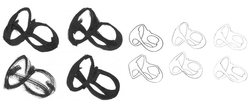 sketches
gelli has acknowledged some similarities of the design to that of the foundation’s, but feels that broad concept of people embracing is not a novel idea stating, ‘the brand is radically different because it is tridimensional.’ he has also disregarded any claims that the winning logo is similar to that of the painting ‘the dance’ by henri matisse.
 form explorations
the logo is meant to translate the spirit of collectivity and the olympic spirit. the colors selected refer to the brazilian environment: ‘yellow symbolizes the sun and our warm, vivacious and happy nature. blue expresses the fluidity of the water that surrounds us, and our easygoing way of life. green represents our forests and hope, a positive vision that inspires us to go even further,‘ says fred gelli / tátil.
the jury who selected the winning logo, consisted of a team of 15 national and international members of the organizing committee for rio 2016 olympic games.
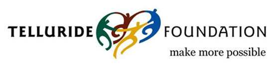 the telluride foundation’s logo which the winning rio 2016 olympics logo is said to resemble
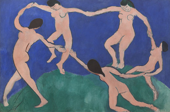 ‘the dance’ by henri matisse image courtesy of the MoMA
the making of rio 2016video courtesy of tátil design de ideias
launch of the olympic games emblem for rio 2016 video courtesy of SuperUber
read more the washington post creative review: rio 2016 olympics logo creative review: rio 2016 logo – a closer look
FRED GELLI / TáTIL (3)

LOGO DESIGN (244)
 Aug 14, 2023
 Aug 02, 2023
RIO 2016 OLYMPICS (25)
 Dec 02, 2016
 Sep 05, 2016
 Aug 23, 2016
 Aug 17, 2016
 Aug 15, 2016
PRODUCT LIBRARY
 Apr 15, 2024
 Apr 15, 2024
 Apr 12, 2024
 Apr 04, 2024