sunshine and happiness infographic

sunshine and happiness infographic


'sunshine and happiness', an infographic created by british graphic designer leigh riley
and london-based digital media agency arena quantum for thomas cook budget airlines,
compiles a range of information on happiness and sunlight in a discursive look
at the misconception that the two are directly related.

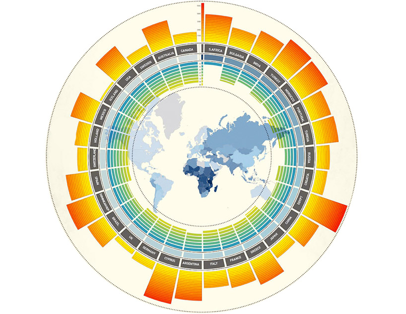
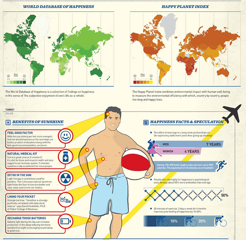
the central graphic correlates by country the average number of hours of sunshine, life expectancy, and life satisfaction
(as measured by the world database of happiness). 'sunshine and happiness' also maps the results of two major global happiness surveys,
lists facts about the salutary effects of sunlight, and includes other interesting facts, using a combination of national surveys,
the 'happiness index' created by facebook based on status posts, and thomas cook airline's own data.


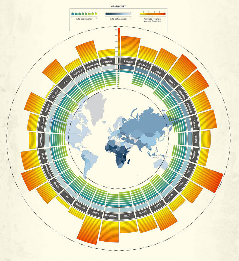
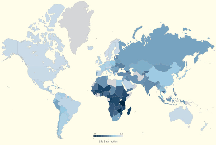
detail on the life satisfaction heat map in the central graphic


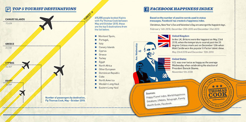
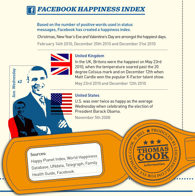
according to national surveys and facebook's happiness index, holidays, nice weather, and election/competition results bring happiness
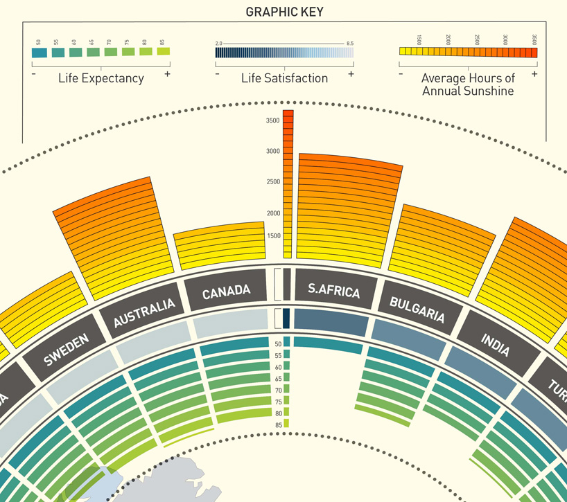


detail view

jenny db
03.18.11  
5
I imagine Mr. Tufte would approve
dbkii   03.18.11
This is utter bullshit -- there IS NO CORRELATION BETWEEN SUNLIGHT AND HAPPINESS -- there are collelations between health, wealth and happiness. Moreover, this is SHITE information design -- by bending the correlation around a sphere, the designers added NOTHING to the legibility of the design -- in fact, they obfuscate what would otherwise be absolutely clear.

Mr. Tufte most certainly NOT approve. Info design is supposed to ADD value and make deductions easier, not harder. This is garbage work by people who don't know what they're doing.
Happy and Sunny   03.20.11
Happy and Sunny chiilax dude! Although I do like reading an angry rant sometimes but you got issues.

The graphic doesn't say there is a correlation between the two. In fact it puts to rest the myth of such a concept. Plus a sphere is 3D, I think you meant circle/circular.

I find it pretty clear. As you look around the dial you can see the levels of sunshine, life satisfaction and life expectancy for each place. pretty easy non?

The map in the middle is a life sat heat map.

And there are all the fun facts at the bottom. I like it, well done to the team responsible, you've certainly rocked some of the info design boats! Hahaha
Advocate   03.20.11
Happy and Sunny says: "by bending the correlation around a sphere, the designers added NOTHING to the legibility of the design".

true enough. Personally I do not think that it DECREASES the legibility, but to each his own.

what it DOES add is visual interest (you clicked into the article, right?), which is the first and biggest step to getting any information across. And in this case, with the three different scales, it also is very efficient as a design.

there are a couple things that I might choose to do differently if I were designing this. But what makes infographics so interesting is the need to attend to multiple levels of interface design, so to ignore aesthetic appeal, as well as the constraints involved in depicting cross-correlations of data, is to ignore something quite fundamental to their design.
the other cj   03.21.11
good look, is interesting facts, PUNTO E BASTA!!!
instead of talk, talk, talk!!!
A.R.V.   03.21.11

youtube: one hour per second

design | 01.26.12

every second, one hour of video is uploaded onto youtube. that adds up to one century of video every year. the statistics were translated into mind-bending infographics. 

0

arthur buxton: color trend visualizations

design | 05.15.11

the charts are designed to be visually pleasing, but also function as a color trend visualization tool. each circle represents a famous painting, portraying the five most prominent colors as a percentage.

2

ikea stonehenge infographic

design | 02.22.11

an infographic by british writer justin pollard offers ikea-style instructions for the construction of stonehenge.

12

ccdstudio: new center for childhood

READER'S SUBMISSION

this project is the result of two municipal programs coming together to create a new structure and urban identity for the commu...

alejandro delgado: amparo

READER'S SUBMISSION a handcrafted light object made of recycled cardboard that is modeled after the representative rituals of the colombia pacific region.

tom sachs: space program - mar

art

designboom has visited the american artist's most recent space odyssey installation exploring NASA's mars missions at the armor...

nendo: still & sparkling f

design

the collection of delicate pieces rejects traditional glassblowing techniques, embracing instead the irregularities typically c...

design time breil award ceremony

DESIGNBOOM COMPETITIONS the designs explore a variety of topics from comic memorabilia to pop culture. s

curved visions digital art competit

DESIGNBOOM COMPETITIONS designboom in collaboration with INFINITI is excited to announce the CURVED VISI

GRAPHIC DESIGN - may 17 - july 17

DESIGN - AEROBICS make graphic design work for you. with this course you’ll enhance your understanding of the basics and learn more about emerging developments within the field.

SHOPPING - may 17 - july 17

DESIGN - AEROBICS we'll look at the seamless way in which design and consumer culture cross paths, with a focus on; shop design, packaging, carts, carriers, online shopping and markets.
designboom news
348,800 subscribers

keep up to date with recent articles and upcoming events.
to receive both newsletters please check 2 boxes.

DAILY - see sample BIWEEKLY -see sample
© copyrights 2000 - 2012 designboom, all rights reserved. all material published remains the exclusive copyright of designboom.
no contents, including text, photographs, videos, etc. may be reproduced in whole or in part without the written consent of designboom. in addition,
no material or contents may be reproduced on the world wide web by techniques of mirroring, framing, posting, etc. without the written consent of designboom.