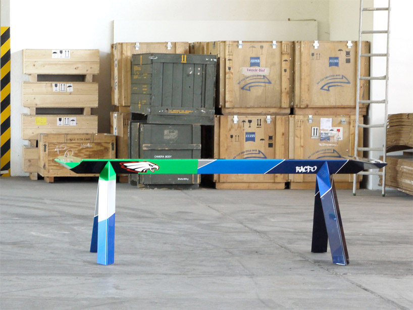
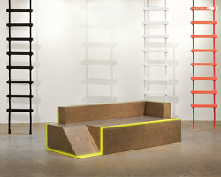
konstantin grcic: champions at galerie kreo‘apache’ photo © erica overmeer, courtesy of galerie kreo
konstantin grcic: champions galerie kreo, paris june 11th to july 23rd, 2011
german designer konstantin grcic in conversation with art critic and editor alex cole on ‘champions’, his exhibition of six new tables presented at galerie kreo, paris:
‘I want the tables to appear like they are formula 1 cars lined up on the starting grid of a race track,‘ konstantin grcic says, standing in his studio space in munich on a spring morning in 2011, a time we’ve set aside to discuss six new tables produced for his exhibition, ‘champions’, at galerie kreo in paris. we are flicking through a thick dossier of print-outs of computer renderings of the new table bases – aluminium trestle-like constructions with either circular or rectangular glass surfaces. the dossier details the various stages of the rigorous research and design process: the structural designs, the graphic logos, the colours, and the numerous fonts that have all been tried out. as we continue our conversation, grcic’s eyes move to a sleek black ski pole propped up against a books- helf; he reaches out for it. lettering runs up and down the stick: the larger lettering reads ‘salomon’, while the smaller insists this is ‘high performance’ equipment. ‘after all, it’s not such a leap between these two things,‘ grcic remarks, holding the black ski stick next to the leg of the table, a black version of ‘table_one’ (2005). ‘what I particularly like is how the graphics on sports equipment refers to performance,‘ grcic continues. ‘they create the illusion that the object with them is faster or more powerful than the one without. the graphics on the six tables are fake – totally made up.‘
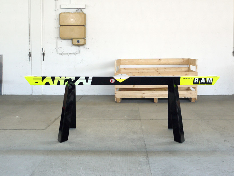 ‘banzai’ photo © erica overmeer, courtesy of galerie kreo
cutting across these two references from the world of sport, comes grcic’s memory of a 1994 jean prouvé exhibition at the galerie jousse seguin in paris. turning the pages of a prouvé… monograph, grcic stops at an archive image of the exhibition and elaborates on how the table tops were hung flat against the walls with the table legs protruding out into the narrow room. grcic’s designs for the new tables are loosely derived from the juxtaposition of these two disparate sources: the worldof formula 1 racing cars and sports equipment on the one side and that of prouvé on the other. by staging the disjunction that exists between the anonymous designs of the sports world and a signature design by prouvé, grcic reshuffles the otherwise static relationship between the high and low in the product design world.
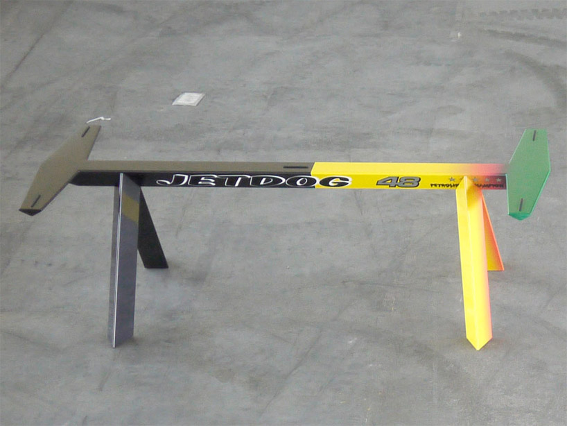 ‘jetdog’ photo © erica overmeer, courtesy of galerie kreo
one of the early problems encountered during the research and design process for the new tables was how to ensure the graphics didn’t feel extraneous to their design – i.e., to ensure that the three-dimensional and the two-dimensional vocabularies productively interrelated. this objective was achieved by rejecting the transfer foils that are routinely used in sports equipment and instead opting to collaborate with the highly revered lacquerer, walter maurer, who worked directly with andy warhol and frank stella in germany on their art cars for BMW in the mid-1970s. the way maurer painstakingly builds a graphic language up by using many layers of paint is crucial. the graphic vocabulary seems as if it’s embedded into the aluminium tables, like a series of inlays. ‘the lacquerer technique is old school – I wanted to achieve the same level of quality found in an old lacquered chinese box,‘ grcic affirms.
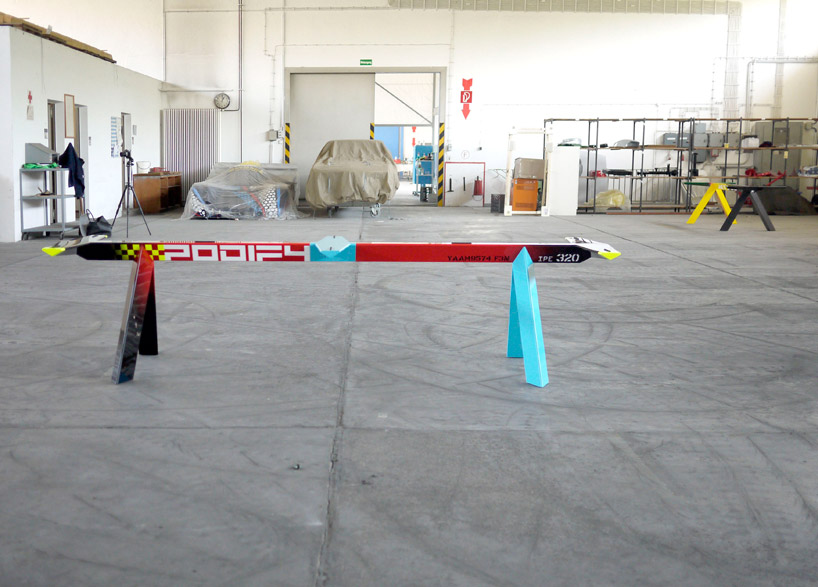 ‘podify’ photo © erica overmeer, courtesy of galerie kreo
received wisdom has it that grcic inherits the legacy of the productdesigners marcel breuer and dieter rams from the pre and post-war periods respectively. but this smooth lineage is too simplistic to really hold since it fails to take into account grcic’s flexible way of responding to even the tightest briefs within the context of industrial product design. in fact, with these new tables, it’s as if grcic sets out to deliberately refute the lineage pinned on him, introducing a playful graphic vocabulary thoroughly alien to the functionalist designs of breuer and rams.
by transferring the precision that derives from the research and design process from his industrial product designs to these new gallery bound tables, grcic has been able to question these two genealogies central to the history of product design: of prouvé, breuer and rams with their strict principles and geometries on the one hand, and studio alchimia and memphis, with their panoply of ersatz decorative signs and playfully pop shapes on the other. instead of just being a tautological game, this is nothing less than a speculative design process aimed at generating a vocabulary of product design for the future.
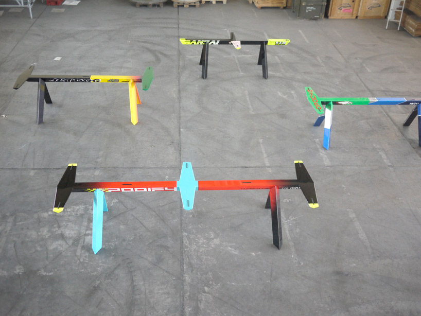 overall view photo © erica overmeer, courtesy of galerie kreo
 production details photo © erica overmeer, courtesy of galerie kreo
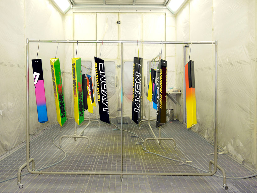
 production detail of lacquer and graphics drying photo © erica overmeer, courtesy of galerie kreo
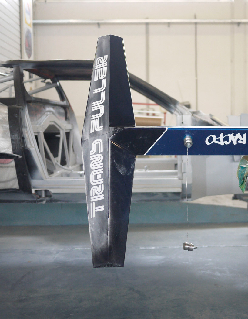 detail photo © erica overmeer, courtesy of galerie kreo
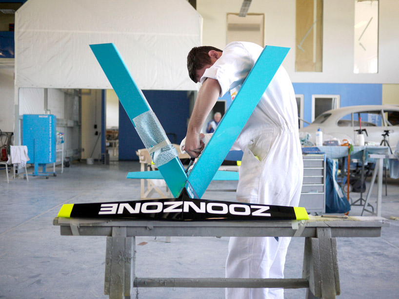 production detail photo © erica overmeer, courtesy of galerie kreo
GALERIE KREO (21)
 Sep 22, 2023
 Mar 10, 2023
 Nov 16, 2022
 Feb 10, 2022
KONSTANTIN GRCIC (93)
 May 01, 2023
 Sep 14, 2022
 Sep 06, 2022
 Jul 07, 2022
PRODUCT LIBRARY
 Apr 17, 2024
 Apr 15, 2024
 Apr 15, 2024
 Apr 12, 2024