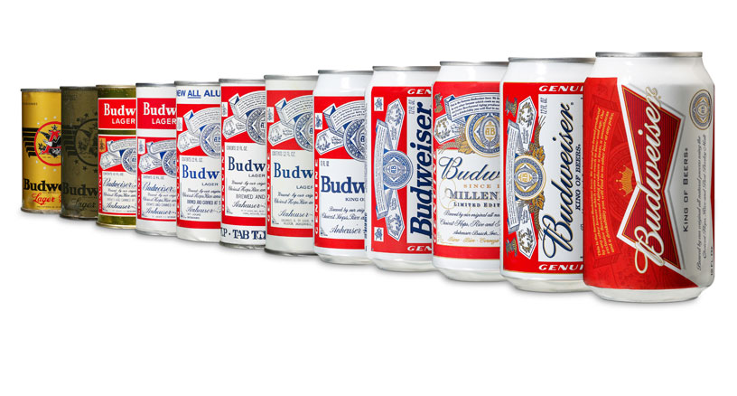
this week american beer brand budweiser presented its new cans designed by london-based JKR. the ‘bowtie’ design is the 12th can redesign since the company started using them in 1936.

the new design gives greater importance to the ‘budweiser bowtie’ that was created as a symbol to encourage people to order the beer by its full name, instead of just by its nickname ‘bud’.

— following text from the budweiser press release:
‘budweiser’s success is rooted in aspects of the beer that will never change – a crisp, refreshing taste, an unwavering commitment to quality and the enormous pride we take in each batch’ – rob mccarthy, vice president, budweiser.
‘our refreshed packaging design gives budweiser an updated look, which dramatizes the iconic budweiser bowtie and incorporates the brand hallmarks that loyal budweiser drinkers will recognize and appreciate.’
budweiser’s new ‘bowtie’ can and secondary packaging designs will be the global standard as the brand continues to expand internationally.
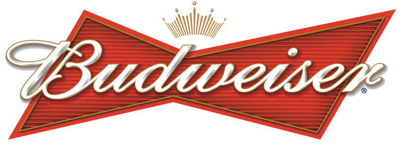 previous budwesier logo (2001 – 2011)
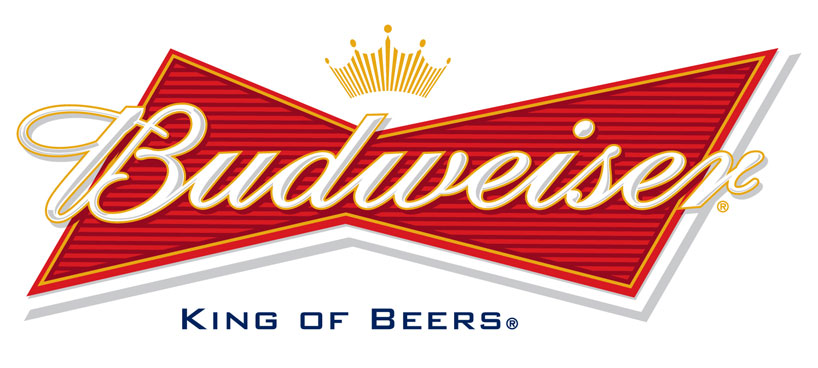
updated logo launched this week
‘this new visual identity is one of many steps in our quest to reinforce budweiser’s role as a true global beer brand. together with our unifying global creative idea, the new global packaging look and feel will reinforce budweiser’s bond with consumers around the world’ – frank abenante, vice president, brands, anheuser-busch inbev.

using the same design principles as the newly designed can, the redesigned secondary packaging will be used for all package configurations and emphasizes the budweiser creed, which highlights the beer’s unique beechwood aging process and 135-year long commitment to quality. the packaging will also feature a ‘quick response’ code that will better enable budweiser to regularly communicate with consumers.

for more information about the new budweiser packaging, key design elements and images, and background on the evolution of the budweiser can, click here.
via brand new
LOGO DESIGN (244)
 Aug 14, 2023
 Aug 02, 2023
PRODUCT LIBRARY
 Apr 17, 2024
 Apr 15, 2024
 Apr 15, 2024
 Apr 12, 2024