
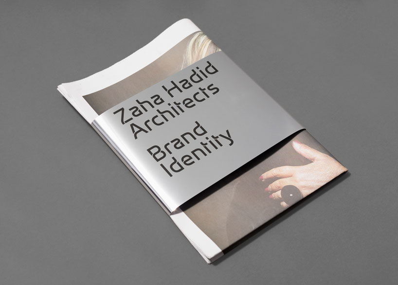
design and brand strategy specialists greenspace have developed a new identity, bespoke typeface and website for zaha hadid architects.
— designboom spoke to lee deverill, design director at greenspace to find out more —
DB: how long did greenspace work on the project for? LD: the original brief was sent to us in july 2009. we pitched against a number of high-profile agencies and our response focused in particular on process, collaboration and the potential of the brand – rather than any creative solutions. we then went through the interview process before starting the project proper in july 2010 – through to launch in july 2011.
based on the interviews with the zaha hadid studio, what became clear as the most important thing to communicate with the new identity? with such a large and complex studio there was clearly a diverse and contrasting range of opinions.
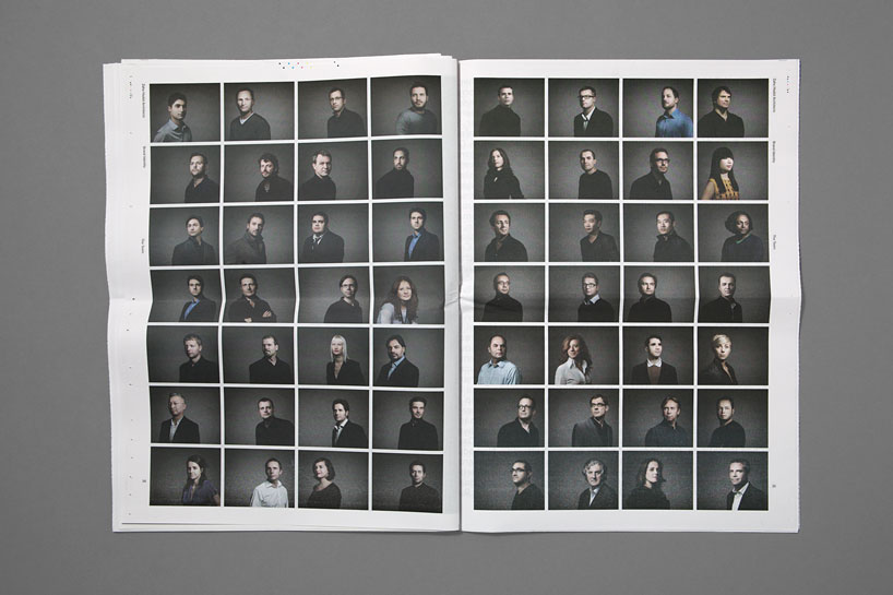
what was clear to us through both the interviews and the original brief was the need to; (a) highlight the vast number of projects that have been created and realised (b) highlight all the talented designers and architects within the practice (c) communicate ZHA as a company that is world-class, highly-professional and yet avant-garde in its approach.
clearly all that can’t be achieved through an identity alone and that’s why the website became our primary focus initially and the main vehicle for the ZHA story.
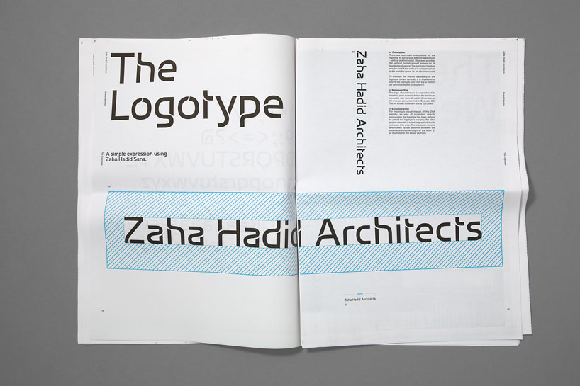
that said, creating a unique typeface that could be used by everyone on a day-to-day basis also felt like a nice inclusive way to bring the brand to life.
which aspect of the project proved most challenging? as a creative process it was truly collaborative and very positive.
the real challenge is hoping you create a piece of work that reflects the client’s own reputation and high standards.
regarding the branding, it can be hard sometimes when dealing with a client that has such a strong visual style to find your own path and reasons for doing so. we hope and believe we did that by creating a look that’s not a pastiche of the architecture and in fact allows it to be elevated and viewed without distraction.
finally, regarding the website, we set out to create something that has a unique user experience and sets itself apart from all sites – not just architectural ones. the level of content, movement, functionality and search capabilities are clearly complex and when combined with a beautiful bespoke CMS it obviously took a great deal of thought and an incredible development team to deliver.
we really hope people explore the archive both now and in the future as more and more content becomes available.
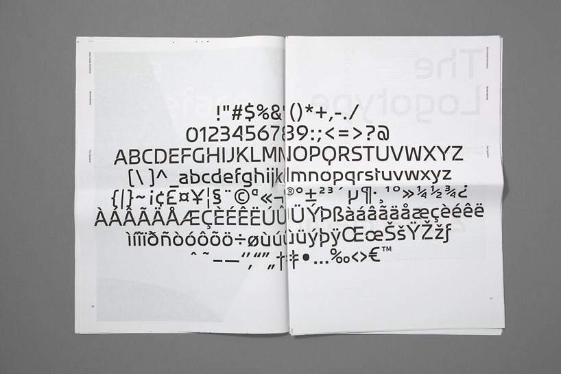
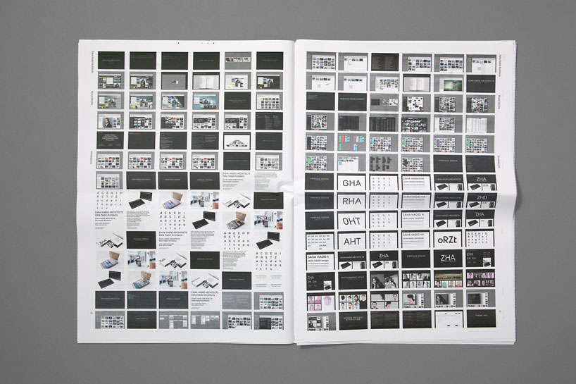
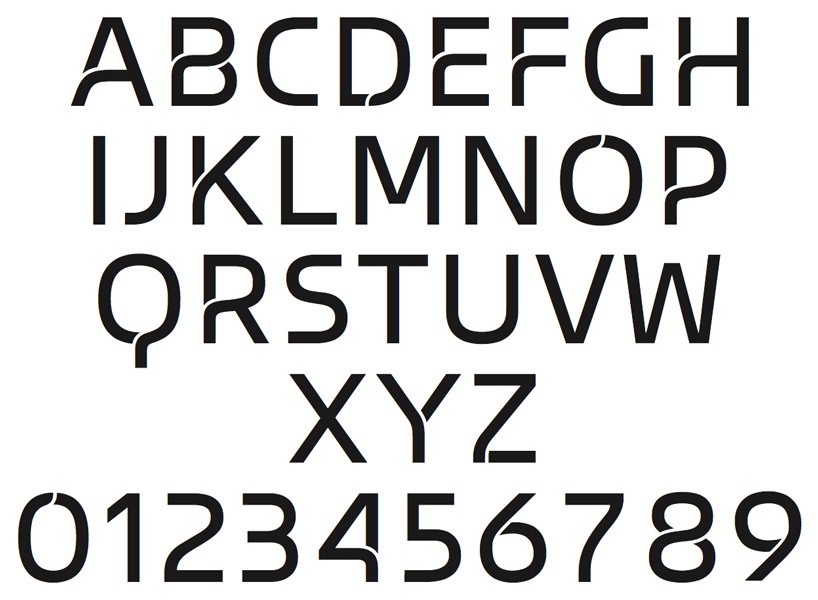 selection of the characters from the typeface designed by miles newlyn with greenspace
—- following text from the official press release:
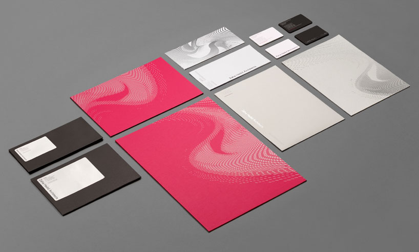
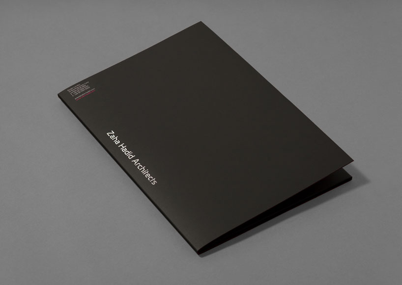
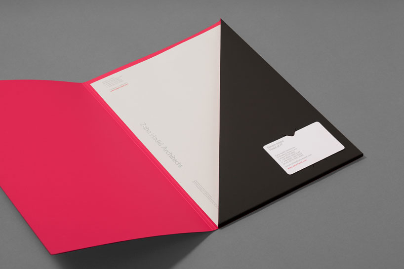
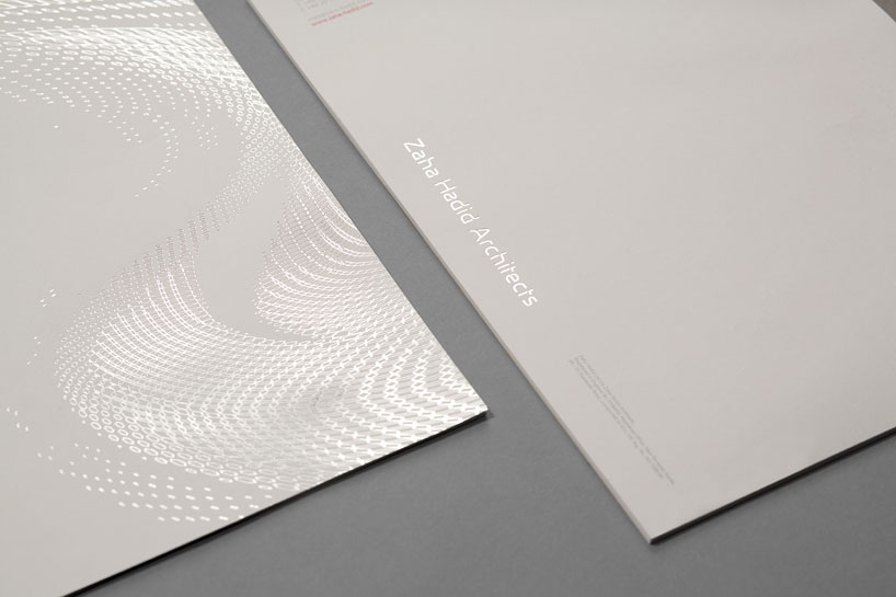
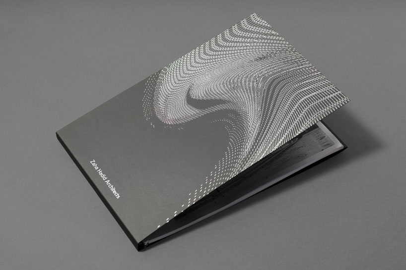
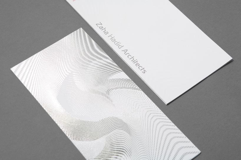
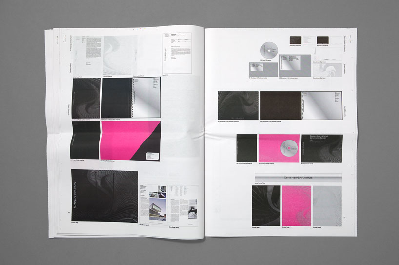
collaborating closely with zaha’s senior partner, patrik schumacher, greenspace and designer miles newlyn have developed a brand identity that has a minimal feel. it is inspired by the contemporary material and construction choices employed by ZHA, visualised through the use of varying paper stocks, simple highlight colours and carefully chosen print techniques.
‘we deliberately didn’t want to create a brand identity that would be a pastiche of any of the ZHA created works. we wanted the work to speak for itself, not be over-powered by its brand‘ adrian caddy of greenspace
dynamic patterns ZHA use a wide range of computer program scripts combined with parametric theory when creating buildings and designs. greenspace took inspiration from these to create a set of patterns that can be used graphically across communication collateral and to which future patterns can be added as new structures, shapes and forms are developed.
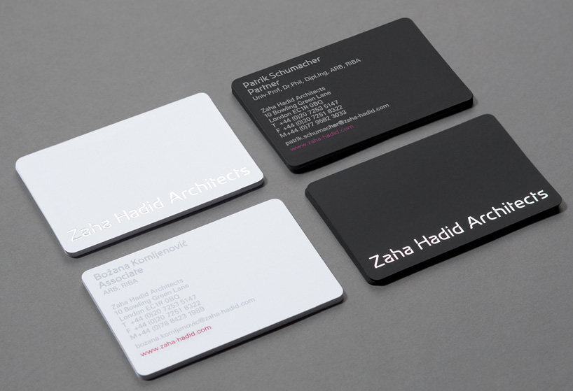
bespoke and unique typeface as part of the brand revamp, greenspace and ZHA’s patrik schumacher worked closely to develop a bespoke typeface, called zaha hadid sans.
‘the typeface uses two unique features: there is the folded detail, in which joins that are usually truncated are divided by a slim gap to give the appearance of layering. the other feature is a carefully stressed curve that flows from vertical to near horizontal and back again.’ – miles newlyn
 identity guidelines / overview
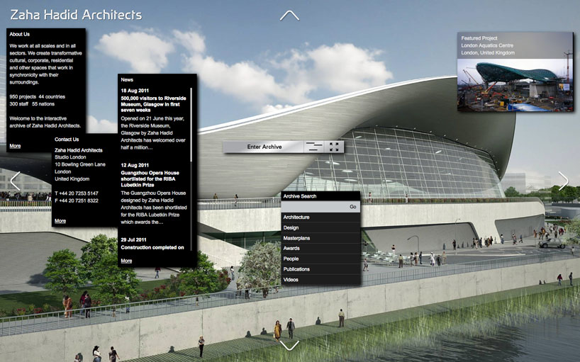
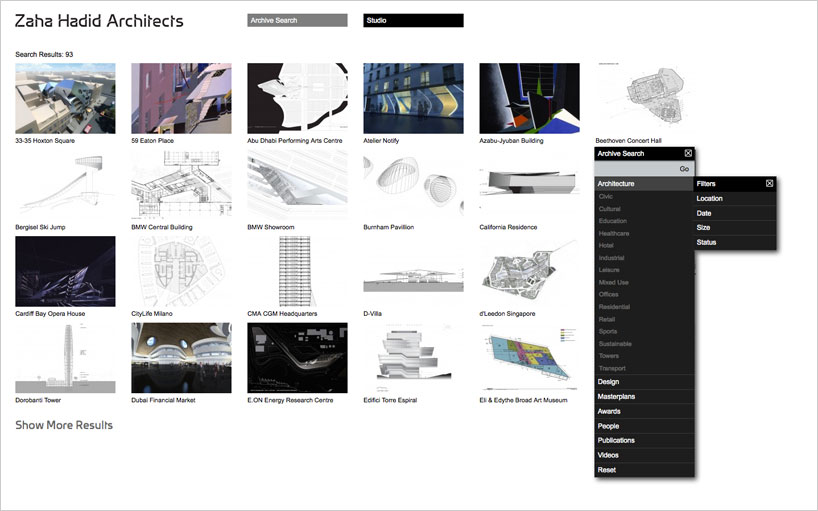
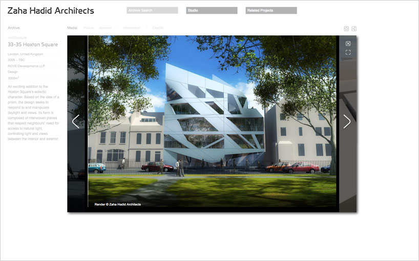
website the website acts as the ‘ultimate archive’ of everything ZHA has done – both built and conceptual – with a CSM system that allows the archive to grow indefinitely. greenspace has designed it to be a purely visual, never the same twice, mesmeric encounter with the ZHA world.
containing vast amounts of data, the site is an ‘inclusive’, user-friendly experience that pushes the boundaries of other more traditional architectural sites. it enables the
user to modify, personalise and dictate relevant content. built in HTML 5, avoiding the
constraints of flash for ease of loading to ipad for example, it captures and exposes
everything that is current and ZHA related, worldwide. and it’s been designed to
be practical, so both students and press can download images, information and
biographies about the work and people that make up the ZHA brand.
credits greenspace design team: paul blackburn lee deverill james taylor stephanie wilkinson adrian caddy miles newlyn (typeface)
zha project team: patrik schumacher lars teichmann bidisha sinha
photographic portraits: alex telfer
website production: scott david
ZAHA HADID (370)
 Feb 01, 2024
 Dec 13, 2023
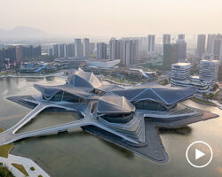 Dec 06, 2023
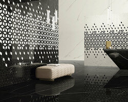 Nov 08, 2023
 Oct 24, 2023
PRODUCT LIBRARY
 Apr 15, 2024
 Apr 15, 2024
 Apr 12, 2024
 Apr 04, 2024