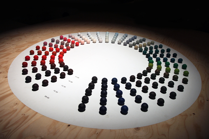
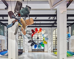
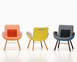
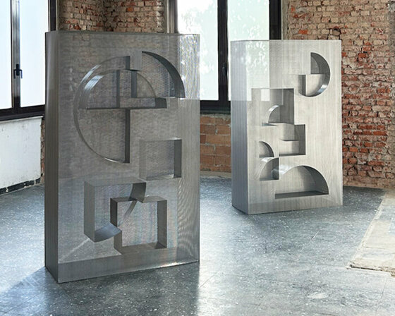
‘clay circle’ by hella jongerius image © designboom

the use and exploration of color is strongly embedded in the practice of dutch designer hella jongerius. her project ‘color in changing daylight’ is an installation / video which documents the optical change in a clay ball’s colored appearance, between the hours of 5:00am and 9:00pm on a day in late june 2011. produced and documented in berlin, the clay balls were made late march 2011, the temperatures of the basic colors each altered by mixing it with varying amounts of blue, yellow and red.

hella jongerius at dutch design week 2011 a look at the optical change in color of five clay balls during the hours of 5:00am to 9:00pm image © designboom

hella jongerius at dutch design week 2011 the temperatures of the basic colors are each altered by mixing it with varying amounts of blue, yellow and red image © designboom

hella jongerius at dutch design week 2011 detail image © designboom

hella jongerius at dutch design week 2011 pigments for ‘new options for industrial paint’ by hella jongerius image © designboom

another one of jongerius’ latest research developments is ‘new options for industrial paint’. the experiment utilized colors composed of diverse pigments, which were then illuminated with lamps emitting light based on specific times during the day. the designer selected five full-spectrum shades of green, once the colors were produced, the five ‘daylight’ lamps were used to individually illuminate five samples, each of the same color. because the colors are made-up of pigments, the application of the daylight had a changeable marked effect. the result was 25 variations of green, which jongerius elaborated into 25 shades of paint in association with manufacturer of fine paints, kt.color.

some samples conclusions made during the process included the following: green containing a lot of yellow or orange was marked as unstable, so as the day progresses the color assumes a different shade.  green with a lot of cobalt blue remains stable which is why the paint industry primarily works with this recipe. generally, industrial colors are stable and are only formulated by just a few tones (i.e. black is typically added to make colors darker and white used to make them lighter). by contrast, the shades developed by jongerius are layered and inconsistent.

hella jongerius at dutch design week 2011 daylight green pigments image © designboom

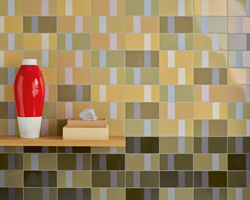
hella jongerius at dutch design week 2011 paint chip samples of the 25 different shades of green image © designboom
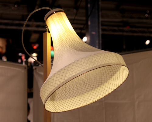
officially presented during dutch design week 2011 at the netherlands architecture institute (NAI) in rotterdam, these two projects by jongerius are on show as part of ‘daringdesign’. the exhibition presents the work of eight designers, four living in china and four living in the netherlands, the selected projects revealing a presentation of contrasts of those subsiding in these opposing worlds. the projects on show are these designers and architects’ responses to the contemporary developments of their countries.

on show from china: ai weiwei (architect/artist), urbanus (firm of architects), to meet you (graphic design agency) and ma ke (fashion designer). on show from the netherlands: rem koolhaas/oma (firm of architects), hella jongerius (product designer), alexander van slobbe (fashion designer), and irma boom (graphic designer).

‘daringdesign’ is on show until january 8th, 2012.