— the following is an example of a lesson from the upcoming graphic design course:
composition & layout
the idea of a ‘correct’ composition in keeping with the human need to understand everything we see, composition is an aspect of visual communication that we have sought to perfect for thousands of years. over the ages people have explored this through examining the natural world and began to realize that certain systems and sequences found in organic forms can be translated into man-made works to theoretically enhance their ‘beauty’.
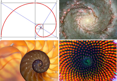
from the ancient egyptians and greeks through the italian renaissance, modernism… artists, designers and architects have applied what is known as the golden ratio to their works. the golden ratio is a visual representation of a number called phi (0.618 : 1) a proportion, in which a rectangle is divided into two unequal parts in such a way, that the ratio of the smaller to the greater part is the same as that of the greater part to the whole figure.
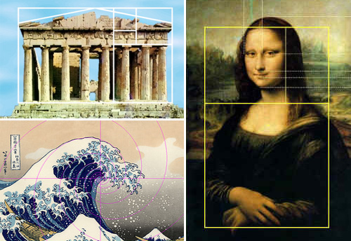
the reason why artists and designers find this ratio so interesting and potentially effective for their work is because it is found commonly throughout the universe from outer space to flower-heads. the thinking is that because we are constantly surrounded by this ratio, somehow humans are aware of these proportions subconsciously and therefore when applied to a design we perceive the distribution of space as ‘correct’.
— so what’s right and what’s wrong?
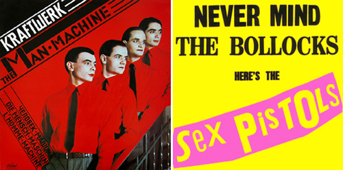 left: kraftwerk’s album artwork from their first album (1978) nods to constructivist artwork while the sex pistol’s – never mind the bollocks (1977), has more of a dadaist feel, it’s lack of order sums up the music much better than a more rigid approach might.
the notion of things being correct by them being orderly is something that carries a lot of weight. but there are as many ‘untidy’ works of art and design that carry just as much aesthetic value. to consider these theories in equal measure we can only conclude that a designer should apply the level of order necessary to answer the problem at hand. for instance, time and consideration must be spent on the design of album covers for both a electronic music as well as a punk rock music. the poster for electronic music will most likely seek to reference the repetition and ordered nature of the tracks – while punk music would seem ill-represented by such an approach given the chaotic nature of the music. layout and composition is like anything – down to practice and patience and seeing what works best for the brief.
practical advice the following points are intended not as rules but as a resource – tips that have worked for individuals and techniques that are used widely throughout the graphic design industry.
make some decisions before you start before you even start to work on your layout / composition it’s important that you decide what it is you want to say and which aspects of your design are going to say that clearest. list all the different core ingredients and assign them a position of importance from 1-10 for example. this order will inform the order and layout. design element 1 is going to be emphasized the most, followed by 2 then 3 etc. by deciding this early on you can generate layouts / compositions much faster than by realizing you’re off-brief half way through the job. make good compositions work for you don’t be afraid to ‘borrow’ compositions from elsewhere to begin with. this doesn’t mean copy them outright. it means look at a photograph. poster, book-cover or painting that is aesthetically pleasing and analyze what it is about the composition that makes it ‘work’. the more you practice the better you’ll get and within time successful compositions will come into you mind faster and faster.
sketch with your priorities in order you should start sketching some layouts (at actual size when possible). using a pen and paper – just thrash out as many layouts as you can in 30 minutes to an hour and start to work on the 5 or so you like best. sketching roughs will help you save time messing around in illustrator or whatever software your using early on. obviously you’re still going to tinker on-screen a lot at some stage but by sketching rough layouts at actual size you’ll know what works much quicker than composing the elements on screen at half size or over-sized.
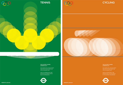 these olympic posters by alan clarke use a rather straightforward grid system and the alignment of the elements around the borders help maintain a sense of order which allows the viewer to know they are part of the same series.
alignment for a clean and crisp look all the elements of your design should align with another – using a grid will ensure this. parts of your design should only not align if they carry a particular importance or if disorder best represents the subject matter.
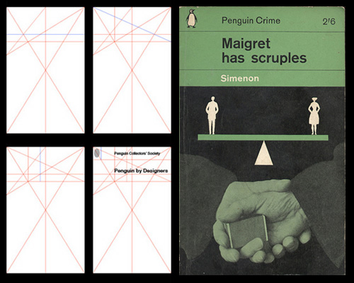 ministry of type explain penguin’s famous grid systemgrids the use of grids was popularized by the bauhaus and swiss design schools. this is a regulatory system which dictates the basic formal decisions in the design process. by dividing your space up into sections such as halves, thirds, quarters and so on you can separate the content effectively – perhaps using larger sections for more important elements of the design and smaller sections for those which have less relevance. you should also think about block colors and cropped images to fill space and divide areas.
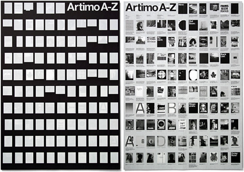 above: experimental jestset’s catalogue / leaflet for a book publisher shows the benefit of using a structured grid to organize a lot of content in an aethetically pleasing way.
when you are designing a grid it’s important to consider how it will distribute potential content. remember that it should offer some flexibility but at the same time should not be too complex (if a grid is offers too many variations coherence is lost). you’ll know a good grid system if it offers both consistency and flexibility in even measure. grids are a good idea if you are designing a leaflet or book that requires a uniform look across many pages.
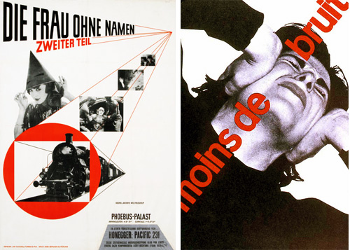
left: jan tschichold (1929) , right: joseph müller brockman (1955) it’s hard to imagine these posters having the same impact using horizontal or vertical text.
angles through angling text and images so that they are not just horizontal or vertical you can make your designs more dynamic.
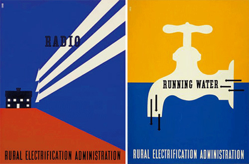
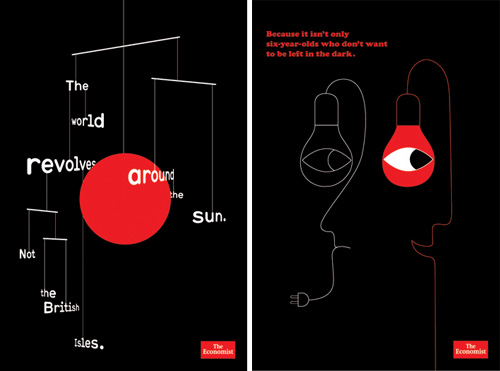 these posters for the economist magazine by non-format show how consistency can be achieved by color.
consistency don’t think that a grid is the only way to generate a uniform look to a design – typefaces, color and forms all can unify elements within a design. decide which parts of a series or pages will be constant and unchanged and stay with your decision.
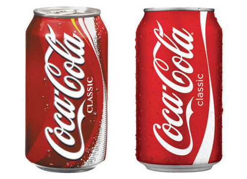 the coke rebrand of 2009 by turner duckworth won a number of awards for what was largely a removal of effects and patterns which did nothing for the brand’s packaging except make a lot of noise.
get rid of clutter its important to know if something is adding any value to your design on the whole or not. ornamental lines or additional text that don’t give any value to your design should be removed. this is not to say your design should be without such things (some times they can tie things together) but their value must be justified on the whole.
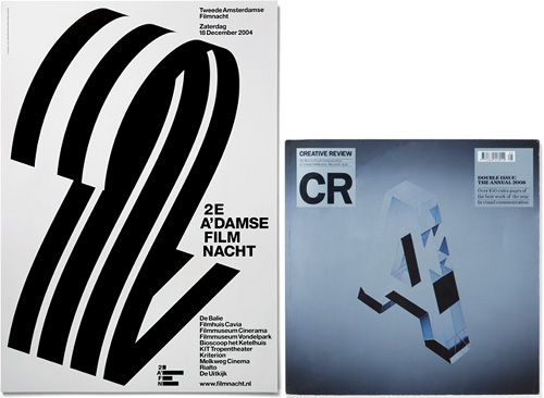
left: 2AFN poster by experimental jetset, the fact this is the second edition of the event is made clear through the lareg number 2. right: creative review’s annual – the large A suggests the title but has more initial impact than the entire word.size and proportion as we mentioned, the most important parts of your message must be communicated most prominently within the space but of course you can play on this rationale by enlarging certain elements which might not be the most important but have a strong visual impact – numbers, illustrations and images for example can be stronger than a headline or logo etc.
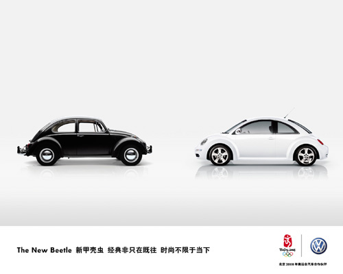 the VW ad above shows how effective large areas of white space can be in drawing a focus onto elements of the design, also note the use of contrasting black against white. white space the reason that objects within a layout seem important is because of what is around them. white space draws the viewers eye to parts of a composition and allows them to digest different elements individually rather than being bombarded with too much info at once. bear in mind though that too much empty space can give an ‘cheap’ feel to layouts if the focal points aren’t aesthetically pleasing.
contrast use opposites to clarify space – think of dark and light, organized and disorganized, fat and thin etc. juxtaposing radically different aesthetics can stimulate interest at a glance.
 these posters emphsize how related information can be grouped within a layout
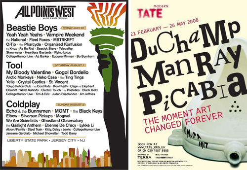
group related information usually if there are different facets to a design in terms of its content then grouping related elements is a good idea. this needn’t mean cramming them together but visually suggesting that they be taken-in as one piece of information. left: this poster for a music festival clearly shows that there are three days of music at a glance.
emphasis the way that we digest graphic design revolves around a sort of visual hierarchy we look at the things that are emphasized most first and consider them to have the most importance – we then search for supporting, secondary elements to verify if we have understood correctly. you must decide what is the most important thing you want to say and emphasize this using any of the techniques you feel fit. probably the oldest trick in the book when it comes to composition is placing something of importance at the center where there’s little chance it will be overlooked.
 american designer lester beall used arrows regularly in his work to give momentum to his compositions.
lines and arrows by using lines, symbols and other guiding devices you will help dictate the reading path of the viewer, this can help you take them from bottom to top or right to left and so on.print and re-think sometimes there are things you just don’t notice on-screen. print off your designs at various stages and analyze the composition up-close and from afar. draw on the prints, color them and so on to see if you can get something more out of them. show them to others – don’t be fooled into thinking you can go from start to finish with a layout without getting something wrong.
repeat, crop, off the page by repeating parts of the design the viewer is forced into thinking they may bear some importance. you can also enhance imagery and text by cutting them or cropping them in interesting / unexpected ways. also play with positing elements partly on the page or almost completely off it – again this arouses interest because it’s not considered ‘neat’.
exercise try and improve a previous design of your own using some of the tips in this lesson.
—

« BACK TO THE DESIGN-AEROBICS HOMEPAGE
DESIGN AEROBICS 2012 (22)
 Nov 11, 2011
 Nov 11, 2011
 Nov 11, 2011 Oct 31, 2011
PRODUCT LIBRARY
 Apr 17, 2024
 Apr 15, 2024
 Apr 15, 2024
 Apr 12, 2024