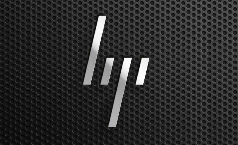
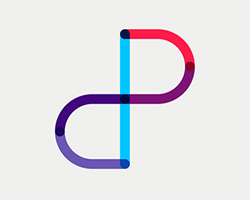
new HP logo designed by moving brands
moving brands have designed a new identity scheme for technology company HP (Hewlett Packard). the new logo sees the well established lower case ‘hp’ logo reduced to four forward slashes.
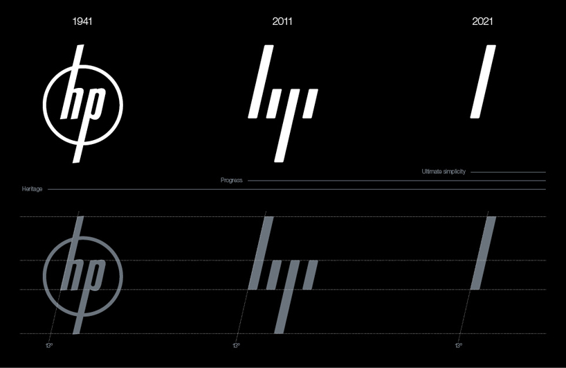 logo progression
following text from the moving brands website moving brands partnered with HP as their lead agency to set a creative vision for the HP brand. the vision was to transform the world’s biggest technology company into the world’s most powerful brand. HP would become the blueprint of a moving brand, built for a moving world. when we began working with HP, their offer was unparalleled, with the broadest portfolio of all their competitors. from services to servers, printing to networking, storage to mobility and far beyond, HP have lead the market in almost every category in which they operate.
however, HP had lost its forward leaning culture after over 50 acquisitions in the past five years. the once iconic brand was deemed dull and lifeless by consumers and business customers alike. the power of the portfolio could only be fully leveraged by aligning it under a single-minded story that could rally various businesses and over 300,000 employees world-wide behind a unified strategy and behaviours.
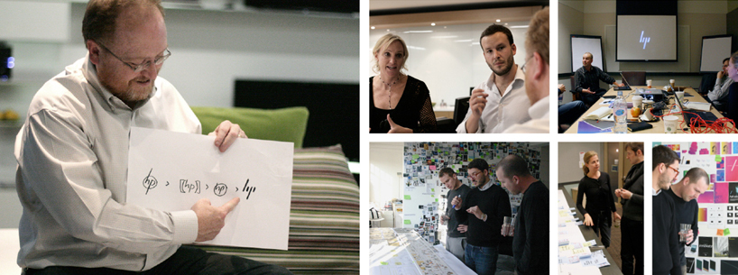 work in progress
greg johnson, HP’s global creative director of brand strategy and experience design, describes this time. ‘if you step back and think about when the transformation project began in 2008, so many of our people did not understand hp, and were falling into the same trap of our customers: thinking of ourselves as commodity, or just hardware, and not seeing HP as relevant.’
as with all powerful brands, HP needed a strong story at its heart. a story that would embrace the proud heritage of a silicon valley pioneer but lean forward to the future. HP was founded on the belief that technology will improve people’s lives, and HP should always aspire for better. this founding principle was unearthed through co-creation workshops with the key stakeholders across the business groups, the HP labs, product design and insight groups. it was articulated as ‘human progress’. the story was further supported by a set of character differentiators and behaviors unique to HP. this iconic brand ought to be digitally native, context-aware and ever evolving.
UPDATE (15/12/2011) via creative review
“There are no plans to implement the new logo. The design system created with Moving Brands was the only aspect of this work that was approved. The logo was a working draft that did not get adopted by HP.”
HP
— “We have removed the HP case study per the request of HP, in order to clarify the distinction between the aspects of the work that were setting a creative vision for the brand but were not implemented in the market, and the aspects which reflect the actual in-market applications of the Identity and Design System. The ‘Progress mark’ logo is not the go-forward direction for HP.”
Moving Brands
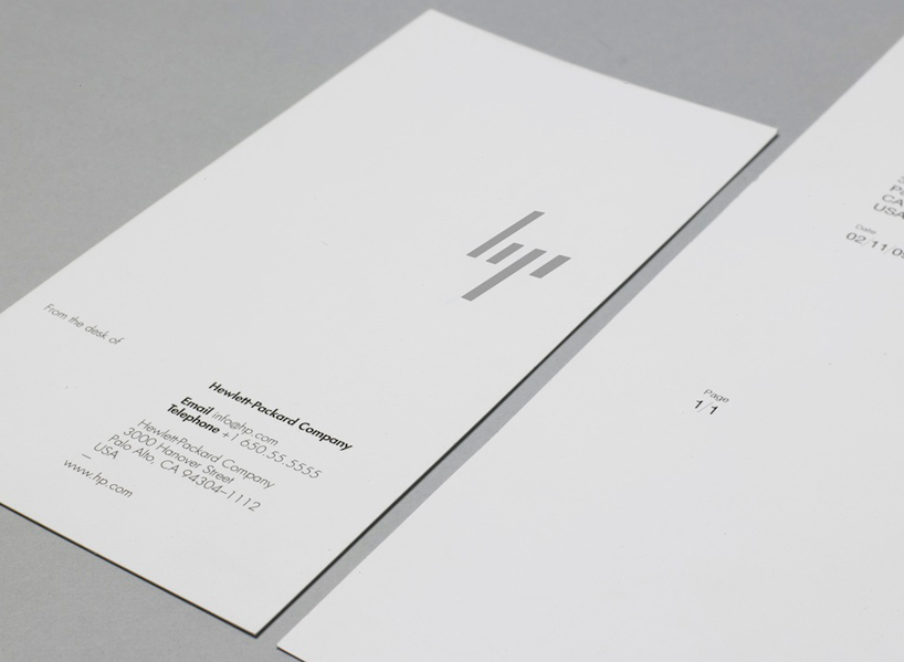 stationery
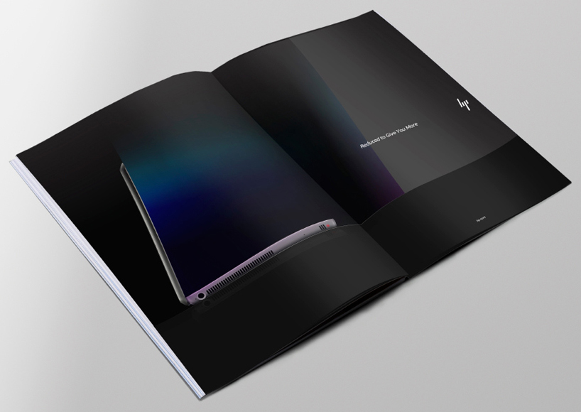 printed communications
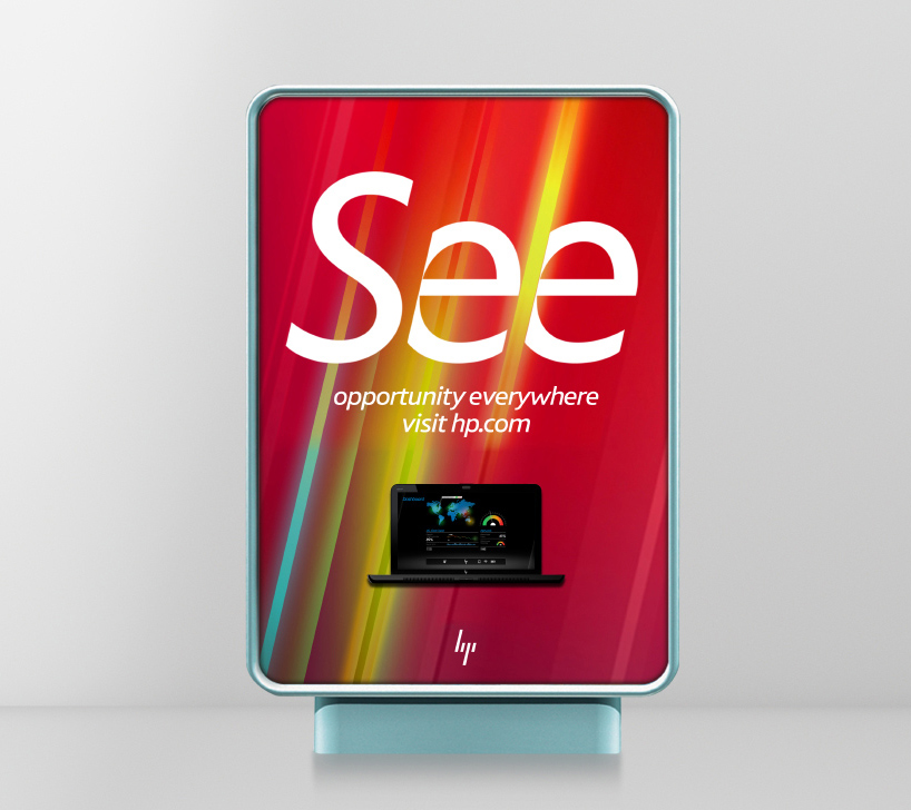 advertising visual language
 advertising visual language
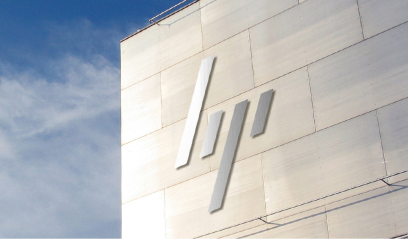
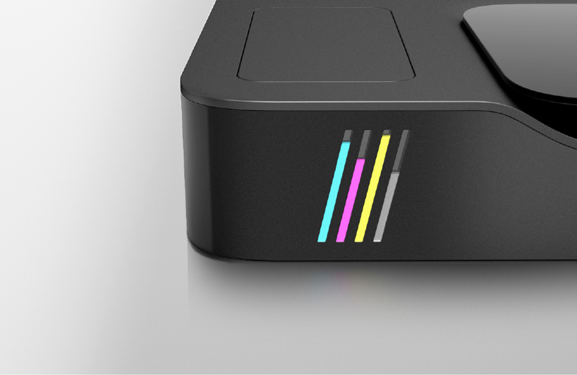
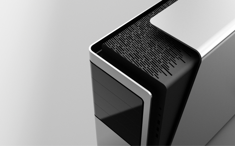 use on hardware…
LOGO DESIGN (244)
 Aug 14, 2023
 Aug 02, 2023
MOVING BRANDS (3)
 Jun 14, 2014
 Oct 21, 2013
PRODUCT LIBRARY
 Apr 17, 2024
 Apr 15, 2024
 Apr 15, 2024
 Apr 12, 2024