nooka 2011
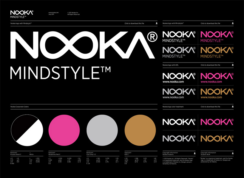
in 2011, futuristic timepiece company nooka undertook a rebranding campaign, reorganizing the company’s visual language to create a more universal visual communication through the melding of motifs found in contemporary fashion, design, and technology.
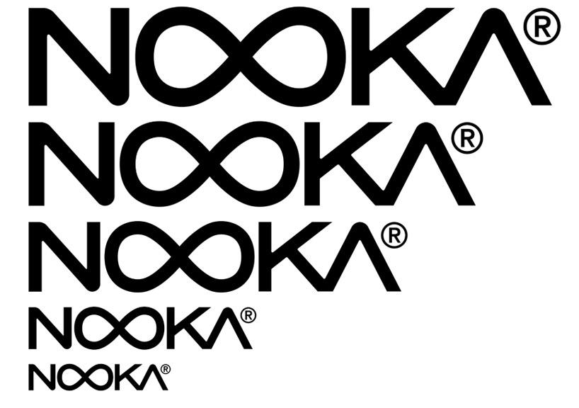
the logo, first drawn with the launch of nooka in 2004, has been restyled. in the newer representation, the size and boldness of font have been increased for both legibility purposes and to make the logotype more visually pleasing. the infinity sign forming the two ‘o’ of nooka remains untouched as the centerpoint to the brand’s logo while the ‘n’ and ‘a’ have been sharpened to juxtapose the rounded center of the logo.
 mylar bags
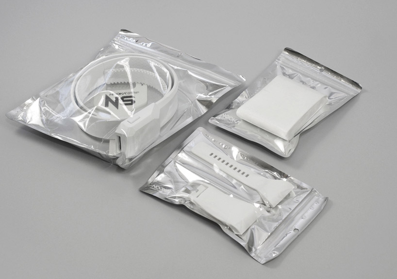
packaging for retail distribution has been greatly reduced. nooka products are now purchased in durable mylar bags available in three sizes. the company has also discontinued its use of acrylic stands for watch display, but rather sends corrugated cardboard pieces, shipped flat and folding to shape after arrival.
 corrugated cardboard display stands
 nooka logo and rebranding concept
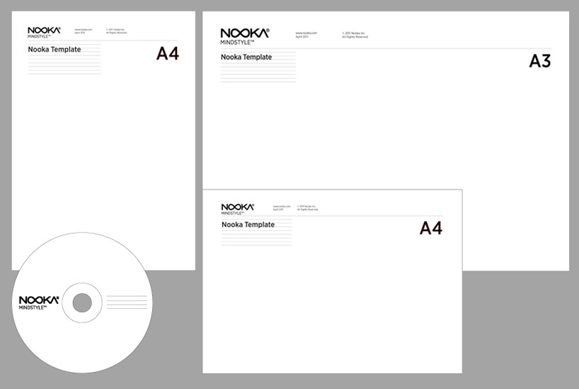
 internal and template stationary rendering
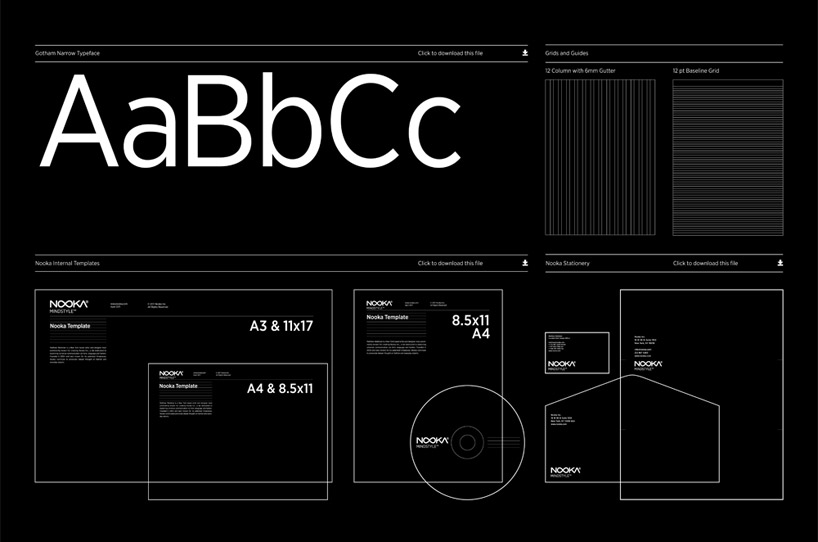
the internal documents of the company have been arranged in a grid-like system with the nooka design featured throughout. the organizational system was developed to ensure the efficiency of the company while adhering to the brand aesthetic.
 additional nooka internal correspondence template view
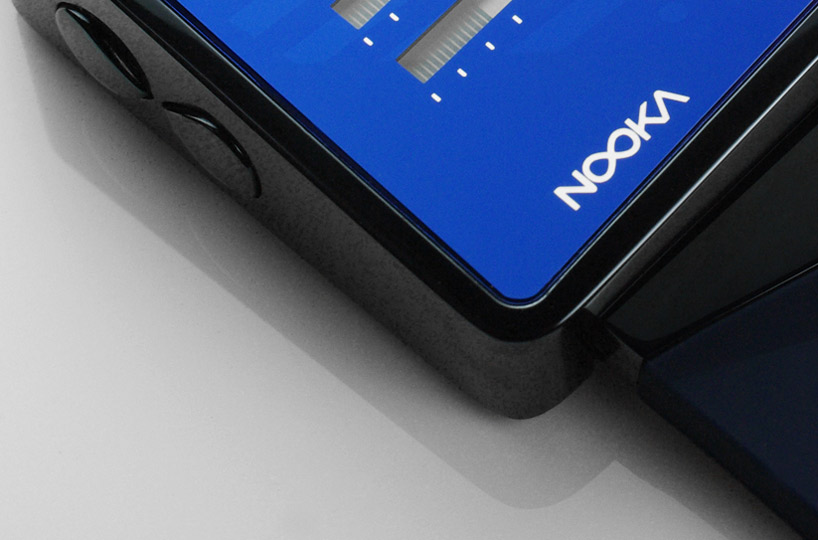 nooka logo detail on the zizm watch
—  design-aerobics 2012: SELF-PROMO course january 17 – march 17, 2012
this online design course will teach you how to present yourself in the creative world. we examine different approaches that ensure that you, your talent, and your work are brought to the attention of the people that matter to you.
for more information on design-aerobics courses and how to enroll click here.
PRODUCT LIBRARY
 Apr 15, 2024
 Apr 15, 2024
 Apr 12, 2024
 Apr 04, 2024