‘flare’ by scholten & baijings for schönbuch
dutch design duo scholten & baijings (stefan scholten and carole baijings) present two new furniture pieces, ‘shift’ for pastoe and ‘flare’ for schönbuch, on the occasion of imm cologne 2012, both of which continue to express the studio’s signature style and use of subtle color gradations.
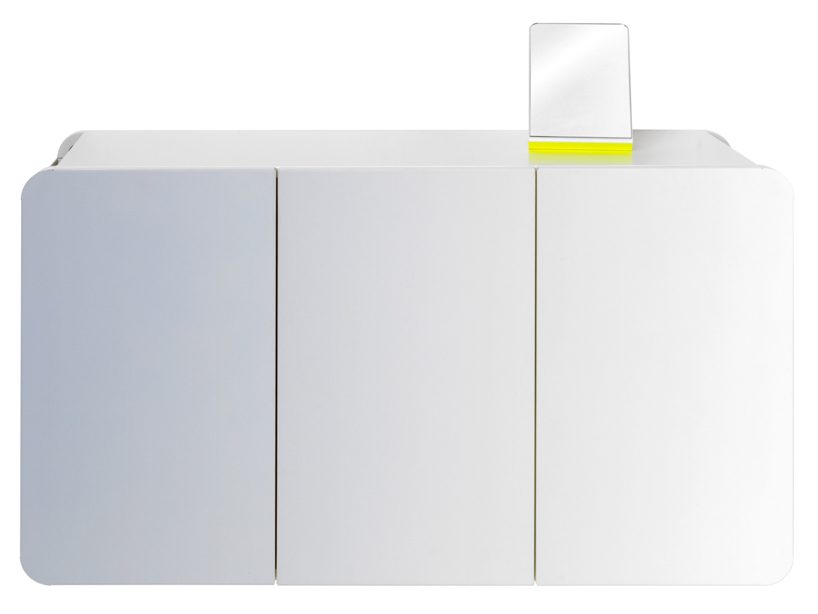
‘flare’ for german manufacturer schönbuch can be considered ‘optical art for the 21st century’. constructed from powder-coated sheet steel front and side panels in combination with aluminium frames, the cabinets have rounded-off open corners which allow them to be attached directly to the wall. ‘flare’ comes in three versions, cupboard, wall cupboards and sideboard, each featuring front panels that are finished with a dégradé print in either light grey, blue or rose pink, which gradually changes to pure white. the storage units’ programmes are accompanied by additional accessories including loose shelves, mirror, coat hooks and hanging rails that can be used in combination with some of the designs.
 ‘flare’ ‘side board’ and ‘cupboard’ for schönbuch
 ‘flare’ ‘wall-mounted cupboard’ and ‘cupboard’ for schönbuch
 ‘shift’ by scholten & baijings for pastoe
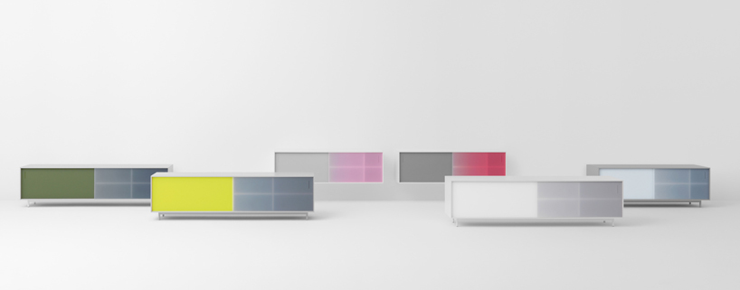
for dutch furniture company pastoe, scholten & baijings have designed ‘shift’, a sideboard cabinet which draws on the manufacturer’s use of grids, light fall and graphic surface divisions, combining a minimalist shape with an expressive use of color. two translucent sliding doors made from acrylate, the reverse of which has been colored; a choice between a gradient or solid finish is available. ‘when the doors move across each other, the colors mix, fade or are strengthened. this is where the piece derives its name ‘shift’ from,’ explains carole baijijngs.
 the six color variations of ‘shift’ for pastoe
through the development of the design, scholten & baijings worked towards staying true to pastoe’s design traditions: ‘this meant creating a clear design with an emphasis on surfaces and volumes. the body has been crafted from very thin materials and the handles have been recessed. this cabinet is easy to combine with others. after all, the company isn’t called ‘pas-toe’ (a dutch pun on ‘application’) for nothing. and if customers want, the cabinet can be a subtle explosion of color in their interiors. an interesting extra is that the cabinet is also available in a smaller size. people are living in smaller spaces, especially in the city,‘ states scholten.
 ‘shift’ sideboard for pastoe
for shift, the duo chose six color combinations, calling them ‘designers’ choice’. they have added six additional ones to the already existing amalgams: magenta, light magenta, fluorescent yellow and a shade of grey. ‘ ‘we supplied the pigments for these colors ourselves. one door displays a color gradient, the other a solid color. we decided to give one of the two doors the ‘dominant’ color and, as it has a layered progression, users can play with it. in the designers’ choice range, the bodies are available in white or grey only. of course, customers can also choose their own color combination from the range of pastoe colors,‘ explains baijings.
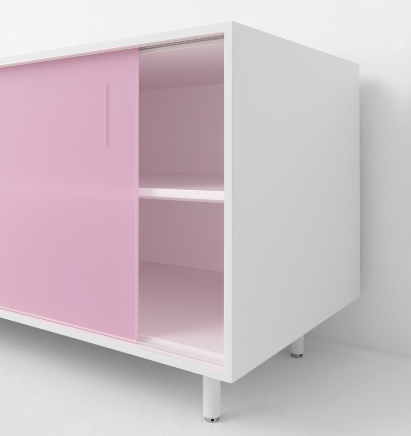 detail of ‘shift’ for pastoe
 carole baijings and stefan scholten photo by freudenthal/verhagen
IMM COLOGNE 2012 (5)


SCHOLTEN AND BAIJINGS (17)
 Jun 12, 2016
 Apr 15, 2016
 Jun 07, 2015
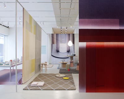 Oct 19, 2013
 Apr 12, 2013
PRODUCT LIBRARY
 Apr 17, 2024
 Apr 15, 2024
 Apr 15, 2024
 Apr 12, 2024