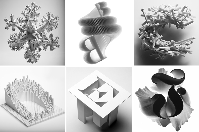
the ‘arkitypo’ project by johnson banks and ravensbourne creates a 3D ‘alphabet of alphabets’
the ‘arkitypo‘ project by london-based design studio johnson banks creates a physical ‘alphabet of alphabets’: a complete set of 3D printed letters, each showcasing the character and history of a particular typeface.
the project is a collaboration with ravensbourne, UK-based digital media university, developed as a means of testing and showcasing the school’s inhouse 3D prototyping technology.
for each of the letters ‘A’ through ‘Z’, the designers selected a typeface beginning with that character, which is used in the sculptural work. each piece furthermore encapsulates a bit of the history of the typeface: the ‘J’ adopts the form of a metro system map, because its fontface ‘johnston’ was originally designed for the london underground; the ‘C’ is composed of ‘courier’, used in 1950s typewriters, and thus is composed of an assemblage of typewriter keys.
‘arkitypo’ took over six months to complete. johnson banks first researched each letter, and then developed drawings, maquettes, and simple 3D renders before transferring the imagery and ideas to the team at ravensbourne. there, designers further developed the 3D models, collaborating virtually with johnson banks, before beginning the first test prints. some ideas worked immediately; others required refining in order to not fall apart. the most involved of the letters took as long as eight hours to print.
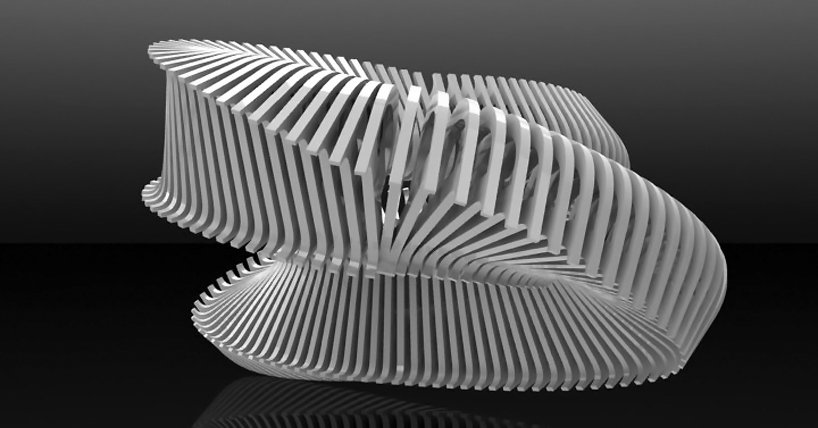
view the complete alphabet, as well as some of the in-process renders, below!
video sequencing the ‘arkitypo’ 3D alphabet, each rotating through full 3D view
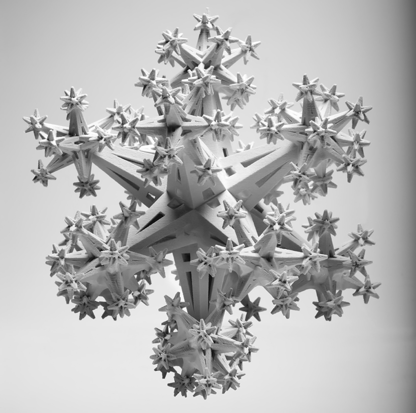
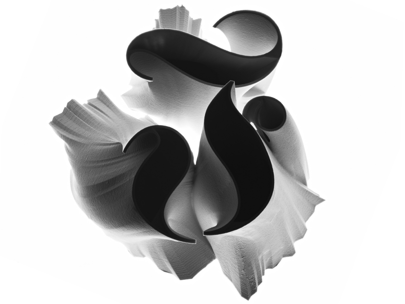
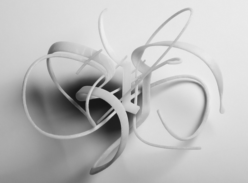
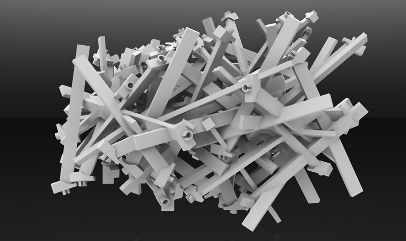
the ‘A’ is composed of the typeface ‘akzidenz grotesk’ (1896). among the first sans serif typefaces to be widely used, the design was part of a family of early san-serifs called ‘grotesques’.
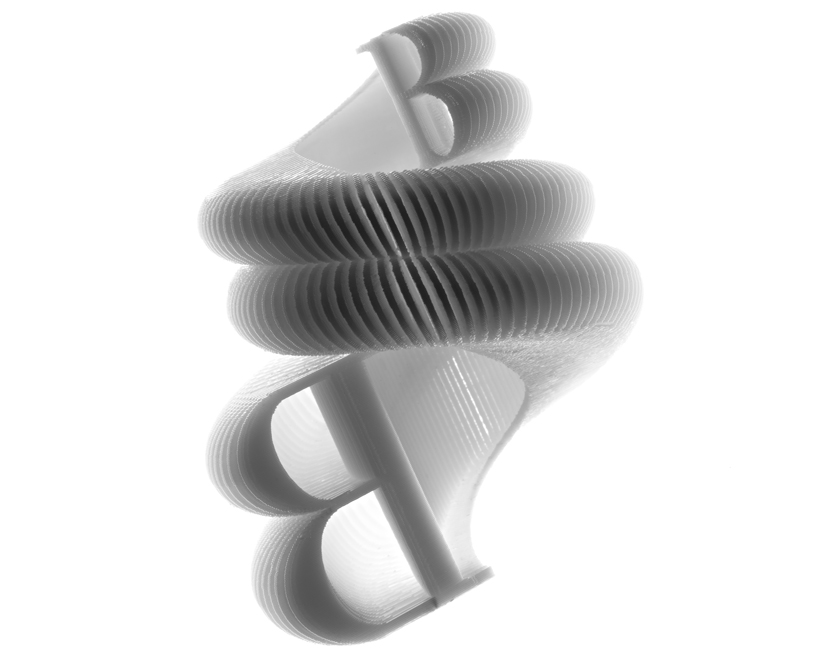
the ‘B’ is composed of the typeface ‘bodoni’ (1798), modeled after ‘baskerville’ but exaggerated in its weight, with heavier thick lines and thinner thin ones. the johnson banks sculpture highlights this history with a ‘bodoni’ ‘B’ that traces its origin to its ‘baskerville’ form.

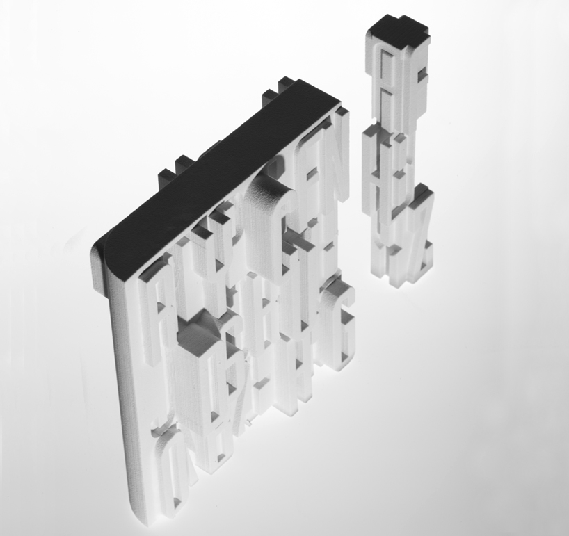
the ‘C’ is composed of the typeface ‘courier’ (1955), originally commissioned for 1950s IBM typewriters. johnson banks designed their model out of typewriter keys, referencing the old days of manual processing and jammed machinery.
the ‘D’ is composed of ‘DIN 1451’, the typeface selected in 1936 as the standard for german engineering and civil service projects.

the ‘E’ is composed of ‘engravers’ (1899), designed for metal engraving.
the ‘F’ is composed of the blackletter typeface ‘fraktur’, modeled after antique carolingian minuscule and other handwritten designs in order to provide a standard typeface for a series of books by holy roman emperor maximilian I. ‘fraktur’ became the predominant style for the following centuries until the 20th century, where it was ultimately banned by the nazis in 1941. here johnson banks’s design alludes to the typeface’s close association with bookmaking.
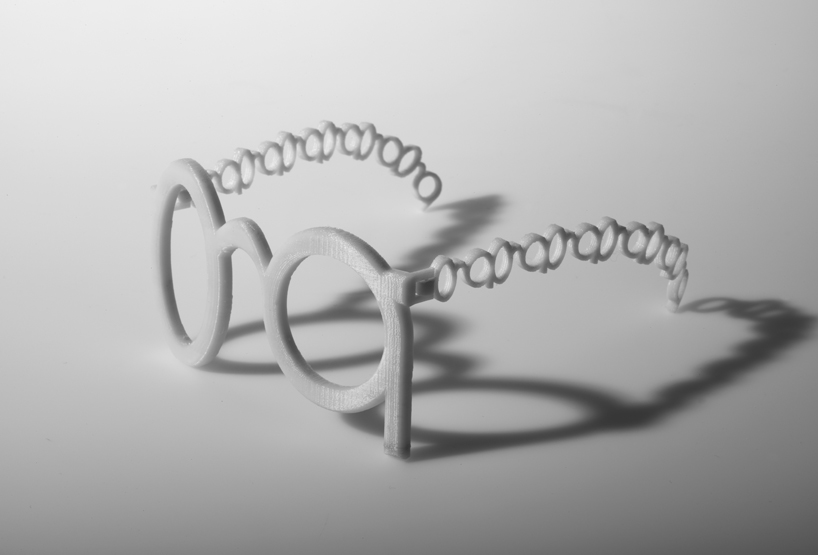
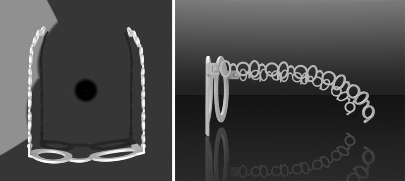
the ‘G’ is composed of ‘gill sans’ (1933). eric gill, designer of the the typeface, is quoted as saying, ‘a pair of spectacles is rather like a ‘g’; I will make a ‘g’ rather like a pair of spectacles;‘ thus providing the reference point for the johnson banks model.

the ‘H’ is composed of ‘helvetica’ (originally ‘neue haas grotesk’, 1957; renamed in 1960). latin for ‘switzerland’, the typeface became associated with both swiss design and modernist industry and graphic design in general. the johnson banks sculpture assembles together the logos of some of the many corporations that use helvetica for their brand.
the ‘I’ uses ‘industria’, originally designed by neville brody in 1984 for ‘the face’ magazine.
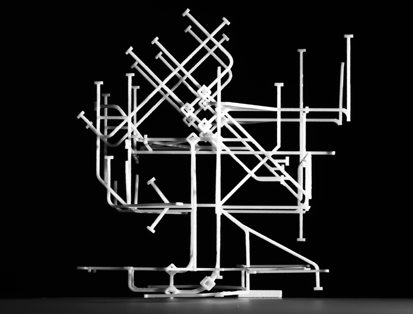
the ‘J’ is composed of ‘johnston’ (1916), created for the london underground transit system, referenced by the johnson banks model.
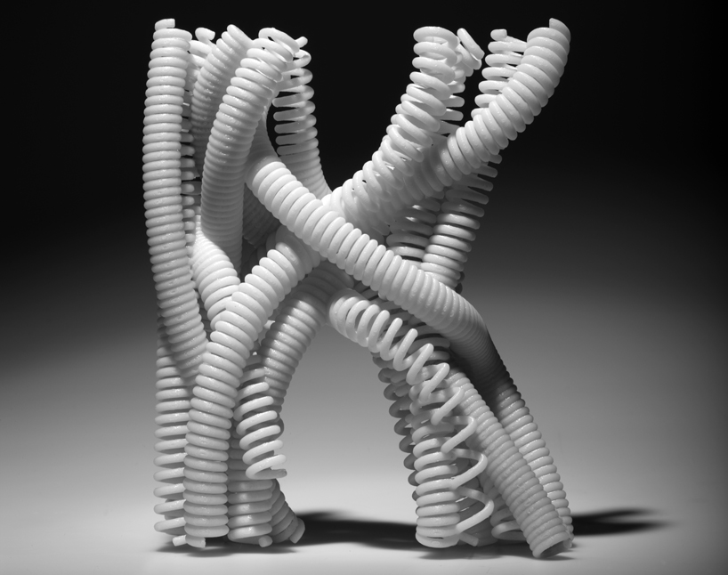
the ‘K’ is composed of ‘kabel’ (1927), named in honour of the then-newly completed transatlantic telephone cable, which is the form utilized by johnson banks for the sculpture.
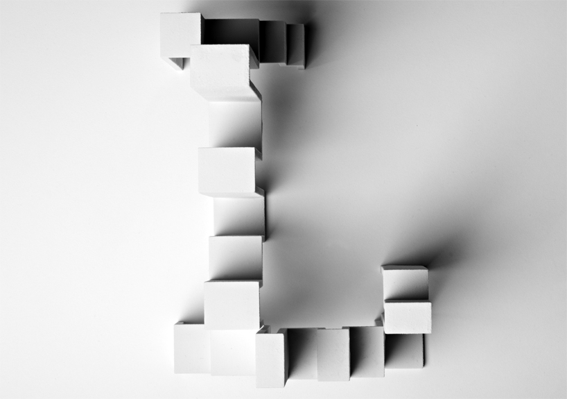
the ‘L’ is composed of ‘lubalin graph’. the typeface was among the first slab-serif alphabets for the phototypesetting industry.

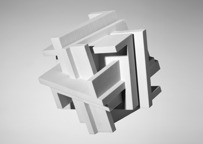
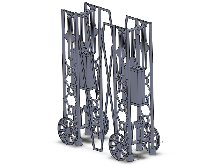
the ‘M’ is based upon the ‘machine’ ITC typeface, often associated with industry, and thus already the influence behind the mechanical cogs used here to compose the letter.
the ‘N’ is created from the ‘new alphabet’ typeface (1967), a minimalist experimental font based on clean lines and precise angles.
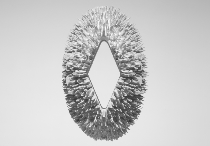
the ‘O’ is composed of ‘OCR-A’, whose strange characters filled the need for a font recognizable by both humans and the simple optical character recognition systems of early computers.
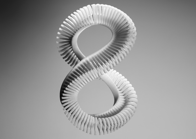
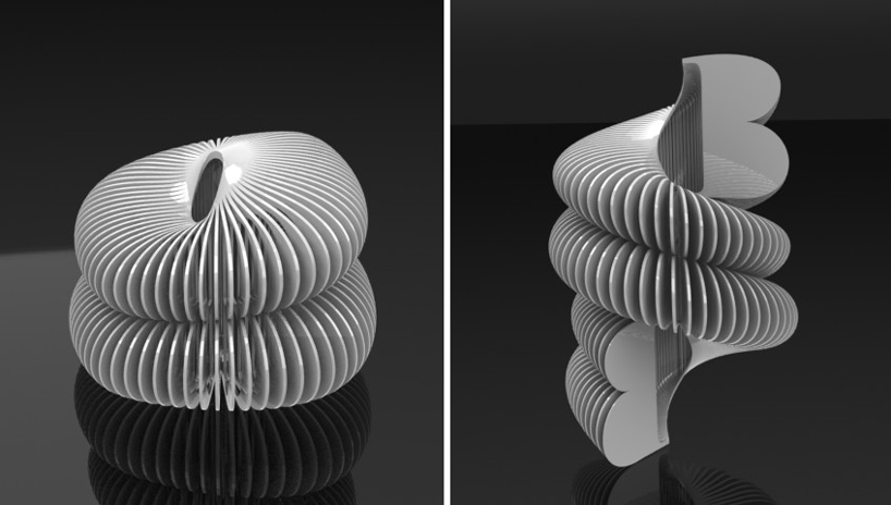
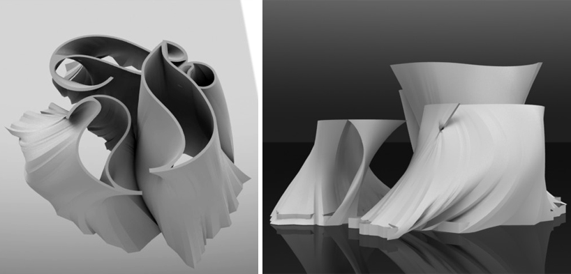
the ‘P’ is an assemblage of letters in the typeface ‘perpetua’ (1929). ‘here‘, the designers of johnson banks explain, ‘it is set to perpetuate in an endless möbius strip of uppercase letters.‘

the ‘Q’ is composed of the typeface ‘quadrate’ (2002), which appears even in 2D to have a 3-dimensional element. as a result, johnson banks sought to produce what the real 3D letter ‘could have been’.

the ‘R’ utilizes ‘retina’ (2002), commissioned by the wall street journal for use in printing stock tables at very small sizes. about their model johnson banks explains: ‘at large sizes [‘retina’] seems to feature crude ‘notches’ cut into the letterforms but these are there to compensate for the way blobs of ink blur type at tiny sizes.’

the ‘S’ is composed of ‘serifa’ (1966), a serifed adaptation of ‘univers’. in reference of this history, here the letterform appears to launch from a ‘U’ sculpture in ‘univers’.
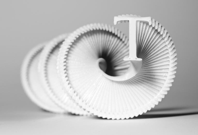
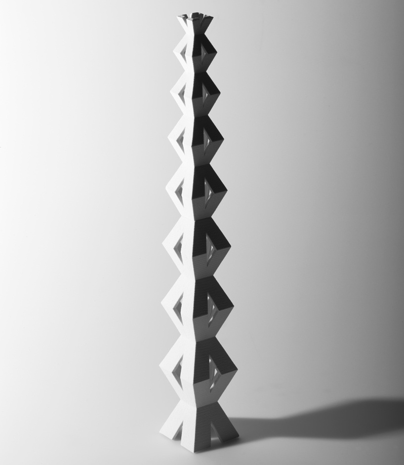
the ‘T’ is composed of ‘trajan’ (1989), a contemporary adaptation of the roman capitals engraved on trajan’s column in rome. the historical monument itself can be climbed via an internal spiral staircase, to which the johnson banks ‘T’ sculpture makes reference.
the ‘U’ is stylized in ‘univers’ (1957), now one of the world’s most ubiquitous typefaces.
the ‘V’ is composed of ‘verdana’ (1996), designed for screen printing and bundled with early windows software.
the ‘W’ utilizes the typeface ‘wilhelm klingspor gotisch’, a blackletter design that draws from the curves of calligraphy, referenced in the johnson banks piece.
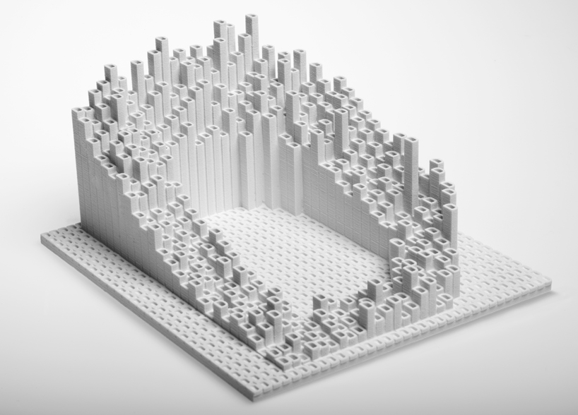
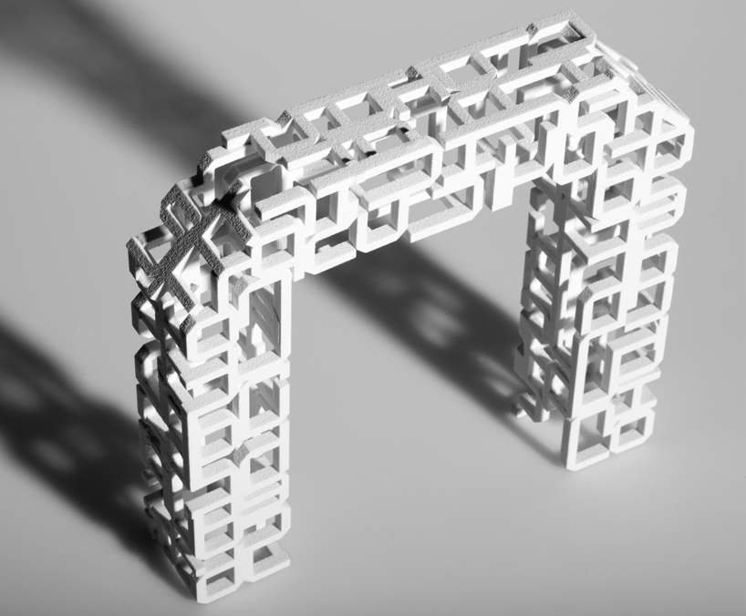
the ‘X’ is composed of ‘xheighter’ (1999), a tall, condensed sans-serif whose form becomes emphasized in the skyscraper-like sculpture here.

the ‘Y’ features the typeface ‘DFP yuan’. in addition to serving as the name for the country’s currency, ‘yuan’ in chinese literally means ‘a round object’ or ’round coin’. here, intersecting ‘¥’ symbols ‘create an endless circle of chinese money.‘
the ‘Z’ is composed of the ‘zig zag’ art deco-style typeface, here interlocked into a zig-zagging puzzlelike form.
project info:
design: johnson banks client: ravensbourne 3D imaging and prototyping: jon fidler photography: andy morgan project client: jill hogan project advisor: ben caspersz
 ‘A’: base structure of the fractal form
 ‘B’: the original 3D object; the ‘B’ form being extruded
 ‘C’: closer side view
 ‘F’: top view of the base structure; side view
 ‘G’: top and side views
 ‘M’: base model view
 ‘P’: closer side view
PRODUCT LIBRARY
 Apr 17, 2024
 Apr 15, 2024
 Apr 15, 2024
 Apr 12, 2024