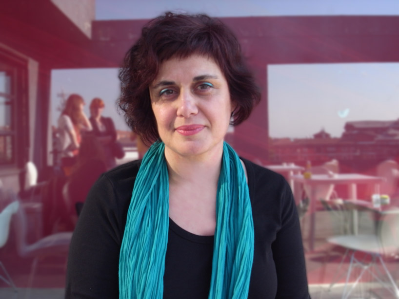
huda smitshuijzen abi farès, 2012 portrait © designboom
designboom has had the opportunity to speak to author, graphic designer, researcher and typographer huda smitshuijzen abifarès about her work as the founder and director of the khatt foundation: center for arabic typography before her speech for the design talks 2012 series hosted by scuola politecnica di design in milan, italy. in her lecture ‘arabic typography for an open and contemporary public space’, the designer spoke about the foundation and the role of arabic writing and typography in the creation of accessible public spaces.
‘huda smitshuijzen abifarès interview’ by designboom video © designboom
beirut-born, american-educated, and amsterdam-based, smitshuijzen abifarès first realized the necessity for further research in the field of arabic typography when she worked as an assistant professor of the architecture and design department at the american university in beirut, lebanon, finding that the literature necessary to teach her students about arabic calligraphy, typography and script in the context of modern graphic design did not yet exist. at this point, the designer wrote the book ‘arabic typography’ (2001), examining the complexity of arabic typeface on a structured and theoretical level.
 a mural in UAE by el seed image © the artist
 nuqat font is applied to poetic public furniture (folly) design by rené knip, khajag apelian and jeroen van erp image courtesy khatt foundation
just a few years later, in 2006, smitshuijzen abifarès developed the khatt foundation in order to create a tangible design collaboration between arabic and
western designers for the advancement of field of typography. ‘khatt’ is the arabic word for writing, calligraphy, script and line– she felt this name was
fitting for the organization, as the idea of a ‘line’ can take various shapes, from the swirling form of arabic to the straightened letters of latin. smitshuijzen abifarès aspired to create a community in which the tradition of arabic calligraphic methods could be reexamined in the context of the inflexibility of latin characters, by participants from all over the world. in this open forum, both alphabet systems are assessed by the community for their pure form. design projects have the opportunity to originate in the east and end in the west, contrary to past developments in typographic design relationships between the middle east and western world.
 an image from khatt foundation’s installation at future of tradition ‘tradition of future’ exhibition in munich image courtesy khatt foundation
 fonts from typographic matchmaking in the city were used in saadiyat island cultural district master plans surrounding zaha hadid’s proposal for the performing arts center image courtesy khatt foundation
after the khatt foundation took root, smitshuijzen abifarès wanted to create an in-person project to actualize typographic forms from scratch, which could be
employed in either latin or arabic character sets. the ‘typographic matchmaking in the city’ project brought together five teams of dutch and arab designers
to collaborate in the creation of matching arabic and latin fonts for architecture and public space. through this cross-cultural collaboration between middle eastern
and northern european designers, the teams were able to develop projects that could then be implemented in real-world projects.
 examples of arabic and latin typefaces image courtesy khatt foundation
1,491 people have built profiles for the social network aspect of khtt.net. participants are designers from all over the world, meeting online in order to reflect upon themes of typography, and building their own projects with the assistance of ideas and suggestions from other members.
 an example of one of the projects of storyline® (work in progress) from the typographic matchmaking in the city 2.0 project image courtesy khatt foundation
 the block arabic typeface grows from the flat surface, reaching various heights image courtesy khatt foundation
 an example of the dots font in use developed in the typographic matchmaking in the city project image courtesy khatt foundation
want to know more? designboom presents more work of huda smitshuijzen abifarè in our online course ‘graphic design’. — DESIGN-AEROBICS – GRAPHIC DESIGN 2012 ONLINE COURSE – STARTS MAY 17
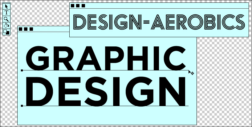
GRAPHIC DESIGN 2012
duration may 17 – july 17, 2012
make graphic design work for you. with this course you’ll enhance your understanding of the basics and learn more about current and emerging developments within the field.
• brush up on the basics of graphic design such as composition, color, typography and representation • further your knowledge of print and on-screen applications • gain practical knowledge that you can apply to real-world problems • have the opportunity to enhance your portfolio by developing several design projects related to the theme • our instructors will help you verify your ideas so you can optimize them as much as possible during the course • you also have the opportunity to share your work with other participants on the course
TYPOGRAPHY DESIGN (133)
 Sep 13, 2023
 Feb 23, 2023
 Jan 24, 2023
 Jan 19, 2023
PRODUCT LIBRARY
 Apr 17, 2024
 Apr 15, 2024
 Apr 15, 2024
 Apr 12, 2024