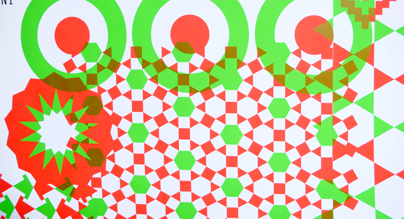
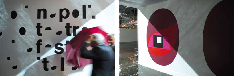
detail of ‘fratelli in italia’ poster by leonardo sonnoli 
italian graphic designer leonardo sonnoli talks to designboom about his typography and poster designs.
DB: could you tell us briefly about your background? LS: I received my masters degree in graphic design from the isia of urbino, italy. in 2005 I became a partner of tassinari / vetta studio where I started as intern. there are 4 people working at the main office in trieste and myself and one other person working from a small office in rimini.
whats a typical day at your studio? me and my collaborator irene start at 9AM. around 11AM we take a break to drink an espresso (on the rocks in the summer) at a local cafe. at 1PM we have lunch for about half-an-hour and it’s normally 9pm when we stop working.
how would you describe your design process? finding the answer to a question, often this answer references works of the past… it’s connected to the history of graphic design and inspired by the modern and contemporary art. in a special way there is a link to futurism, conceptual art and the dada movement.
many of your works involve experimental / non conventional typography, how important for you is legibility over creating something that’s visually intriguing? it all depends on the medium and the context. I’m interested in crossing the borders of readability if the letters take on extra or different meanings.
are any of your typeface designs commercially available? no, because I only really design display fonts that are used once, to translate specific content. it doesn’t make much sense for other people to use them for something else.
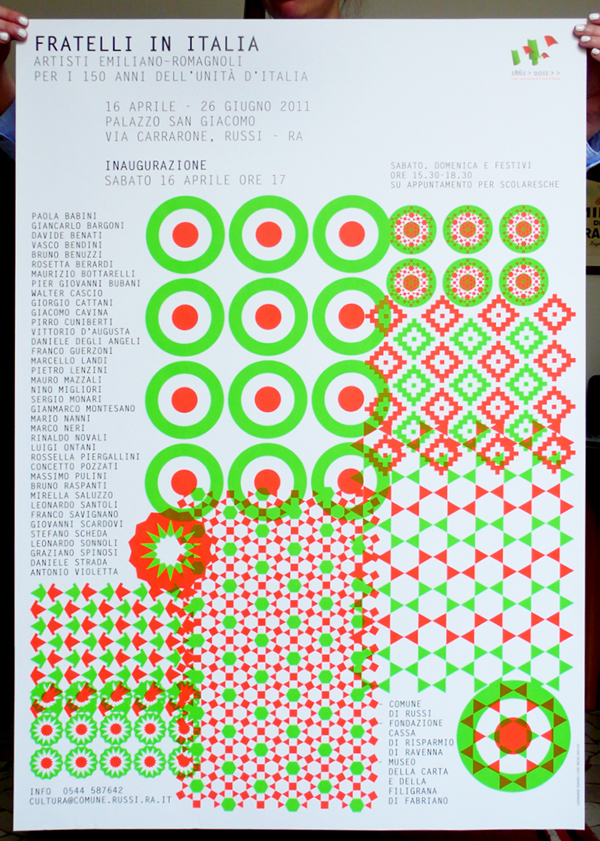 ‘fratelli in italia’ poster
 riviera di rimini identity
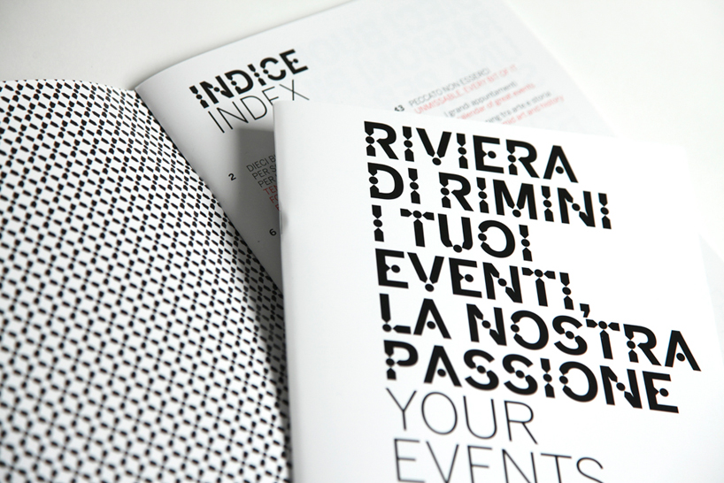 riviera di rimini identity
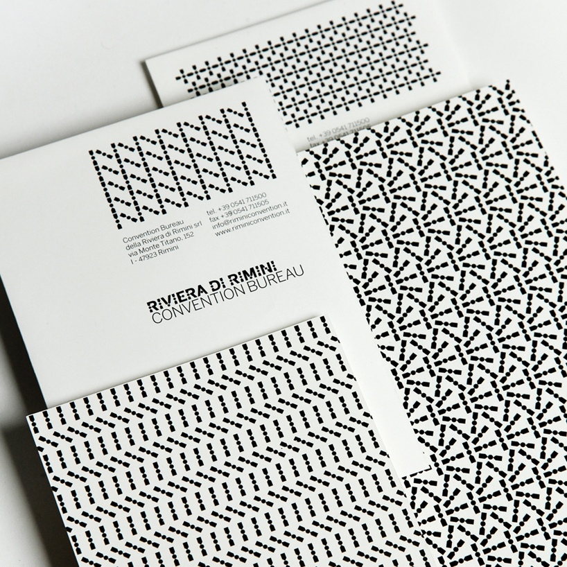 riviera di rimini identity
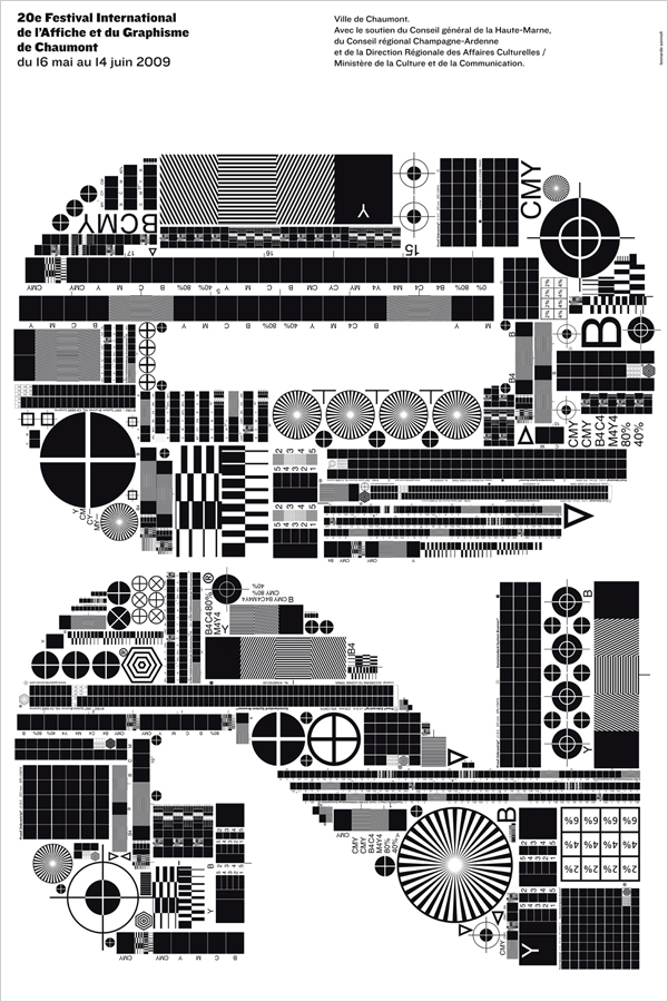 ’20th chaumont festival of graphic design posters’ poster
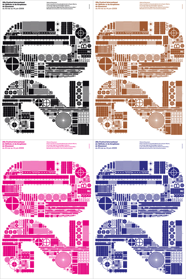 variations of the ’20th chaumont festival of graphic design posters’ poster
 editorial image for an article on biotechnology in the new york times T magazine
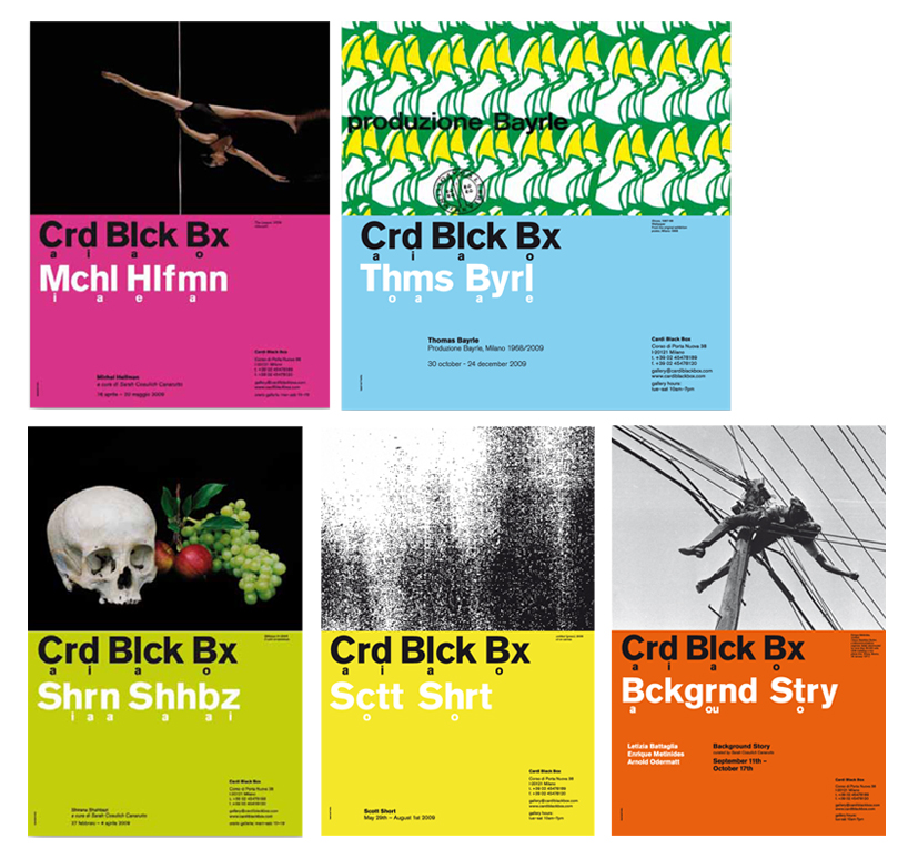
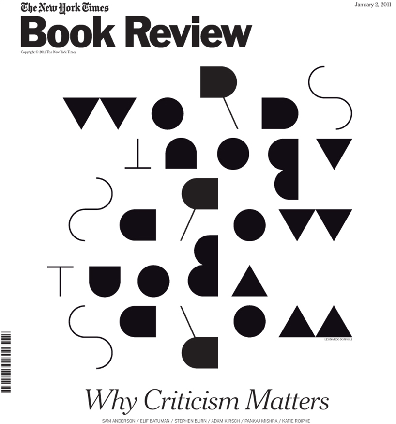 book review cover for the new york times
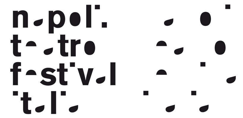
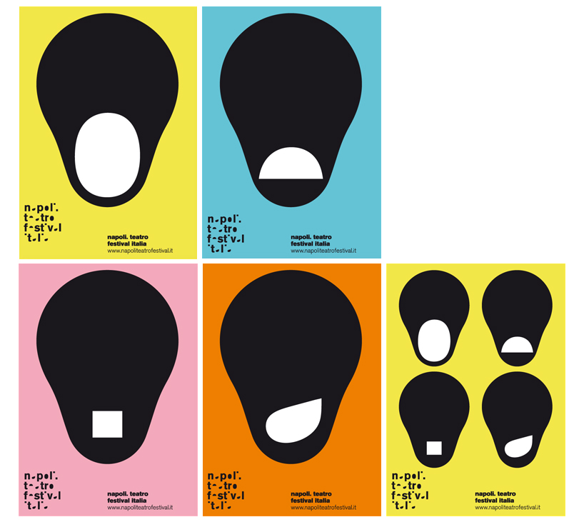
identity for the napoli theater festival
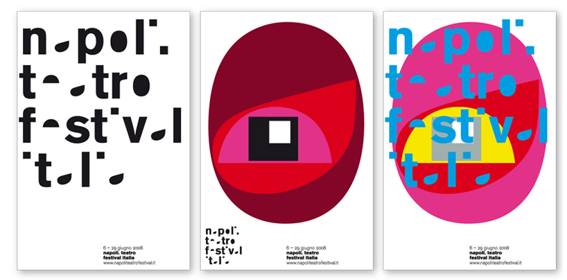
posters for the napoli theater festival (2008)
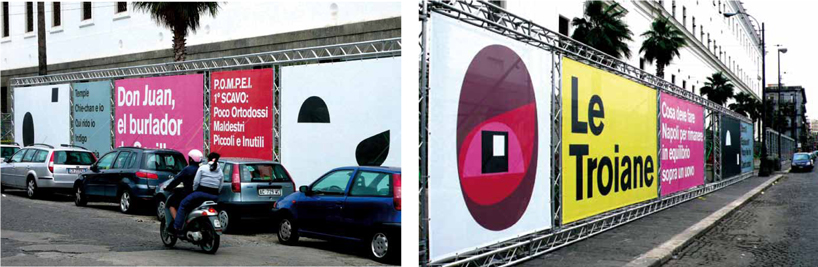
posters for the napoli theater festival (2009)
 posters for the napoli theater festival (2009)
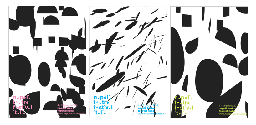 posters for the napoli theater festival (2010)
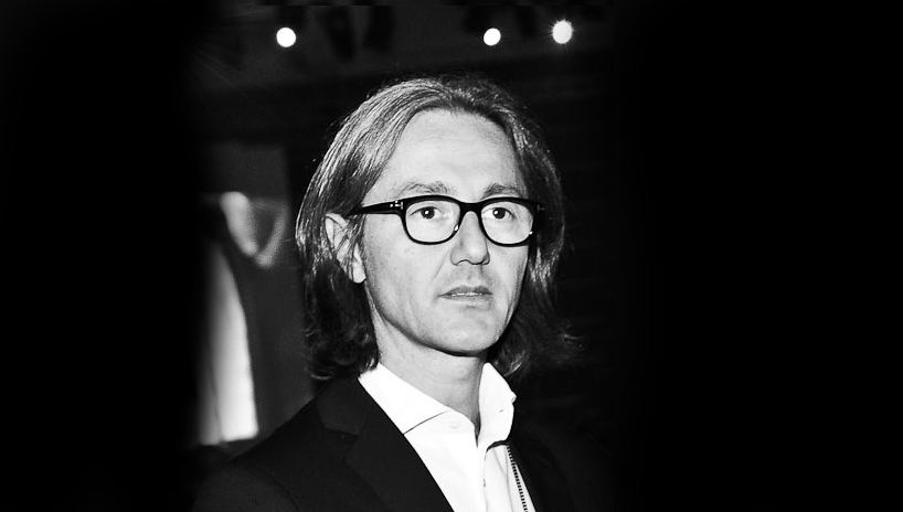 leonardo sonnoli
you have designed many posters – how do you see the future of this medium? it’s still alive and in good health. recently I started developing some digital, animated versions of my posters.
how do you approach a poster project? first it’s important to understand the main theme and think of a strong sign / image to communicate it. it should have impact, so that it’s possible to understand the message from far away. after that I concentrate on the secondary info that can only be read from close up.
besides design what do you have a passion for? my sons, books, art, sleeping and teaching.
what piece of advice should every designer remember? don’t listen to any piece of advice.
what piece of advice should every designer ignore? don’t listen to any piece of advice.
GRAPHIC STUDIO INTERVIEWS (193)
 Nov 21, 2022
 Feb 10, 2019
 Jun 21, 2018
 May 17, 2018
 Oct 04, 2017
LOGO DESIGN (244)
 Aug 14, 2023
 Aug 02, 2023
PRODUCT LIBRARY
 Apr 17, 2024
 Apr 15, 2024
 Apr 15, 2024
 Apr 12, 2024