various pictograms by stefan dziallas 
designboom talks to stefan dziallas of iconwerk about his pictogram and icon design.
DB: please could you tell us briefly about your background and how you came to have your studio in it’s current format. SD: I was born in bremen, germany. I studied graphic design at the university of the arts bremen. my professor was eckhard jung, a student of otl aicher at the HFG ULM. this led me to classic pictogram design and after graduating I started iconwerk.

whats a typical day at your studio? I work everywhere, so I also work any time. no office hours for good ideas! I work where it’s nice and enjoyable… my setup consists of: a macbook pro with SSD, a mighty mouse, an ipad, an iphone, android and a windows phone. I use OSX10.7, windows 8, adobe illustrator 15.1, photoshop 12.1, glyphs app, goldfish 3, and hype 1.5. I digitized all my books and collected print material since 2007 into searchable PDFs. this made them not only available on the go but approx. 600 pounds lighter!
this concept might work so well because I’m driven and challenged by the inquiries that arrive by email or phone almost every day. every time a visual communication problem has been explained to me, I love to find a solution and get into the ping-pong game with the client’s design team. I also enjoy to work on different projects at the same time. this leads to better solutions because the excitement of a successful step in one project jumps over to the other project that might just be stuck.

please could you tell us a bit about how you design your icons? my design process starts with digital scribbles directly in illustrator. I don’t scribble with a pen on paper because it is impossible to build a precise form that resembles the vague character of a hand-drawn scribble. my digital scribbles in illustrator almost match the final designs. line strength(s), corner radius, dimension and the grid define the creative space in which the final result can be executed. it’s like a game of chess: you have the board with 64 fields and the fixed rules but you will be able to play an unlimited number of exciting games!
the level of abstraction is based on the otl aicher’s definition of icon design: ‘an icon is not an illustration. it is the most simple form that still communicates the information’.
I extended it with ‘… and looks great!’.which refers to the iconwerk approach to match the character of the corporate design, corporate type or environment used in. when the icon connects with it’s surrounding, it’s perfect.
or as jonathan ive puts it: ‘design that doesn’t wag it’s tail in the viewer’s face.’
that doesn’t mean that icons need to be boring. a surprising metaphor, a little unexpected detail and a fine tuned shape make icons very enjoyable. this extra effort also increases the value of the product. sometimes you don’t see it first, but feel it.
 pictograms for keller maurer
which things are the most difficult to translate into icon form? everything can be translated into an icon. things, ideas, functions, words, even feelings (think of emoticons). I love to find symbols or combinations of symbols for difficult metaphors, a triangle for ‘play’ is not very challenging. even though the quest for the style that matches the corporate design and the fine tuning of the optical weight and detail offer pleasant hours in front of the computer. often better than TV.
a good tip for beginners is to learn realistic drawing. if you can’t draw a human figure realistically, you can’t build it in an abstract form. do it like a musician: learn to play all styles on the graphical piano. from norwegian free jazz to slovenian buffalo butcher polka. this will help to become a virtuoso and the virtuoso is able to find the correct tone in every concerto.
when designing a family of icons how do you make sure there is consistency between each icon? that’s simple. use a limited set of graphical elements as building blocks for one project. don’t mix lego with meccano. or if you do, match the colors ;-). don’t use super glue. the elements of a system need to be interchangeable and standardized. you can compare an icon system with a typeface. all icons have a different shape but they share the construction principle.
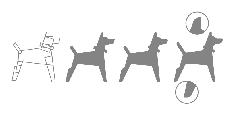
evolution of a dog pictogram
icons, pictograms and infographics are enjoying a new wave of popularity both for on-screen and off-screen applications – why do you think this is? the user interface of modern operating systems like windows 8 have a reduced set of design elements: picture, icon and text. in opposite to the opulent user interfaces of the late 90s like OSX, the modern interfaces are very similar to wayfinding systems.
the content is so rich that the navigation needs to be very sleek and reduced to function. microsoft’s designer joe belfiore describes this technique as ‘true to digital’. additional design elements like realistic surfaces, layers or artificial shadows have been removed from the user interface because they don’t belong to the group of information elements.
this trend also reaches into the territory of print and film. this doesn’t mean that icons need to look boring, think of a typeface. a well-designed typeface is bulletproof in all imaginable situations. so is a well-designed icon system.
which project have you learned the most from? I would say that I didn’t learn from projects but from people. expertise is a good collection of ‘better solutions’. when I join a project, I join a team. the background of each single member has a huge influence on the project. everyone brings ‘better solution’ tricks to the (virtual) table and the more tricks come into the game, the more magical the result will be.which icons are you most proud of and why?
I think, the most complex icon systems that required deep thinking and a lot of elbow grease are my favorites. I made them for cisco, plantronics, google, logitech, ssrs, viewbook and repsol. I work on an universal icon system for iconwerk. think of it as a humanistic version of the geometric icon systems out there. I hope that I will be proud of that one.
 iconwerkTV, episode01
 infographic for bloomberg
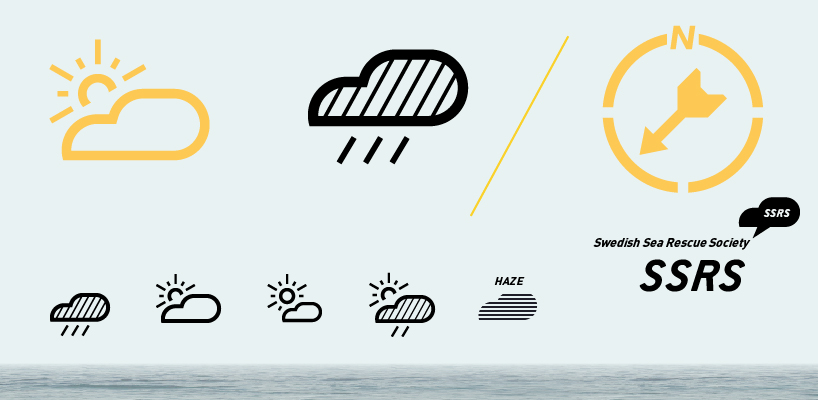 pictogram system for swedish sea rescue

which artists or designers would you say have influenced your work the most? otl aicher, reknown for his pictogram system of the 1972 olympic games in munich. his pictograms mark a milestone: the first geometric designs, based on a grid system. dieter rams is a major influence. his designs don’t use pictograms at all, but I found many valuable secrets in his industrial design! for example: almost all of rams designs use an uneven number of elements. this principle always produces one centered element that creates symmetry:
 the group with five elements has a center element
marc newson, ives behar, matali crasset, jonathan ive, naoto fukasawa, konstantin grcic, sam hecht, barber osgerby and stefan diez influenced my work. they’re industrial designers, not graphic designers! most of my clients are large corporations, and I suppose the industrial design teams feel that I have a similar interest and background. I’m deeply interested in the technical aspects of the devices and applications that need icons to optimize the interaction. combined with the quest for beauty in simplicity and the deep understanding of the product I can offer solutions that (when everything comes perfectly together) offer astoundingly simple and comprehensive solutions.
 stefan dziallas
is there a certain type of project you would like to work on in the future or do more of? I love products. hardware and software. I love information and simplicity. any project that requires my skills and expertise to bring together complex technology and seamless usability is highly welcome! I think of product design, digital devices, cars, planes, boats, digital media, street signs…
— design aerobics – online design courses – digital design : september 19 – november 19, 2012
learn the fundamentals of visual communication and how to apply them to the multimedia platforms of today. better understand basics of icon design, web-design, apps, motion graphics and more. – enroll here.
PRODUCT LIBRARY
 Apr 17, 2024
 Apr 15, 2024
 Apr 15, 2024
 Apr 12, 2024