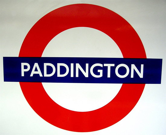
the london transport roundel is one of the earliest, best, most familiar and enduring of all corporate logos.
it’s been around in one guise or another for exactly 100 years ago this autumn.
it’s been around in one guise or another for exactly 100 years ago this autumn.
edward johnston [1872-1944], the brilliant arts and crafts calligrapher, is who turned the 1908 ‘bullseye’ into a strikingly handsome and wholly convincing symbol by 1917. johnston worked on the design over a number of years, and had perfected its balance and proportions by the time the architect charles holden began incorporating it into the distinctive underground stations he designed from the 1920s. as for lettering, johnston designed his superb sans-serif capitals for pick between 1913 and 1916.
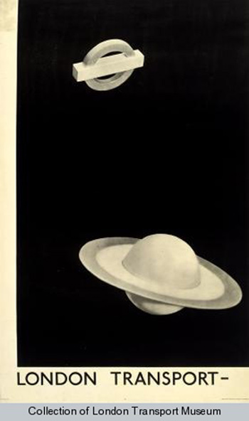 london transport by ray man, 1938
read more: http://www.guardian.co.uk
KEEP UP WITH OUR DAILY AND WEEKLY NEWSLETTERS
PRODUCT LIBRARY
 Apr 17, 2024
a powerful symbol of the house’s cultural heritage, the jockey silk with colorful geometric motifs is an inspiration for leather goods and textiles.
connections: +670
 Apr 15, 2024
watch our livestream talk with BMW Design at 19:15 CEST on monday 15 april, featuring alice rawsthorn and holger hampf in conversation.
connections: +320
 Apr 15, 2024
the solo show features five collections, each inspired by a natural and often overlooked occurence, like pond dipping and cloud formations.
 Apr 12, 2024
discover our guide to milan design week 2024, the week in the calendar where the design world converges on the italian city.
connections: 49