consumers want the old packaging of tropicana juice back

consumers want the old packaging of tropicana juice back


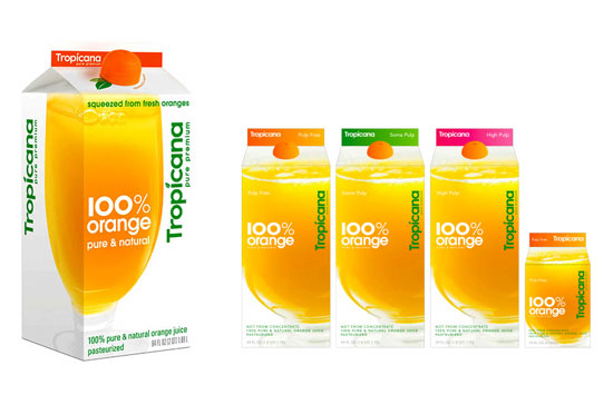
redesigned tropicana packaging by the omnicom agency

in early january 2009 tropicana of pepsico introduced its redesigned packaging by peter arnell of the
omnicom agency. the new packaging depicts a tall glass of tropicana with the message '100% orange
pure and natural' written across the carton which aimed to capture the pureness and freshness of the
product and brand however it failed to win the heart of its loyal customers. the company has received
negative comments on its new packaging saying it was 'ugly', 'stupid' and 'a generic bargain brand'.


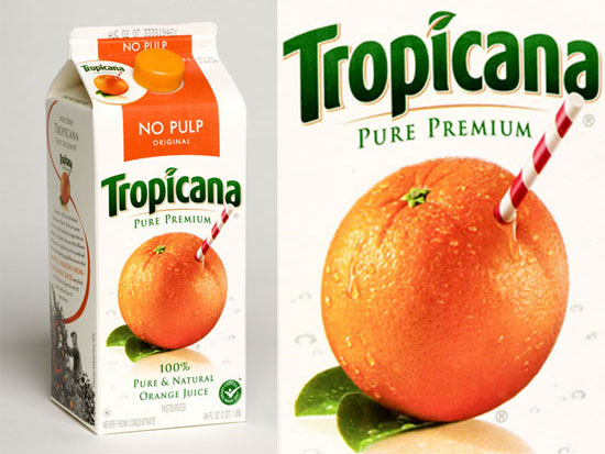
previous packaging of tropicana

tropicana has decided to bring back the previous packaging with a straw sticking in the orange,
starting from the next month. the president at tropicana north america has admitted the brand's
underestimation of the strong emotional connection that consumers had with the previous packaging.
he also mentioned 'those consumers are very important, so we responded'.

the orange shaped new cap will remain as they continue to run a TV, print and out door advertising
campaign 'squeeze' acclaiming the change of design. more

http://www.tropicana.com
leeji db
02.26.09  
15
I like it, its not as messy.
j   02.26.09
Now they just need to get rid of that horrible new pepsi logo.

I really didn't that the orange one was that bad, maybe they should just use the straw and orange logo.
g   02.26.09
Americans are just afraid of anything different.
If they were told by their T.V. to like it then it would be the bees knees. I for one think they made monumental progress with the new design and it is a shame that their consumers freaked. I guess drinking pesticide laden orange juice helps make you a zombie.

Wake up sheeple.

Peace
Ritt   02.26.09
I like the threaded cap from the new design; they should have added that to the old carton design.
mw   02.26.09
this is ridiculous. this whole fight is ridiculous.
the new packaging WORKS, why are people fighting it so hard?!
tarynpaper   02.26.09
It is too bad. I prefer the look of the new packaging, however it did have some issues.

Because the different types of juice are only differentiated by the color coded top band, you can't tell what's what when they have a shelf over them in the refrigerator. You have to pull them out to tell what kind of juice it is...not well thought out.

Also, even the grapefruit juice has a picture of orange juice on it...it's all very confusing.

If only they had put as much attention in to the usability as they did into type face and layout.
Tony the tiger   02.26.09
@Ritt

Sheeple?

Are you fourteen? Do you own a black and white novelty shirt that reads, "You laugh because I'm different, I laugh because you're all the same"?
sg   02.26.09
well they had to remove the orange because they arent using real oranges anymore. scientifically laboratory hormonal enhanced orange color fluid that taste like citrus. the pulp is actually larvae skin. - so i think the design is great for that !

other wise please go back to the original packaging please.

i am a designer so i know what im talking about.

thank you.
orange colored   02.26.09
I have to disagree; I like the old design; the new one is just too plain and generic.
oscarte   02.26.09
Original is best.
As everything else.
Jesus's love   02.26.09
the new cap is ok... but why so serious ??? at least i like to think that i'm drinking "real orange" but the new design says artificial everywhere, is so insipid i can even imagine it taste the same. Go back original!
RQ   02.27.09
While the new design is cleaner, it IS really generic. What about it sets it apart from anything else on the shelf?

and "sheeple"? Someone sounds like a pretentious first year design student.
Jodee   02.27.09
I like the cleanliness of the new design, but I do agree that it seems generic. They should make a more modern design that still utilizes the orange with the straw in it.

That being said, who are these crazy-ass people who have a "strong emotional connection" to a carton of sugary, low-quality juice?
Yulianna   02.27.09
The new design is cool and understated. As an Australian, I'd expect to see something like the new design here. The old design is very U.S. - a little over-done.

No offense guys, it's a cultural difference, like the covers of Sci-fi / Fantasy books - U.S. covers are always big bold and dramatic, whereas UK/Australian covers are elegant and understated.

I guess it's all about the target market!
Darren Woolley   02.28.09
I have been thinking about this for a month. How can such a beautiful design be so rejected. Ultimately I went to the market and discovered why: From a distance the carton looks smaller than an identical carton next to it. The use of white space diminishes the volume of the box greatly.
Tony   03.06.09

former police station by NRJA

READER'S SUBMISSION

the project transforms a former police station of industrial brick into a modern apartment building through the addition of a c...

sticks by gerard de hoop

READER'S SUBMISSION

the cabinet system takes its form from that of a picket sign-- each box of various widths and heights rests upon only one leg.&...

video

starry night interactive anima

art

translating the artist's paint daubs into particles governed by fluid dynamics, petros vrellis has created an interactive anima...

inga sempé: stockholm f

design

within the airy structure, the french designer has created the feeling of a large, open space apartment, furnished in a way tha...

RENAULT 4 ever behind-the-scenes

DESIGNBOOM COMPETITIONS thousands of you entered from across the world; now take an exclusive video look

'horsey' by eungi kim

DESIGNBOOM COMPETITIONS 'horsey' by eungi kim from korea is one of the shortlisted design entries from m
video

SELFPROMO - january 17 - march 17

DESIGN - AEROBICS how to present yourself in a creative world. different approaches to make sure your work is brought to the attention of the people that 'matter'...

POP UP - january 17 - march 17

DESIGN - AEROBICS don’t blink or you’ll miss it! in this course we’ll look at temporary structures, from living quarters and exhibition stands to container stores...
designboom news
340,177 subscribers

keep up to date with recent articles and upcoming events.
to receive both newsletters please check 2 boxes.

DAILY - see sample BIWEEKLY -see sample
© copyrights 2000 - 2012 designboom, all rights reserved. all material published remains the exclusive copyright of designboom.
no contents, including text, photographs, videos, etc. may be reproduced in whole or in part without the written consent of designboom. in addition,
no material or contents may be reproduced on the world wide web by techniques of mirroring, framing, posting, etc. without the written consent of designboom.