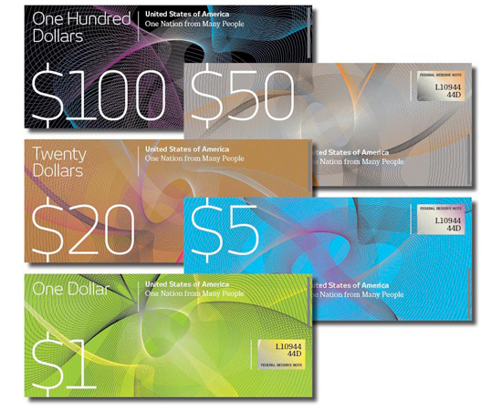
graphic designer richard smith thinks designers can help kick-start the US economy with ‘a thorough, in-depth, rebranding scheme – starting with the redesign of the iconic US dollar’. smith recently created the designs featured here and is asking the public to contribute their own dollar designs to his blog.
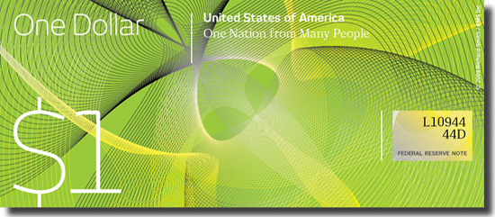
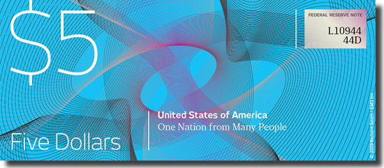
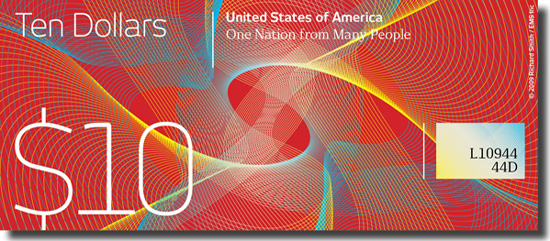
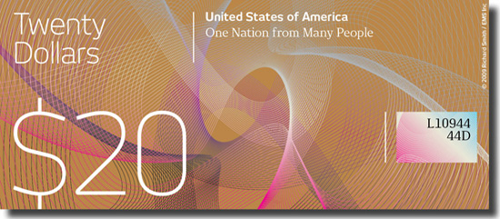
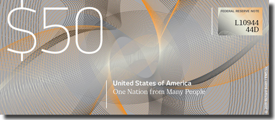
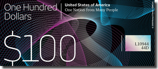
‘the american dollar has not truly been redesigned since about the 1930s. the dollar redesign project is your opportunity to theoretically ‘change’ that. yes, technically there are many limitations and complications when it comes to bank note design, but if the swiss can do it on a regular basis, why can’t we north americans too. besides our great ‘rival’, the euro, looks so spanky in comparison it seems the only clear way to revive this global recession is to rebrand and redesign. why not ? it seems to work for everyone else …’ RS
full details of the project can be found here.
via iso50
MONEY (64)
 Dec 15, 2023
 May 17, 2022
 Feb 11, 2022
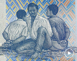 Sep 03, 2021
PRODUCT LIBRARY
 Apr 15, 2024
 Apr 15, 2024
 Apr 12, 2024
 Apr 04, 2024