2012 london olympics pictograms

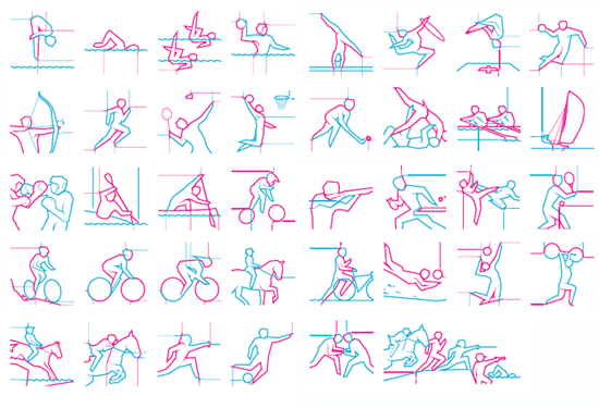
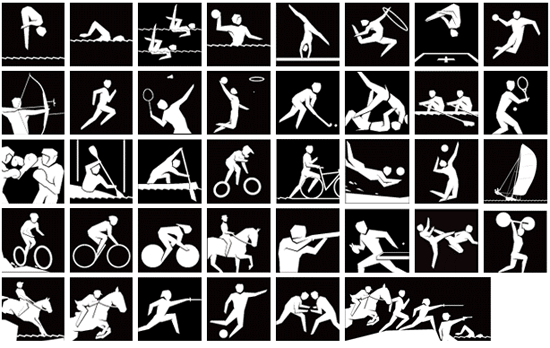
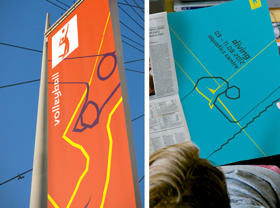
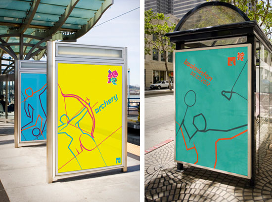
today the organizers of the 2012 london games unveiled the 38 olympic pictograms designed by someone.
they will be used on merchandise, signs and tickets, helping spectators find their way to their sport of choice
when the olympics begin in three years. there are two versions of pictograms, one silhouette and the other
a more colorful rendition 'inspired by the london underground map'

pictograms of each sport were first used at the 1948 games in london and have become a regular
feature of the olympic movement since the tokyo games in 1964. otl aicher's pictograms for the
1972 olympics in munich are largely regarded as the design benchmark.

'we wanted to make sure that whatever we came up with was a great piece of design but it also
worked hard for our identity… to create an asset that we, our licensees and our partners would
use in more creative ways than just at games time - we really wanted to push the concept for
the pictograms and one of the outcomes of this was to create two style versions - a silhouette
version used for high visibility and information-based applications, and a dynamic version used
both as decoration and where a more exciting version is called for. - do I believe they could rival
the munich games' versions? absolutely, because I strongly believe these will touch and inspire
everyone – whether in london, the UK or more widely around the world.' (more)
yasmine, london 2012 organising committee (LOCOG)


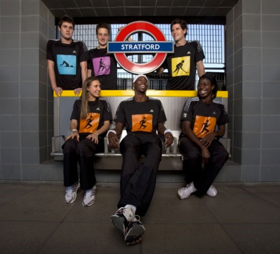
the new pictograms will be featured on limited edition adidas t-shirts on sale from october 24
to celebrate 1,000 days to go until the olympic games.
the ongoing development of the pictograms will be led by london 2012 marketing
services supplier mccann worldgroup.
I love that the woman from 2012 branding team "Yasmine" has the audacity to think these are anywhere near as good as Aicher's when they are more or less copies with a fancy brush stroke!
But, as the previous comment says, this are masterpieces when compared to the logo.
Saludos de México!
A nice idea to bring them back though. I can see them working well animated, the lines starting very random and coming together at the end as the icon.
This is always going to draw comparisons from what other olympics did. I think these hold up really well.
Well Done London!
What SomeOne has done, and obviously very well, is follow what's there, and make it more interesting. The lines, the colours and the silhouettes are all different but unite in some way. We are finally seeing a brand 'language' with the Olympics. 3 years to go... so looking forward to more creativity!
Mas com diferença, no estilo ou na cor, forma já da um toque diferente.
I hope Brasil will come up with something more interesting in 2016
serie architects: BMW olympic pavilion
taking advantage of its elevated site above the waterworks river in london, the pavilion will feature a water curtain that will function act as a means of cooling the structure.
erect architecture: queen elizabeth olympic p
the north hub for the summer 2012 olympics in london will create a native ecological environment encouraging visitors to engage with streams of water, woodlands and meadows.
james corner field operations: queen elizabet
integrating gardens, promenades and event spaces, the south park hub will become a focal point within the legacy park for the transient visitors of the london summer olympics 2012 as well as residents of the city in...
barberosgerby: london 2012 olympic torch
prototypes of the london 2012 olympic torch designed by barberosgerby have been unveiled.
royal mail london olympics 2012 stamps
royal mail's second set of london 2012 olympic and paralympic games stamps has been issued in anticipation of the 30th olympiad.
2012london olympics mascots
today the mascots for the 2012 olympic games in london were unveiled. the one-eyed characters 'wenlock' and 'mandeville' were created from the last two drops of british steel used for the london 2012 olympic stadium...
michael schoner: coathanger chopper
the clothes hanger moves through out the space, controlled by radio and propelled by two computer fans.
little red house in nolita
the six story brick building, originally used as a 19th century carriage factory, has been reinvented as a minimalistic and mod...
RENAULT 4 ever behind-the-scenes
'horsey' by eungi kim
SELFPROMO - january 17 - march 17
POP UP - january 17 - march 17
keep up to date with recent articles and upcoming events.
to receive both newsletters please check 2 boxes.
no contents, including text, photographs, videos, etc. may be reproduced in whole or in part without the written consent of designboom. in addition,
no material or contents may be reproduced on the world wide web by techniques of mirroring, framing, posting, etc. without the written consent of designboom.

submit a project
publish a project
email
RSS
facebook
twitter


