el portillo by spanish design firm stone designs is a cabin located at javalambre ski station
in teruel, spain. its construction is modeled after typical canadian wood cabins made of
tree trunks with a pitched roof. the project consisted of converting the space, which to this point
had been uncared for, into a cafe for that specific zone of the ski station.

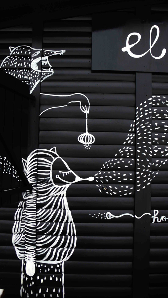
graphic artist pepa prieto has inhabited the exterior walls with creature as if emerging from the snow
the project was offered to stone designs by spanish holding company aramón group.
the initial ideas were to create and interior and exterior that would co-exist to complement each other.
taking into account the presence of snow, and the fact that it would only operate in the winter,
the first idea was that the cabin should form part of the landscape. during the winter,
with snow on the mountain, everything becomes a contrast of black and white –
snow covers everything and anything not covered appears dark. looking at this,
stone design decided to paint the entire exterior of the cabin in black, so that it would contrast
the snowy landscape. in addition they collaborated with graphic artist pepa prieto,
who has given the outside of the cabin life, inhabiting the walls of the café with creatures
painted in white as if they are emerging from the snowy ground.
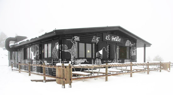
exterior of el portillo
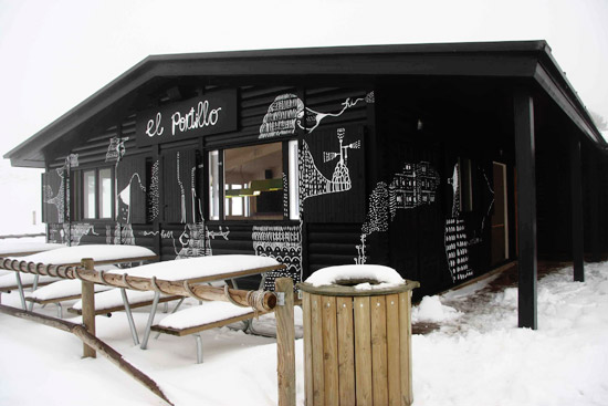
exterior of el portillo
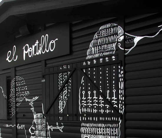
graphic details
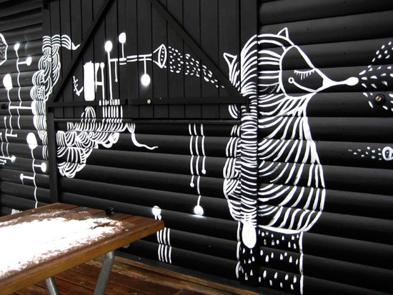
graphic details
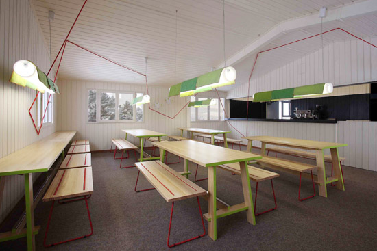
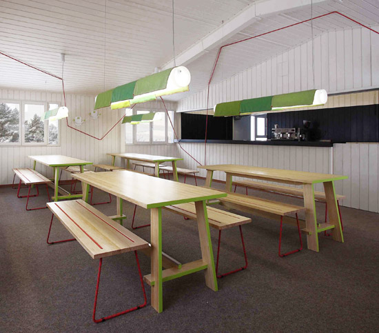
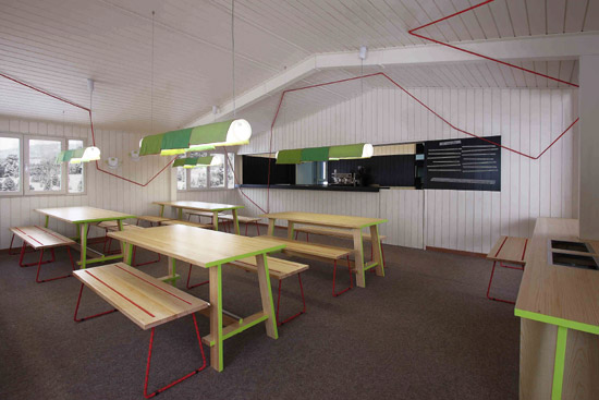
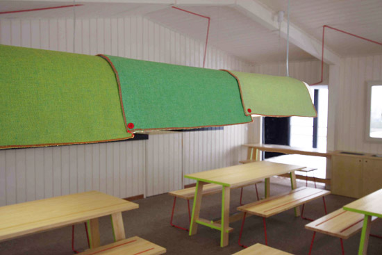
the contrasting interior
the design approach inside is completely different. it is painted white, in order to optimize
the scarce light on cloudy days and creating a cozy space, an escape from the harshest days of winter.
they wanted to use as few elements as possible so that in the end, the furniture becomes
the means used to create the topography of the interior. red climbing rope has been used as
an element of distortion, creating an area that is less static.
interior of el portillo
the interior view of eating area and bar
the bar is decorated with a black band referencing the cabin’s exterior and the menu is
written directly on masking tape, which means they can change items when necessary.
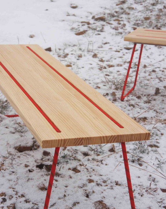
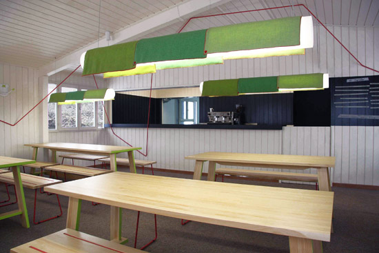
detail of furniture with use of red climbing rope
detail of lighting
STONE DESIGNS STUDIO (10)
 Dec 13, 2022
 Nov 25, 2020
 Jan 19, 2017
 Feb 04, 2015
 Mar 27, 2014
PRODUCT LIBRARY
 Apr 17, 2024
 Apr 15, 2024
 Apr 15, 2024
 Apr 12, 2024