johnson banks recently finished the first stages of a new identity for ravensbourne college. at the core of the scheme is a flexible logo based on the college’s facade by foreign office architects.

— following text from johnson banks:
we were appointed well over a year ago to help ravensbourne college as it moves later this year from its current chislehurst home to a landmark new building next to the 02/dome in greenwich.
we were asked to help create a new verbal and visual identity that would reflect the huge change in emphasis that the new building will bring, one focussed on a digital future and innovation. the building’s design is dominated by tens of thousands of anodised aluminium tiles that tessellate across its skin, following a tiling pattern established by roger penrose.

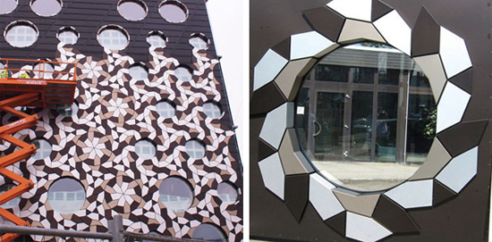
we decided that this visual signature should be included in the visual identity – the beauty of the tessellating pattern is that it seems to vary continuously, but only emanates from three basic tile shapes. it seemed an apt educational analogy that from just a few basic shapes, anything was possible.

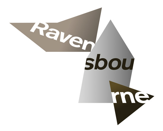
from the three tiles, we then incorporated the ravensbourne name, thrown through the tiles at different angles. we’ve also made it integral to the scheme that there are multiple combinations of the logo itself. 
in total there are six different combinations. we’ve chosen the versions where the tiles seem in motion (either about to resolve, or about to spin again) so the titles themselves appear to be ‘stills’ of an animation.

here’s a trial animation of the logo in motion. art directed by johnson banks and animated by current ravensbourne student, james taylor.

a key part of the scheme is a set of photographs of ravensbourne students, which incorporate the pattern.

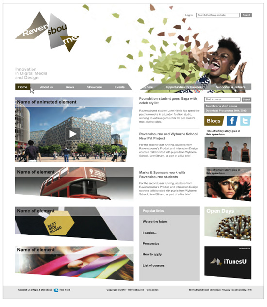
here are the first applications of the scheme including stationery, a prospectus and website proposal.


 the next stages on this project are a vast array of extra applications, and a cohesive approach to wayfinding within the building itself. more details can be found on johnson banks blog.
johnson banks (13)
 Aug 12, 2015
 Jun 15, 2015
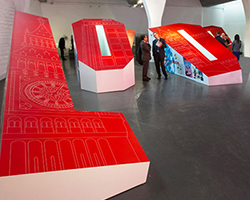 Oct 22, 2013
 Mar 13, 2013
 May 15, 2012
logo design (244)
 Aug 14, 2023
 Aug 02, 2023
PRODUCT LIBRARY
 May 06, 2024
 Apr 17, 2024
 Apr 15, 2024
 Apr 15, 2024