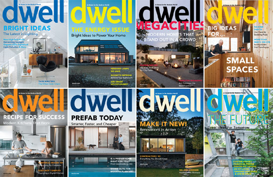
dwell magazine all images courtesy of dwell
designboom presents a new series of questionnaire, posed to editors-in-chief of the world’s most beautiful print publications. with topics that range from conceptualization to printing to digital presence, enjoy ‘dwell’ – architecture and design print magazine from USA!
designboom: how did dwell start?
sam grawe (editor-in-chief, dwell magazine): lara hedberg deam started dwell. when she was working with an architect on her own house, she felt inadequately prepared to properly articulate what she wanted to achieve to create the space she had in mind. she went back to school to study architecture, which gave her the necessary background, and that experience left her with the impression that there was a huge gap between the professional discourse and what could be easily gleaned from say, a magazine. her family has a background in the direct-mail business, so she did her research and developed a business plan for what would eventually become dwell.
after getting the business together, she hired karrie jacobs as the editor-in-chief, who was perfectly suited to developing the concept and setting the tone that the magazine would take—one in which jasper morrison and hello kitty could coexist merrily in the same sentence. karrie called that ‘nice modernism’, and I think that’s still a very valid concept. by and large, americans associate modernism with movie villains’ lairs, banks, hospitals, and museums, not with habitable domiciles. we wanted to show that you could live a comfortable, normal life (cookie crumbs and all) in a modern house.
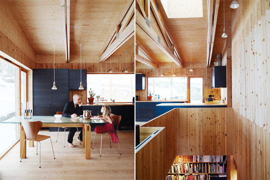
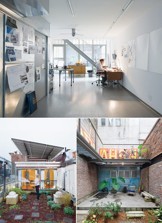 ‘weiner renovation’ by LOT-EK in new york city (dwell, april 2010) photographer: dean kaufman
db: what are some key differences between dwell and other architecture and design magazines?
dwell: in the united states, there isn’t a substantial culture of design, or of design magazines. for the most part, we have trade journals for professionals and decorating magazines for homemakers. the former tend to be somewhat dry, with antiseptic photos and jargon-filled text. they’re not all that engaging for those of us who aren’t in the field but who may be interested in the subject matter. the latter are like fashion magazines for the home—all soundbites, snippets, and celebrity. they tend to be prescriptive—what colors you should be using this fall, what styles of lampshades are popular, etc—and rarely dig deeper than the surface appearance of objects. they try to be all things to all people and do not adhere to one particular style or focus.
dwell is a magazine about modern home design, and it exists somewhere in the no-man’s-land between the two categories described above. on the one hand, we fit into the tradition of ‘shelter magazines’. we’re largely focused on residential architecture and the design of objects within the home. 60% of our audience are not architects or designers, but 100% of our readers live in houses of one kind or another. this gives the magazine focus and enables the stories to be relatable to all of our readers. on the other hand, because of our interest in cutting-edge architecture and design, our subject matter—the concepts, ideas, and technical information we discuss—tends to be closer to what you might find in a trade journal. it’s an uneasy balance, but it’s one that has struck a chord in our audience.
there’s a quote from eliel saarinen that has always inspired how we see the world and how we function editorially. he said, ‘always design a thing by considering it in its next larger context: a chair in a room, a room in a house, a house in an environment, an environment in a city plan.’ you can interpret that as a sort of ‘powers of ten’ approach to a shelter magazine, with the home somewhere in the middle of the equation. from there we can scale in either direction, looking at both micro (reviewing toasters) and macro issues (the infrastructure of mumbai).
lastly, we aim to capture what’s real. that means we don’t stage the homes we shoot and we don’t shoot with wide-angle lenses that distort the space. people tend to tidy up their houses when they know when dwell is coming over for a photo shoot, but we do our best to try to capture reality.
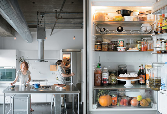
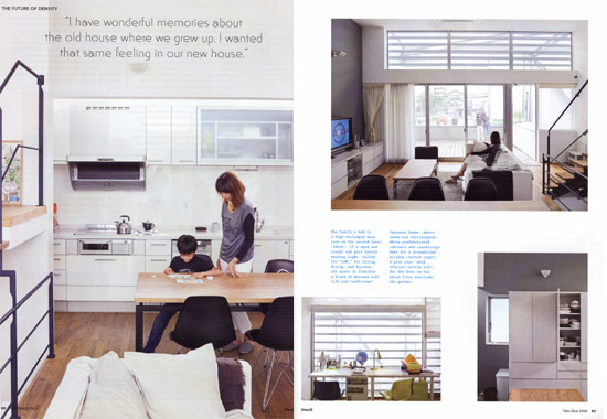 ‘y house’ by IDEA office in saitama prefecture, japan (dwell, dec/jan 2010) photographer: dean kaufman
db: how do you know who your readers are and what they would like to see in dwell’s print issues?
dwell: you can never really know what your readers are going to like and dislike, but with an audience upward of 325,000, you’re not going to make everyone happy all of the time, nor do I think you necessarily should. if you don’t provoke readers, show them somethingthey might not have otherwise seen, expose them to a new idea, or a new way of looking at an old idea, then you’re not offering them something worthwhile. I certainly don’t want to read a magazine all about the things I already know. the challenge is pushing the boundaries, but not so far that you lose people.
our circulation department is responsible for gathering data on our readers, and our publisher and advertisers are, of course, interested in who we are reaching. in addition to more regular issue surveys, we do a fairly substantive reader survey each year. data we gather from that helps inform how we shape the magazine and what we’ll decide to include in the coming issues.
db: how is each issue put together, thematically? how much advance preparation time is required to conduct this?
dwell: each issue of dwell has a particular theme. the three most recent issues were megacities (june), energy (july/august), and light (september). we determine an annual issue calendar each summer for the following year. we’re not dealing with hard news, so it’s possible to work that far ahead, but the tricky part is identifying and selecting themes that will be relevant a year or more down the line.
at any given moment, up to four issues at a time are in different stages of production. one may be shipping to the printer while another is being designed, while another is being photographed, while another is being written. it’s sometimes a bit difficult for me to keep track of what the actual date is when the calendar says july but you may be having discussions that jump from october to december to february. we start planning an issue about five months ahead of its on-sale date.given the scale of our staff and the time it takes to work with writers and photographers around the world, produce all the layouts, color-correct the art, and meet our production deadlines, that’s just the way we work. there may be a better way to do it, and there are certainly more expensive ways to do it, but the longer lead time enables us to produce a very high-quality product within the limitations that have been imposed by other factors.
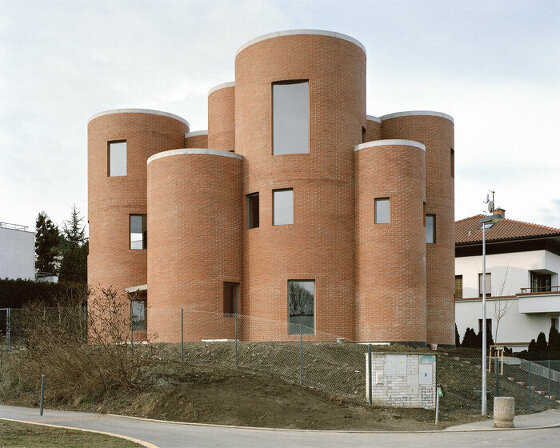
 ‘stavropoulos residence’ by andreas stavropoulos (dwell, october 2009) photographer: mark compton
db: how do you ensure that your content is always fresh?
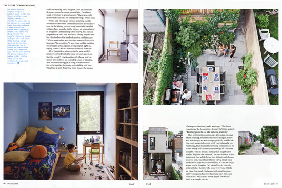
dwell: when the internet is churning up just about everything in the world 24 hours per day, it’s harder and harder to come up with content that hasn’t been seen before. that being said, if we publish something that’s already been online, I’m confident that the way in which we’ll approach the story will be very different, so we’ll offer a fresh perspective. storytelling is a huge part of dwell, and we commission all of our own writing and photography. because we shoot the houses we feature, we get art that hasn’t already been all over the web. take the ‘town house in landskrona, sweden’, that we featured in our september issue. I don’t know where I first saw this house, it may have been on designboom, a few hours later I saw it on archdaily, generally speaking wherever you go online you see the same 8 images and a pretty standard write-up based on the architect’s press release (maybe except designboom, who has lots of own content). in dwell, you get a story that gets into the how the house came to be, how it fits into its neighborhood, what the challenges and the payoffs were in making it, a taste of who the people involved are and how they informed the design. this is complemented by original photography that tells the story visually. when you sit down and read the magazine, you can ascertain that a lot of people’s hardwork went into bringing that package to you. I don’t think you would necessarily say the same about something you look at on a blog, nor does that medium require that you do—it’s all about faster and more. in this day and age, just being able to relax in your favorite chair, open a magazine, and appreciate a well-told story is pretty fresh.
 ‘bornstein residence’ by bornstein arkitekter in gothenburg, sweden as featured in dwell (may 2010) photographer: pia ulindb: being a design magazine, the aesthetics of the publication — from font to layout, kerning to cover — is very important. what style would you say dwell is? how has it evolved, especially in the last years?
dwell: the design of dwell itself is indeed crucial. we take an approach that we feel suits the subject matter we publish and allows what’s on the page—the content, the photography—to take center stage. in some respects we’ve been much more inspired by classic architecturemagazines—old copies of ‘domus‘ and ‘arts & architecture‘—than our competition on the newsstand. that brings up the notion of timelessness, which is something we try to support in both what we choose to show and how we choose to show it. if you open up an issue of dwell from four years ago, I don’t think you would be wildly disappointed by what you saw, or that it would feel out of fashion. that being said, within the constraints we’ve developed—our use of grids and fonts—we are always trying to evolve.
I’ve been working here since 2000, which is when dwell launched, and was promoted to editor-in-chief in 2006. I then hired our creative director, kyle blue, who had been dwell’s senior designer previously from 2003 to 2005. we then spent the whole next year thinking about how to improve the magazine, and kyle led his team on a rather extensive redesign, which launched in february of 2008. the goal there was to think about the magazine’s pacing, to reconsider how best to use the pages of the magazine to most effectively deliver content to our readers, and to innovate the look and feel while staying true to the core values that founding editor-in-chief karrie jacobs and creative director jeanette hodge abbink had so effectively established.
though kyle and I are both inspired by rational systems and by making design decisions that complement an overall concept, we also like to experiment and have fun. in every issue, we redesign the features to complement the theme of that issue, and they simultaneously fit within the overarching system and are fresh and playful. the same could be said for the cover designs. we have a basic template, but with ten issues a year, you need to make it clear to potential readers that there’s something different going on here from the last issue of dwell.I think the rest of the magazine is in a constant state of evolution, albeit within a fairly strict framework.
 ‘jackson residence’ in chicago (dwell, march 2010) photographer: matthew williams
db: many magazines these days are making the transition from print to online. what kind of measures (from publishing strategies to content) are you taking to keep dwell relevant and competitive?
dwell: our site has become increasingly robust over the last four or five years, and underwent an extensive redesign last year. it looks and functions better than ever, but as is the case with the web, everything is changing so fast. as soon as you’ve mastered something,the playing field has changed. a lot of the online content comes from the magazine, but we also must take advantage of the medium we’re working with. great magazine content doesn’t necessarily make for great web content. because we operate within a limited budget, we try to make the most of the work we do for print. for instance, if an editor travels to norway to do a story on a new house in oslo, he’ll also do a series of blog posts on design shops there or speak with local designers about their favorite restaurants. a photographer probably takes upward of 100 photos for every dwell story, but we only have real estate for a fraction of those in print. online, the possibilities are limitless. with amanda dameron, the digital content director, all of the editors do a fantastic job of keeping fresh content flowing onto the site every day.
 ‘galley house’ by donald chong in toronto, canada (dwell, dec/jan 2010) photographer: dean kaufman
db: what is the future of dwell?
dwell: this october, we’ll celebrate our tenth anniversary. I’m not normally someone who gets excited about such things, but it does feel like a great opportunity to reflect on where we’ve been, what we’ve managed to accomplish, and where we might be heading—and to drink a little champagne (or more likely tecate). when we launched, a lot of people thought that the interest in modernism was just another revivalist fad that would soon go by the wayside, and that we would go with it. I think that we’ve proved that that modernism’s core values—using resources more wisely, designing to express the times we live in, taking advantage of new technology, using materials honestly, expressing sensitivity to context and ecology, possessing an optimism about the future—have a timeless appeal.
I don’t think we all need to live in modern houses, but I do think that we could all stand to be better educated about design. architecture plays a huge role in all of our lives, but relatively few people are equipped to discuss it and debate it, so often you end up with a lot of mediocrity. with dwindling natural resources and increased energy demands, mediocrity will increasingly be unsustainable. design can solve a lot of problems, but designers won’t solve much if they are acting alone.
lately I’ve been enamored of a book by bill stumpf, the codesigner of the aeron chair. it’s called ‘the ice palace that melted away: restoring civility and other lost virtues to everyday life’ and it deals with the ways in which a little helping of design could make our lives a lot richer and more enjoyable. it asks you to step back and observe your world from a greater distance, to think about the things that trouble you, to question what’s necessary and unnecessary, if things really need to be the way they are, or if they could be better. and if they could be better, why not try to make them better? considering it was written in the pre-9/11 world, it’s a little depressing to consider the changes the world has undergone in the decade since, but it’s also very inspiring and completely relevant. we need those ideas now more than ever.
we’ll continue to focus on modern home design, but I’ll assume that the dwell reader cares what happens beyond their garden fence. I want dwell to be a catalyst for good, not just in people’s homes, but also in their communities. I’d like to focus on design that is making the world a better place for all of us.
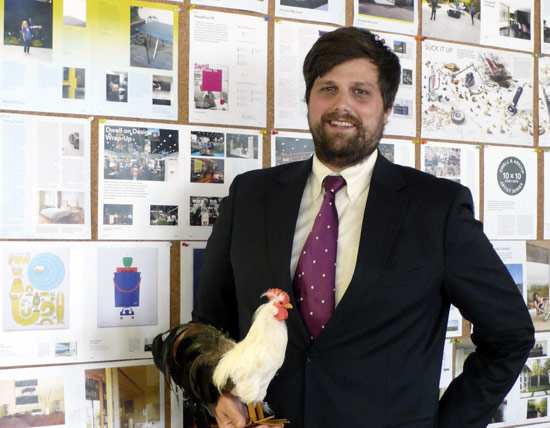 dwell’s editor-in-chief, sam grawe
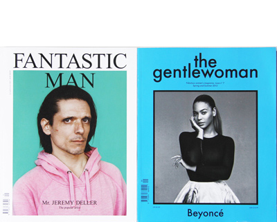
INTERNATIONAL DESIGN MAGAZINES (6)
 May 24, 2013
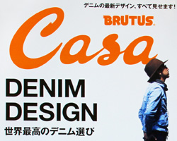 Jan 01, 2013
 Jan 05, 2011
 Nov 24, 2010
 Aug 01, 2010
PRODUCT LIBRARY
 Apr 02, 2024
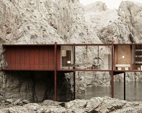 Mar 31, 2024
 Mar 21, 2024
 Mar 20, 2024