
‘fyf residence’ by patterns in rosario, argentina all images courtesy patterns
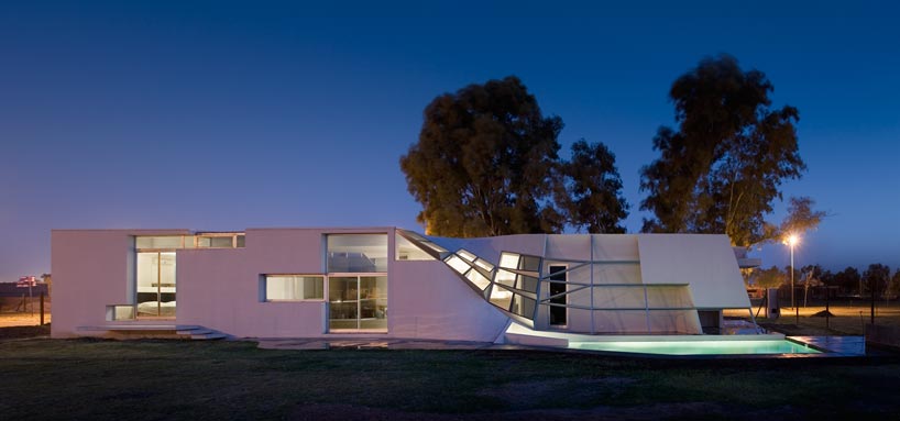
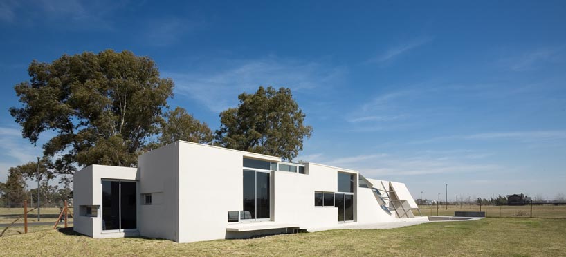
los angeles-based architecture practice patterns has sent us images of their recently finished single-family house in argentina, ‘fyf residence’. located in the outskirts of rosario, a city approximately 300 km north of buenos aires, the single-storey dwelling aims to challenge the flat homogeneity of the traditional neighborhood it sits adjacent.
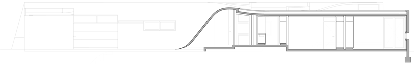
 elevation
the 200 m2 project was conceived as a monolithic form punctuated by subtle inflections that establish a complex spatial identity for both the exterior and the interior. through a number of folds and bends, the cast-on-site reinforced concrete shell forms the body of the house; perforations in areas of transition serves as openings, resulting in an internal environment that is well lit, cross-ventilated, and offers oblique views. the effects of transparency and mass is explored through systematic cuts of both the facade and roof.
 (left) the faceted curve surface from the pool (right) detail
located within viewing distance from the main communal area, a pliant pool stretches the body of the house while activating a dynamic sequence of movement and views to the landscape beyond. the projecting roof near the pool area is broken down into a number of flat compartments that altogether form the complex curvature of the house’s surface.
 looking down to the pool
 interior – kitchen area
 looking out to the pool
 (left) the effects of the subtle curving wall (right) interior corridor defined by the light well
the clients, who are an agricultural engineer and a landscape designer, had requested that a small greenhouse be integrated into the design. instead of placing it in a separate and autonomous structure on the site, the architects situated the green house in a continuous spatial sequence with the interior social spaces. a small curving lightwell defines the central corridor of the house while illuminating the interior with natural daylight.
 lightwell

 exterior view

 entrance and garage
 plan
plan
 roof plan
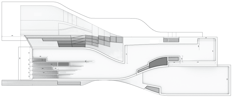
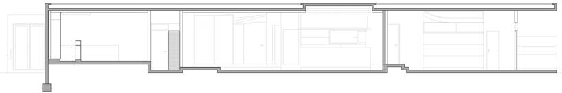 longitudinal section
 longitudinal section
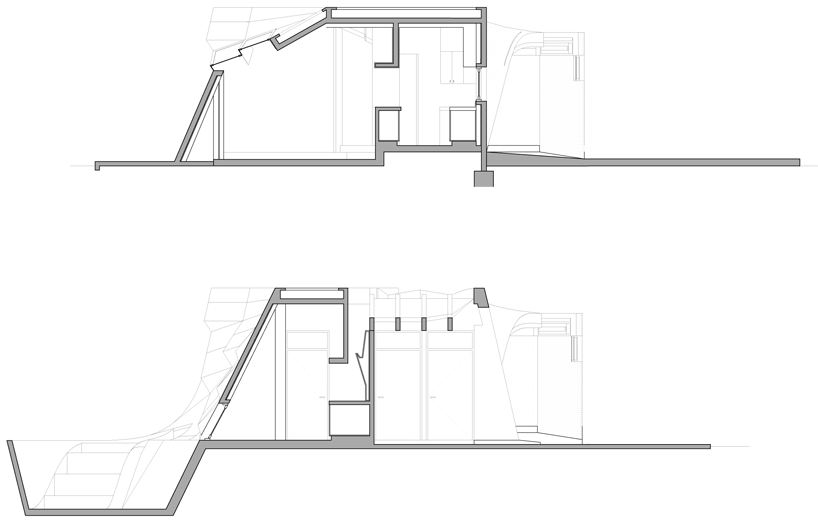 cross sections
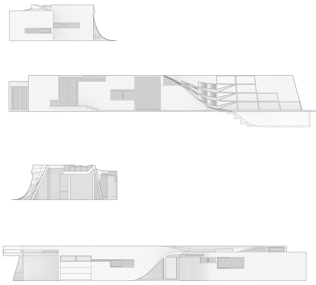 elevations
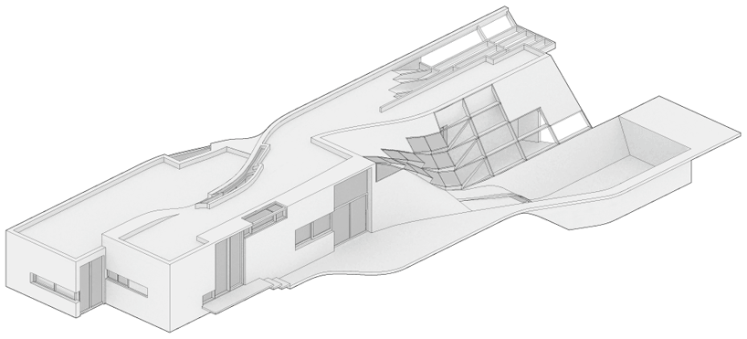 axo
axo
 exploded axo of integrated systems (from bottom to top) landscape – mounds and shreds demarcating vegetation activity terrace interior partitions – activity flow and controlled green systems concrete shell – framing and window systems substrate geometry
 composite site plan (1) topographic garden (2) terrace (3) vehicular driveway (4) concrete shell house (5) pool area
project info:
project type: single-family house location: rosario, argentina size: 200 m2
principals in charge: marcelo spina and georgina huljich project assistants: james vincent, hunter knight, en jang, ben luddy executive architect (1st phase): estudio +/alejandro beltramone and marcelo ponselini executive architect (2nd phase): dalabona arquitectos – monia dalabona, pricipal in charge
PATTERNS ARCHITECTURE (2)
 Nov 30, 2010
PRODUCT LIBRARY
 Apr 02, 2024
 Mar 31, 2024
 Mar 21, 2024
 Mar 20, 2024