‘house da costa in altwies’ by STEINMETZDEMEYER in altwies, luxembourg all images courtesy STEINMETZDEMEYER
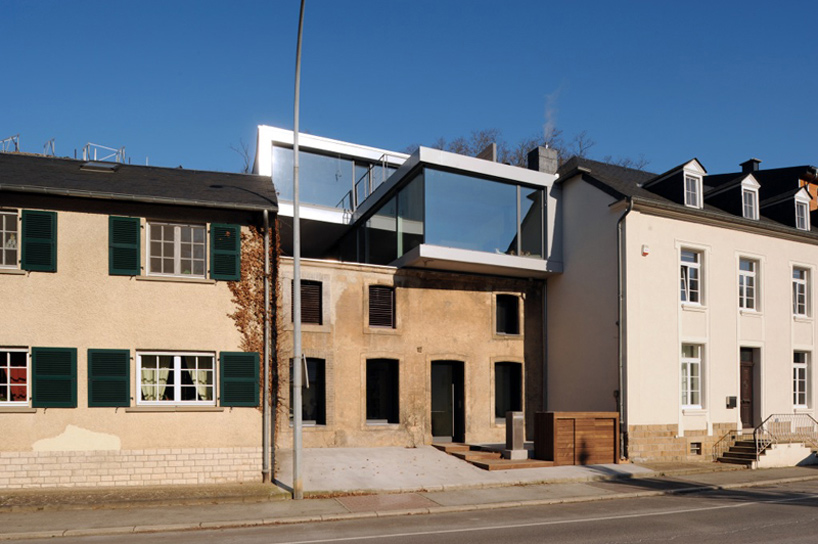
luxembourg-based architecture practice STEINMETZDEMEYER (nico steinmetz, arnaud de meyer) has sent us images of ‘house da costa in altwies’, a multi-storey private dwelling set within a former carpenter’s shop in altwies, south-east luxembourg. abiding by the wishes of both the former owners and the new client, the design maintains the original street facade of the building and utilizes it as a contextual exterior wall that contains an open-air terrace within.
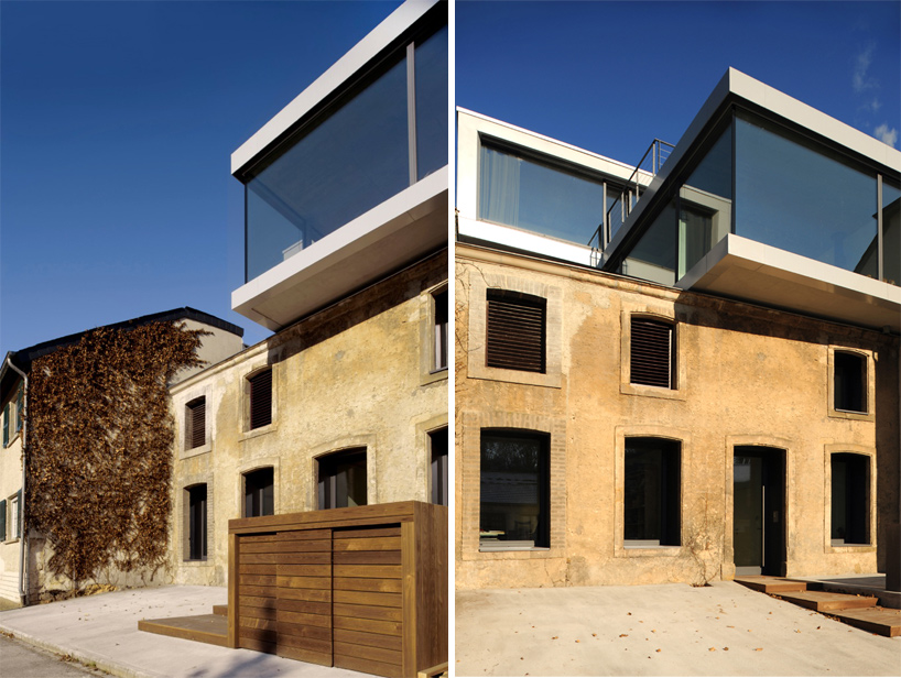 exterior views
flanked on both sides by neighbouring structures, the project focuses on drawing the residence vertically to secure both natural light and views of the surrounding site. a series of volumes are stacked and manipulated to create three levels with the upper storey cantilevering slightly over the street facade. purposely contrasting in gesture and material palette, the geometric design is read as a roof pavilion from the street.
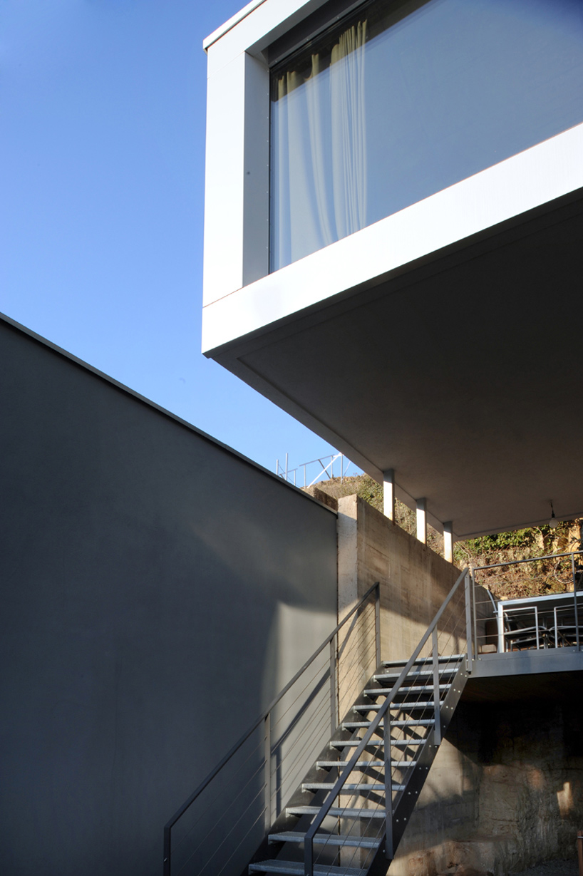 view of overhanging volume over courtyard
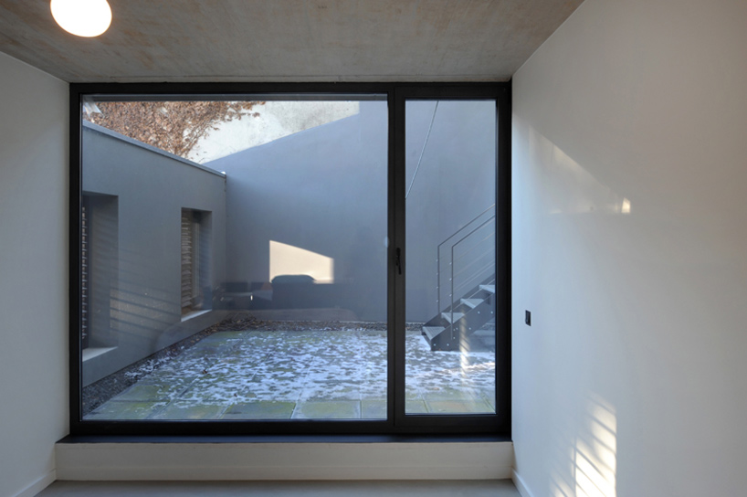
incorporating a generous multi-storey void space within the layout, the layout ensures an active exchange between the interior and exterior. the domestic activities of the house can be expanded and adjusted onto the outdoor patio and terrace. floor-to-ceiling glazing wraps around the south-facing elevations to supply an abundant level of sunlight. despite the unchanged street facade, rooms on the ground floor gain daylighting through the presence of the courtyard.
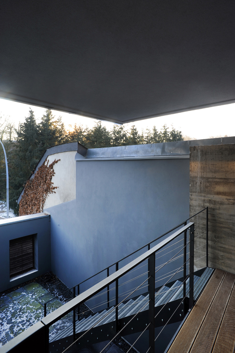 sheltered terrace behind street facade
 view of courtyard from inside
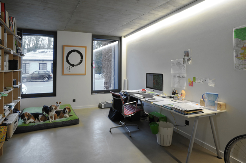
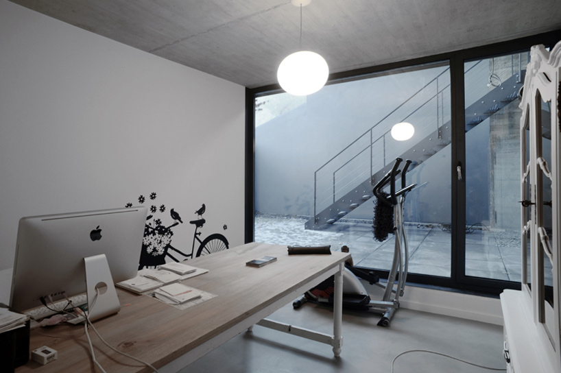 office by courtyard
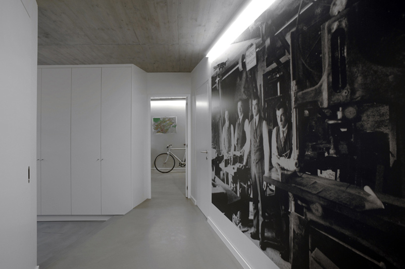
 interior view
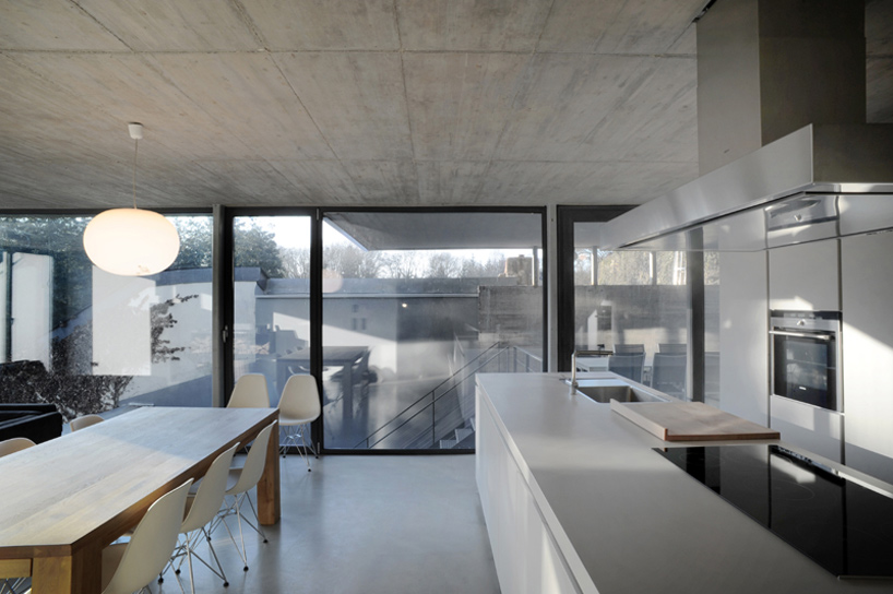
 view from kitchen
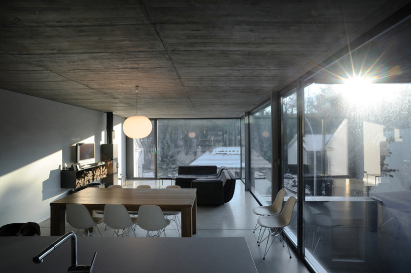
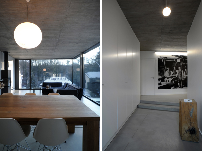 (left) dining and living space (right) circulation space
 office
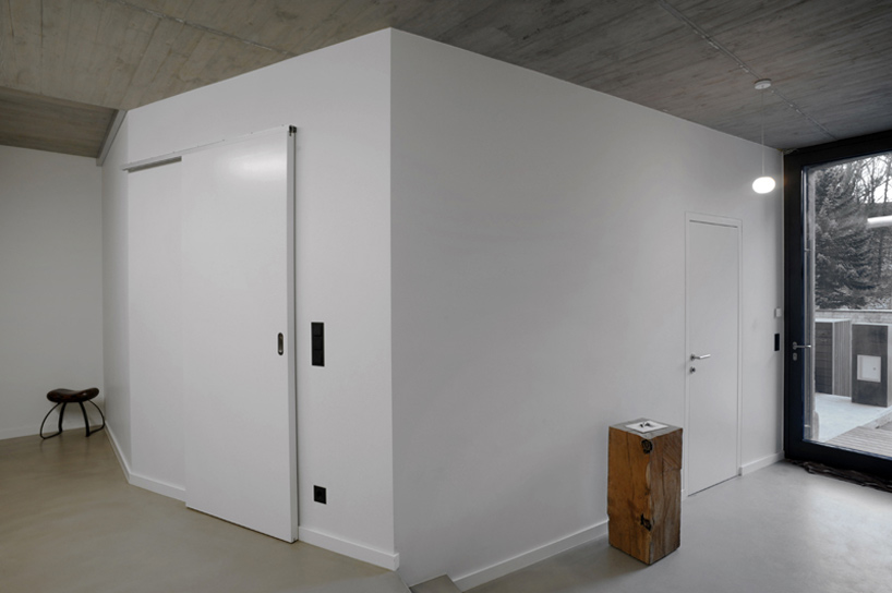
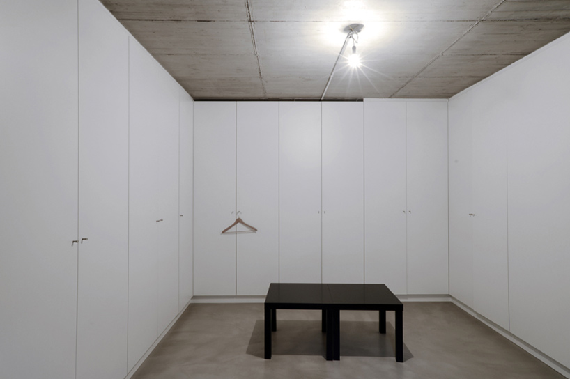 storage
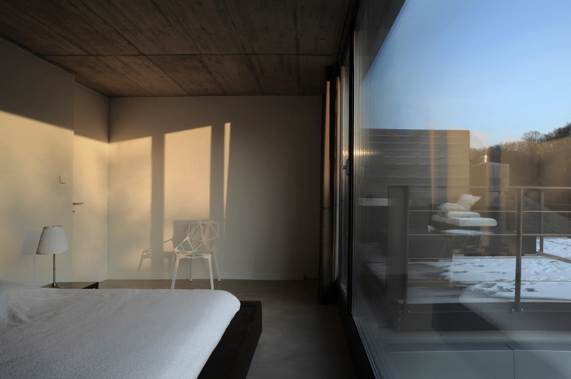 bedroom
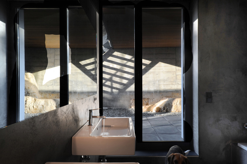 bathroom
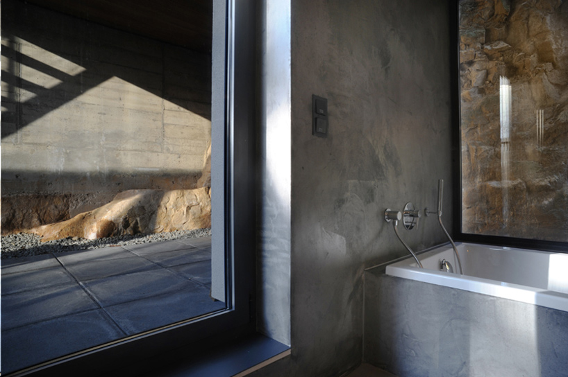 view of outdoor space from bathroom
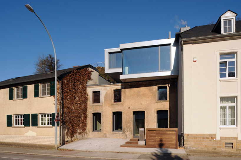 exterior street view
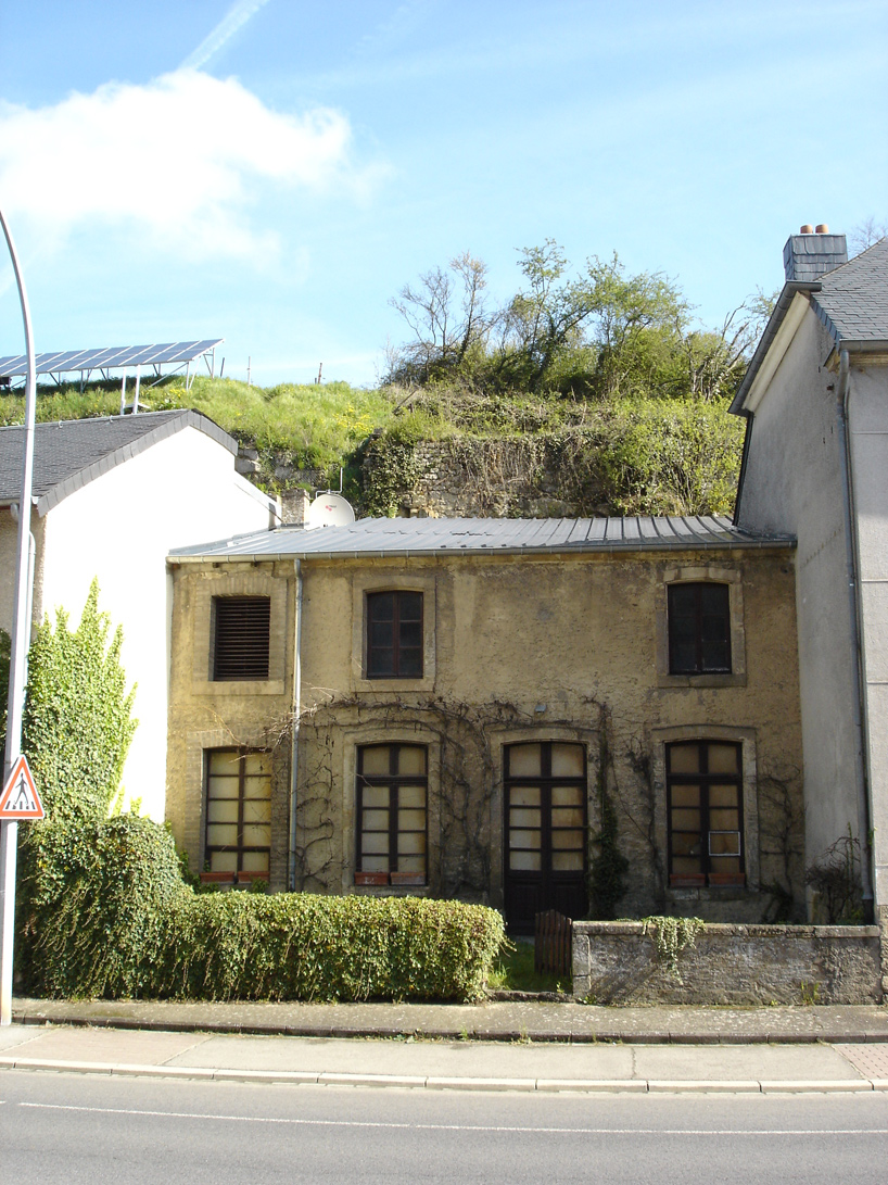 before construction
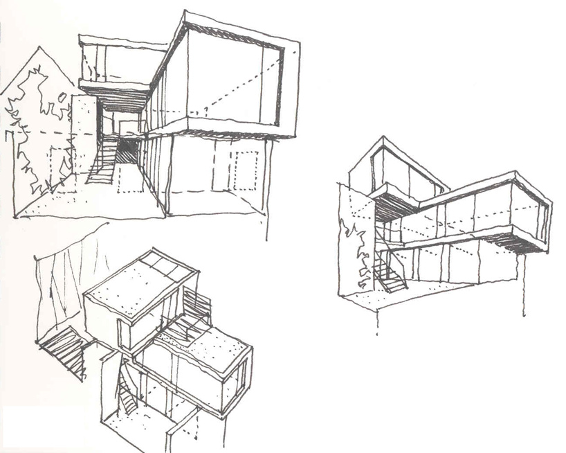 architect’s sketch
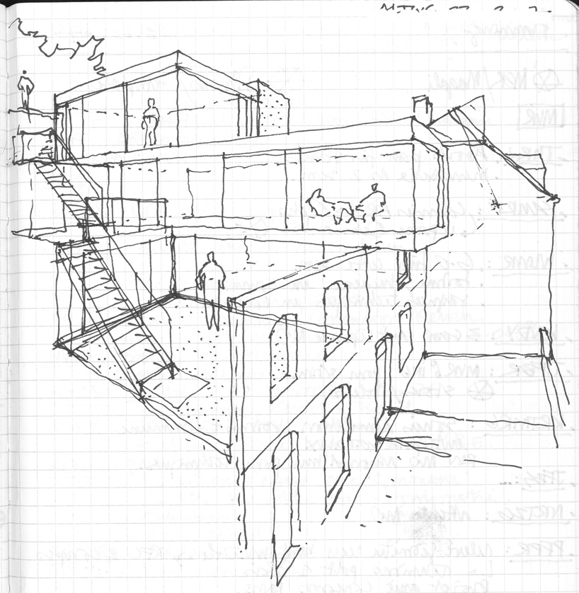 perspective
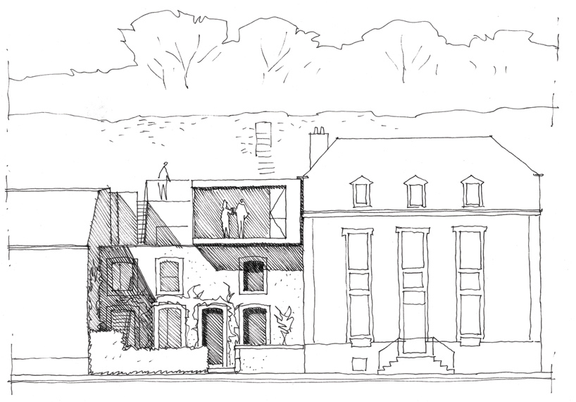 street elevation
STEINMETZDEMEYER (4)
 Aug 22, 2012
 Dec 12, 2010
PRODUCT LIBRARY
 Apr 02, 2024
 Mar 31, 2024
 Mar 21, 2024
 Mar 20, 2024