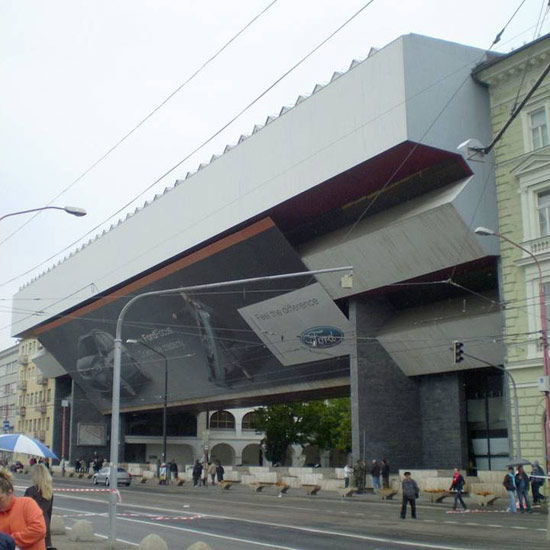
‘feel the difference’ reflection on the facade of the slovak national gallery by NL architects photo © hertha hurnaus image courtesy NL architects
NL architects were invited by the dutch embassy in bratislava to show their work at the slovak national gallery. titled ‘modernice’ the exhibition features numerous NL projects in various stages of development, covering almost two decades.
vladimír dedeček’s stunning ‘bridge’ section of the museum is waiting for renovation and was closed for many years. the bridge was opened especially for the exhibition.
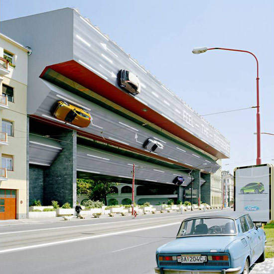
NL architects were deeply frustrated with the mutation of the facade of the building: the national gallery nowadays is covered in a supersized advertisement for ford. the XXXL poster neutralizes the intense horizontality of the facade and destroys its depth.
after being informed about possibilities to remove the poster for the duration of their show – to expose once more the museums unique monumental face- it became clear that it would be a costly operation; taking it down for one day only and reinstalling it would already amount up to 3.600 euro.
the exhibition will be on view until june 21st.
 the facade of the slovak national gallery by NL architects photo © hertha hurnaus image courtesy NL architects
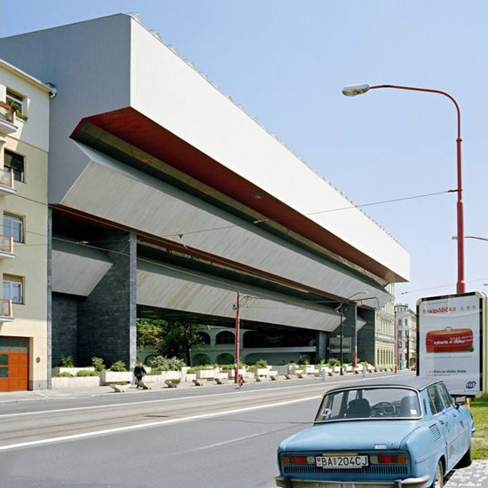
 the current facade of the slovak national gallery photo © hertha hurnausimage courtesy NL architects
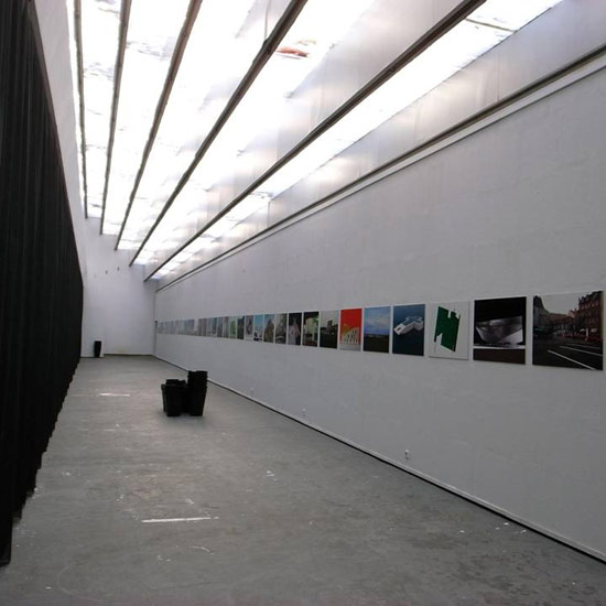 ‘modernice!’ exhibition at slovak national gallery, bratislava photo © hertha hurnausimage courtesy NL architects
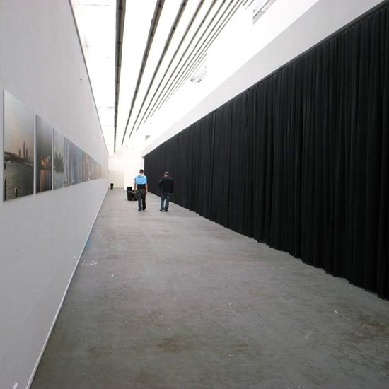 ‘modernice!’ exhibition at slovak national gallery, bratislava photo © hertha hurnausimage courtesy NL architects
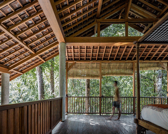
NL ARCHITECTS (54)
 Jul 19, 2023
 Dec 09, 2019
 Apr 22, 2019
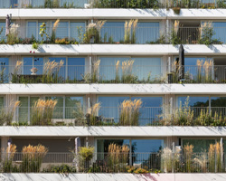 Sep 30, 2018
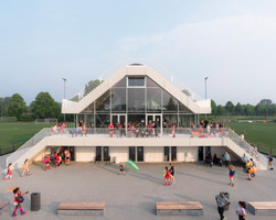 Jul 18, 2018
PRODUCT LIBRARY
 Apr 22, 2024
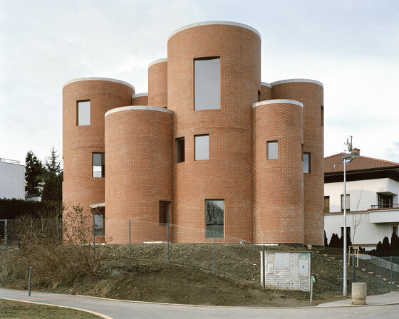 Apr 02, 2024
 Mar 31, 2024
 Mar 21, 2024