
dirk schächter: typomaps
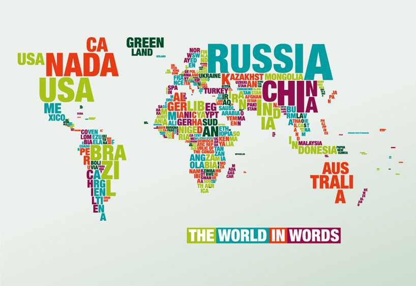
combining the elements of geography and typography, this double-sided poster uses helvetica neue black condensed font to communicate the world in words.
‘typomaps’ by dirk schächter
german designer dirk schächter has created typomaps,which is exactly what it sounds like: a map that combines the elements of geography with typography. the shape and size of the countrys’ names are set to correspond with the respective land mass. to attain a level of likeness that couldn’t be achieved with automatically generated computer program, each letter is carefully handset. dark blue on one side and light blue on the other, the double-sided poster uses helvetica neue black condensed as its font of choice.
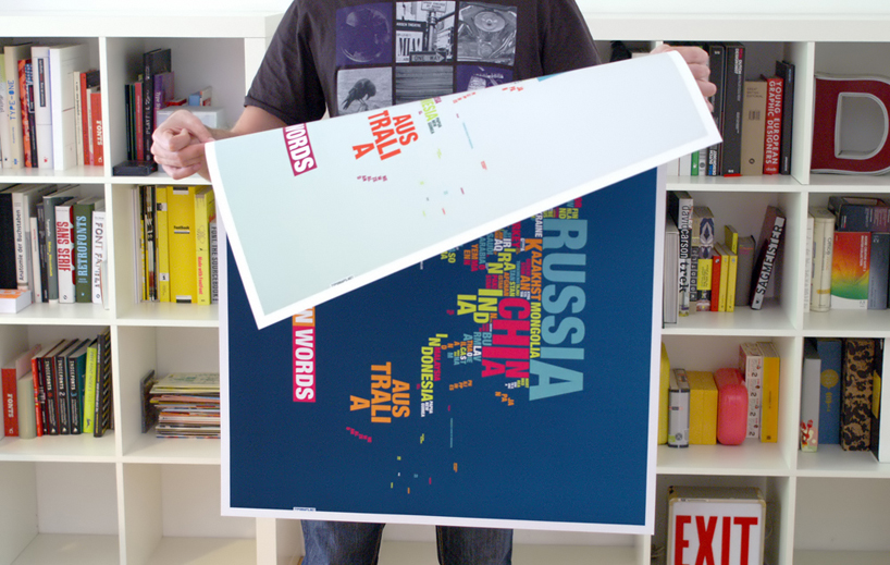 double-sided
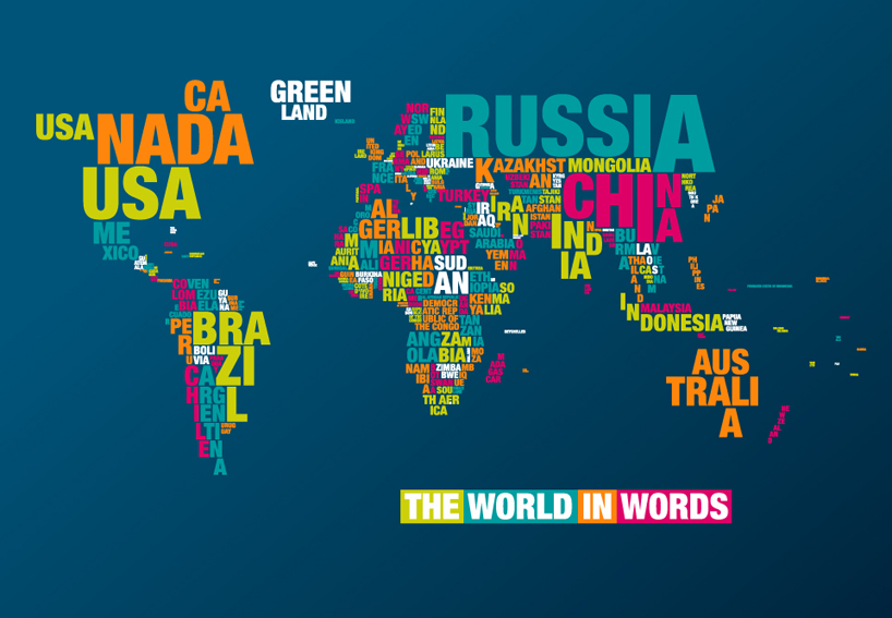 in dark blue
 in light blue
shop
your own online design shop — no sales commission collected