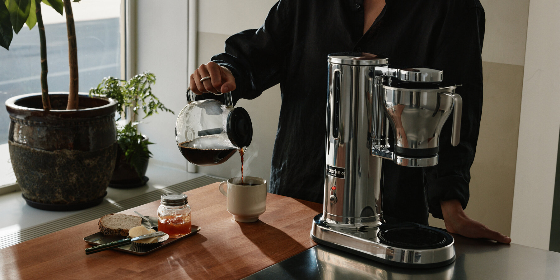
AARKE TRANSFORMS HIDDEN APPLIANCES INTO COUNTERTOP ARTIFACTS
For the sixth feature of Navigators of Design, a 10-part interview series produced with Most Studios, designboom connects with Malin Gäfvert, Creative Director at premium kitchen appliance brand Aarke. Stepping into the digital and physical frontier of contemporary brand building, Malin explores how creative direction transforms everyday objects from functional utilities into elevated lifestyle artifacts. Rather than viewing kitchen appliances as disposable tools to conceal in cabinets, her approach injects worth into mundane daily moments, turning routine tasks into quiet rituals of understated design.
‘Kitchen appliances have traditionally been purely utilitarian and transactional. Aarke started with a simple insight: the kitchen category was overlooked by design, in both form and function,’ opens Malin Gäfvert in the interview. ‘Sparkling water makers used to be bulky plastic pieces you’d rather hide in a cabinet. Our mission was to replace the disposable with the desirable, by making things people really want to have visible in their kitchen — pieces that stand the test of time and withstand the wear and tear of the eye for many years to come.’
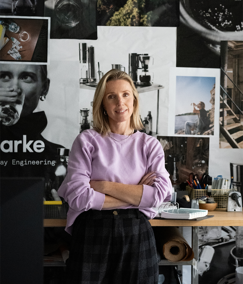
portrait of Malin Gäfvert, Creative Director at premium kitchen appliance brand Aarke | all images © Petter Bäcklund, Frida-M, Malin Gäfvert
INTERSECTION OF PRODUCT DESIGN, INTERIORS, AND FASHION
Founded in 2013 by industrial designers Carl Ljungh and Jonas Groth, Aarke — derived from the Southern Sami word for everyday — was built to refine forgotten home essentials. While the founding team leads the industrial design and product engineering, Malin Gäfvert shapes the intangible ecosystem surrounding the objects, establishing a distinct brand identity that bridges product design, interior space, and fashion imagery.
‘Our visual identity doesn’t have to look like a typical appliance brand. It shouldn’t. I think we are more at the intersection of product design, lifestyle, interior, and fashion,’ Gäfvert notes. ‘One defining decision was building a distinctive identity — an identity with a few cues, repeated consistently, that carry the brand and build recognition. In our storytelling, that shows up as Everyday Engineering: celebrating how Aarke integrates into daily life, not just talking about what the products do and perform, but how they improve your everyday, your lifestyle, your kitchen.’
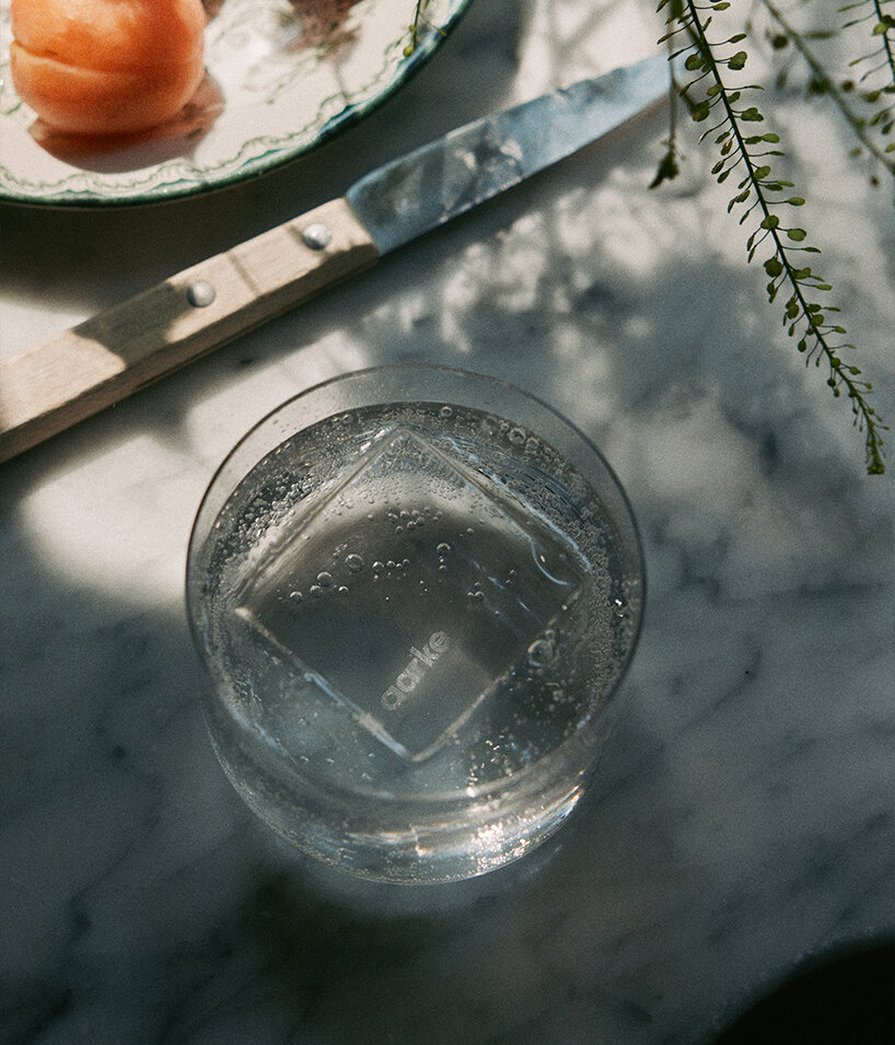
founded in 2013, Aarke was built to refine forgotten home essentials
HOW AARKE BALANCES FORM, FUNCTION AND CULTURAL RESONANCE
Driven by a clear strategic vision, Aarke’s creative direction shifts focus from functionality to deeper meaning. Placing the emphasis on what objects represent rather than just what they do allows the brand to establish a consistent narrative across its entire product collection.
‘We treat the product like a piece of design from day one, rather than as an accessory that gets shoved in a cupboard between uses. In our branding, function became the entry point, not the whole story. We really emphasize how we can inject a sense of worth into the everyday, mundane tasks you do, turning those moments from ordinary to extraordinary by transforming them into small rituals,’ says Malin.
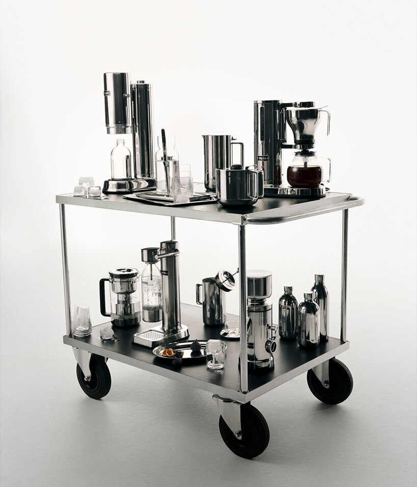
the brand’s identity bridges product design, interior space, and fashion imagery
Aarke’s visuals balance precise product close-ups that highlight materiality and form with dynamic lifestyle imagery. Physical evidence of human interaction brings warmth and context to the design narrative, allowing the brand to create a grounded visual identity free from cold minimalism.
‘Minimalism only feels cold when it’s empty of narrative. Our fix is to balance the more product-close visuals we do, where we focus on design and tactile material, and mix them with visuals that bring in the physical evidence that a human being is present and using the thing,’ declares the creative director. ‘In art direction, that means we favour authentic settings, capturing real moments, shot in ambient light, often on analogue film. It creates a nice contrast between the two visual worlds we’re in: from the precise product-focused engineering to the real everyday moments in the home. That tension, between the engineered and the everyday, is what makes the brand interesting and recognisable.’
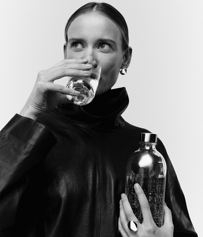
Aarke’s creative direction shifts focus from functionality to deeper meaning
Focusing on daily routines, the brand creates products designed to eliminate minor frustrations and clutter. This user-centered perspective steps away from fast-moving trends, elevating everyday objects through thoughtful storytelling that adapts to seasonal shifts by relying on deliberate tone and timing rather than altering its core identity to fit brief fads. Beyond the physical objects themselves, internal filters ensure that packaging, unboxing, and retail environments mirror this exact design standard, establishing a unified identity across every brand touchpoint.
‘Moments that happen every day deserve better design, because those are the moments people actually live in, repeatedly. They should be free from mess, errors, and bumps,’ concludes Malin Gäfvert. ‘Aarke’s product philosophy: durability, longevity, quality materials, considered design – doesn’t move with trend cycles. But the way we talk about it can flex and adapt: seasonal content, cultural moments, platform-native formats, etc. We can jump on a craze if we think it’s interesting and has something to do with us. And if we do, it happens at the edges, never in the object or the core message.’
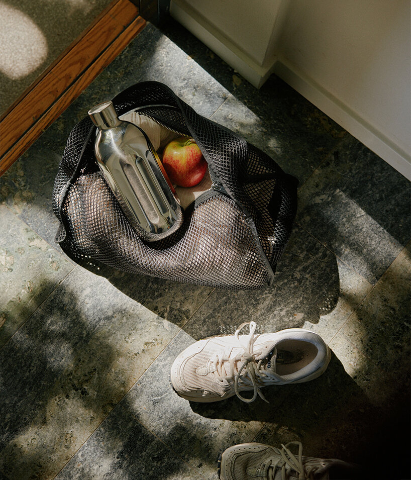
materiality and form combined with dynamic lifestyle imagery
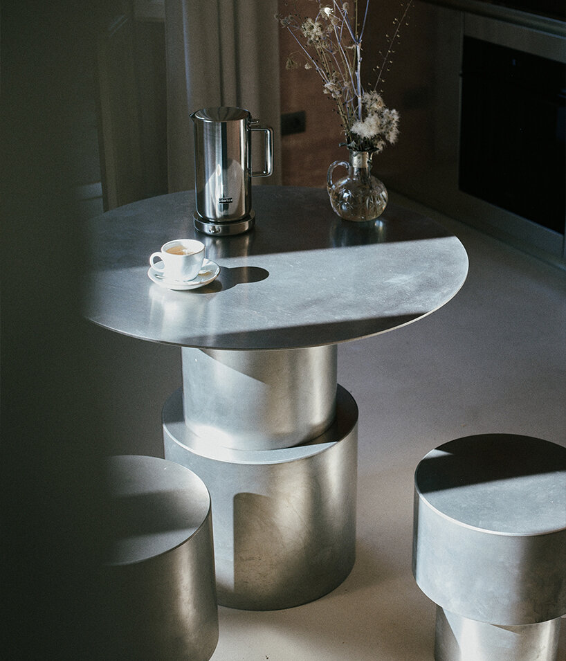
the brand creates products designed to eliminate minor frustrations and clutter
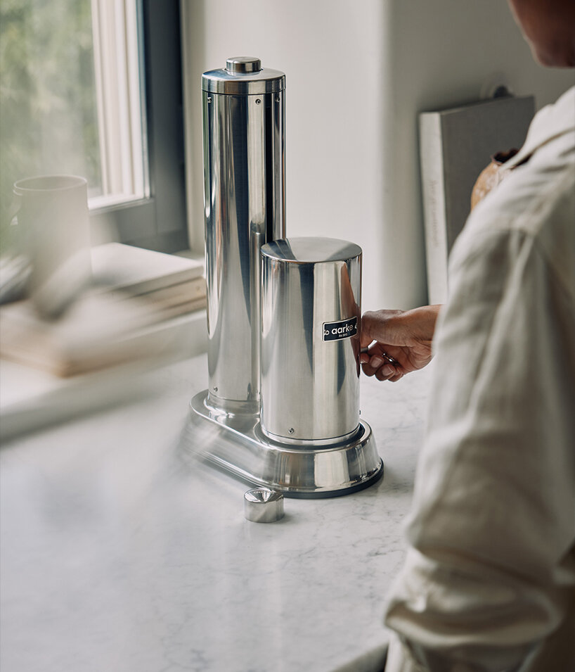
Aarke rethinks objects from functional utilities into elevated lifestyle artifacts
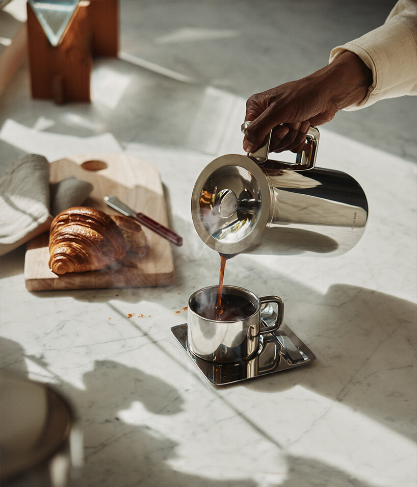
packaging, unboxing, and retail environments mirror this exact design standard
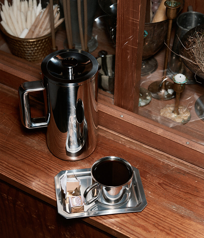
‘Moments that happen every day deserve better design,’ states Malin Gäfvert
project info:
Navigators of Design Series: a collaboration with Most Studios
Design has never changed faster. These are the people navigating that change.
Navigators of Design is a 10-part interview series produced in collaboration between designboom and Most Studios. As the landscape of brand and design evolves at an unprecedented pace, we sit down with the senior leaders — CEOs, Creative Directors, and Heads of Design — shaping the world’s most influential companies.
From rethinking workflows to defining design as a core business differentiator, these conversations provide a platform for the visionaries lifting the industry to new heights.
design interviews (158)
 Sep 15, 2026
 Sep 11, 2026
 Sep 04, 2026
 Sep 03, 2026
 Aug 21, 2026
kitchen design (25)
 Sep 16, 2026
 Aug 27, 2026
 Aug 17, 2026
 Jul 30, 2026
 Apr 15, 2026
Navigators of Design (6)
Sep 04, 2026 Jul 10, 2026
 Jun 26, 2026
 Jun 12, 2026
 May 29, 2026
 Sep 17, 2026
 Sep 15, 2026
 Sep 14, 2026