KEEP UP WITH OUR DAILY AND WEEKLY NEWSLETTERS
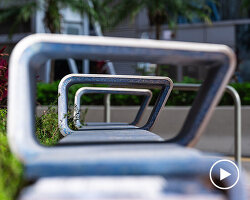
nik bentel studio scales down the lidl supermarket trolley into a stainless steel, wire-frame handbag dubbed the 'trolley bag.'
connections: +330
as designboom evolves into a creative studio, designboom needs a lab senior editor to manage our branded and organic campaigns.
each chair reflects an individual child’s input and imagination.
connections: +920
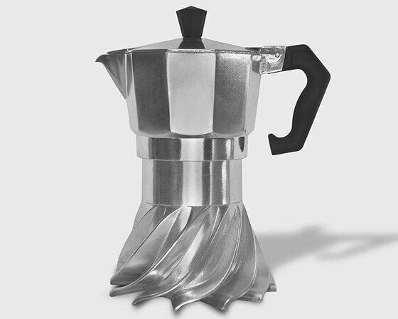
the spiral structure follows principles of fluid dynamics and thermodynamics to optimize heat distribution.
connections: 95
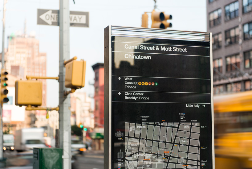
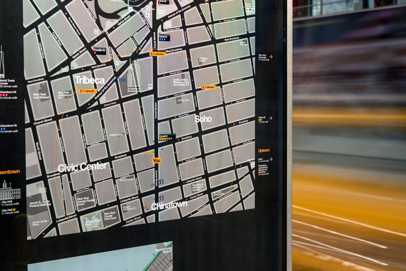
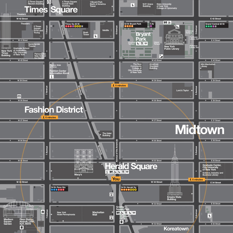
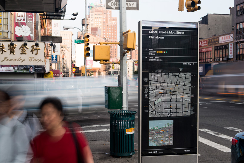 the kiosks present two maps, one of local streets and the other of the area’s location in relation to a larger section of the city.
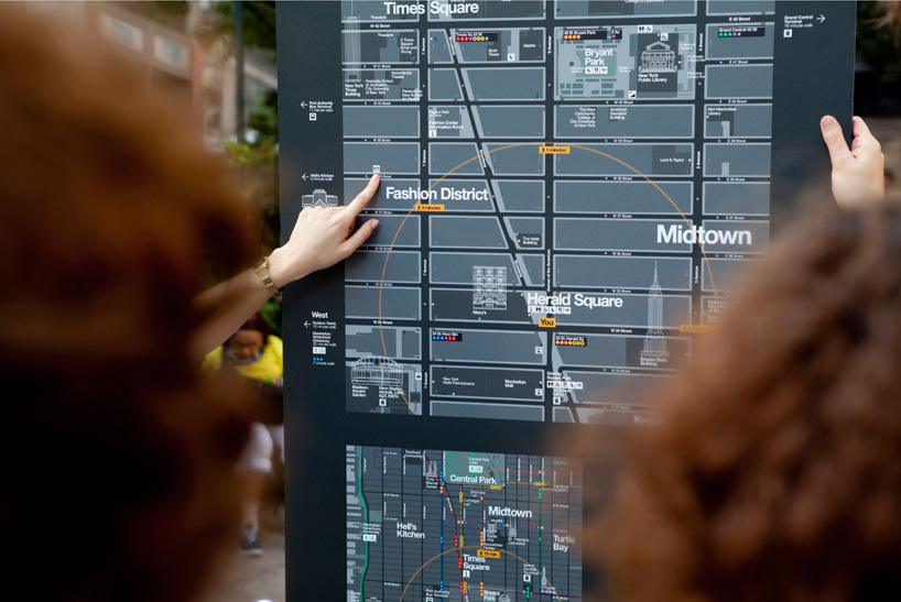 user testing of a prototype.
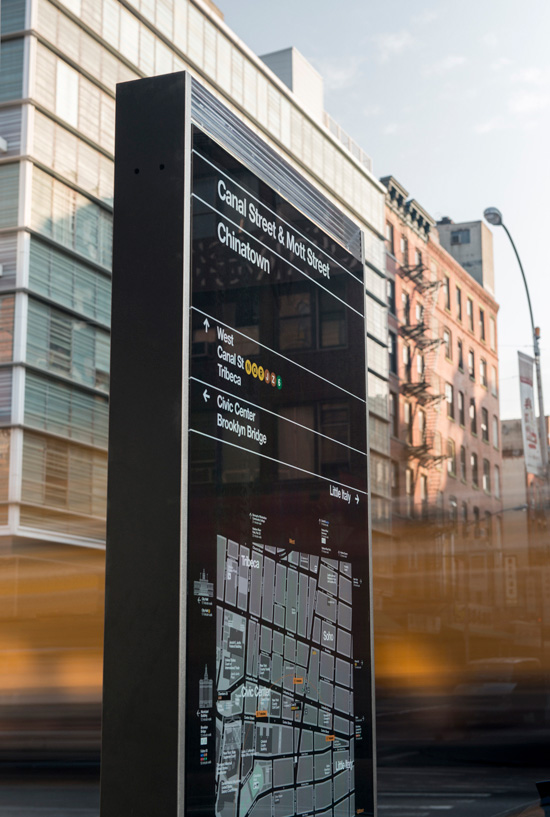 the maps are printed on clear vinyl, which is applied to the second surface of the glass.
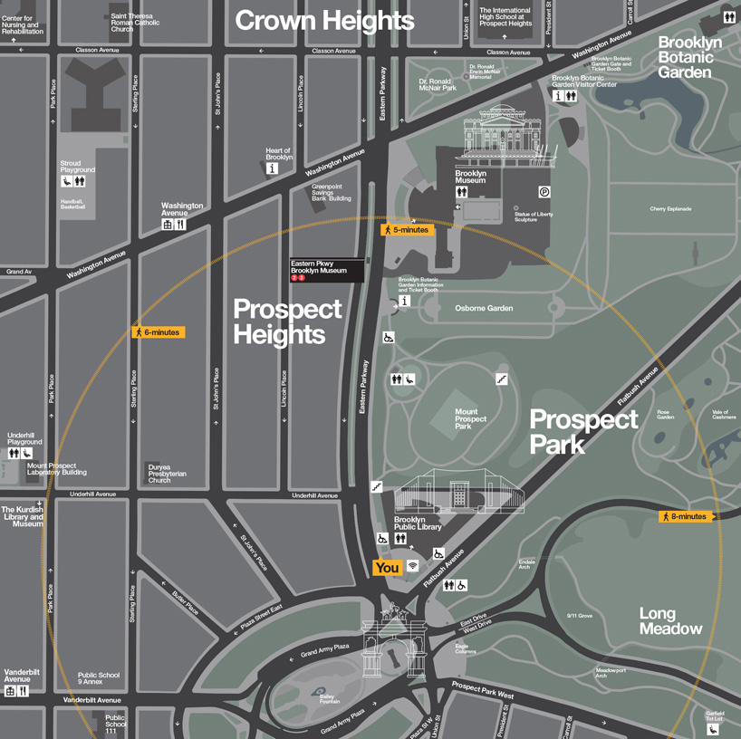
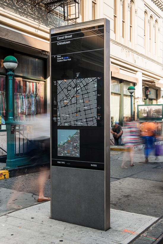 the maps use a ‘heads up’ orientation that corresponds to the direction the user is facing.
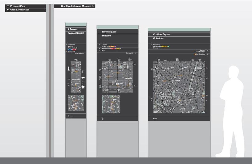 a range of signage types has been developed for different urban environments.
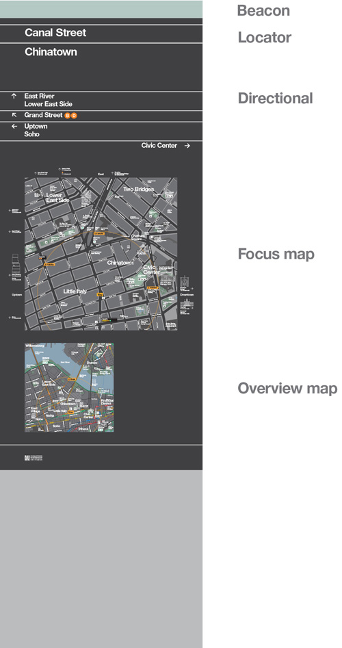 hierarchy of information on a sign.
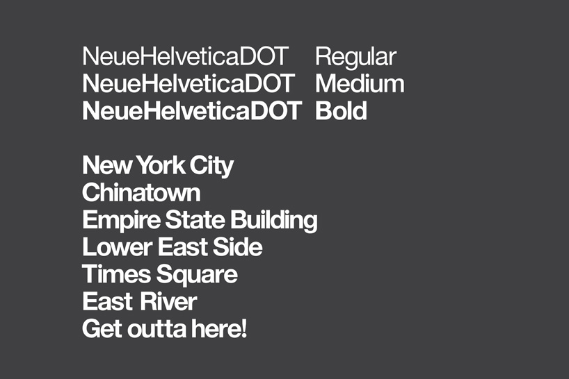 a customized version of helvetica was created for the program…
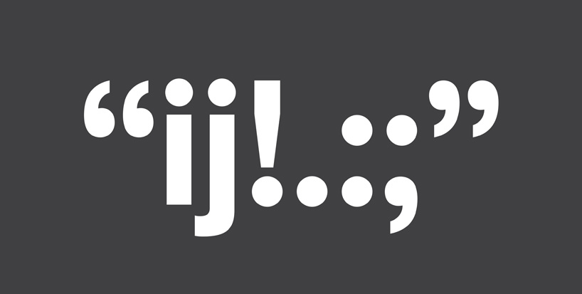 which replaces the square dots of helvetica with round ones.
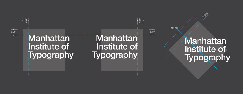 placement of building labels.
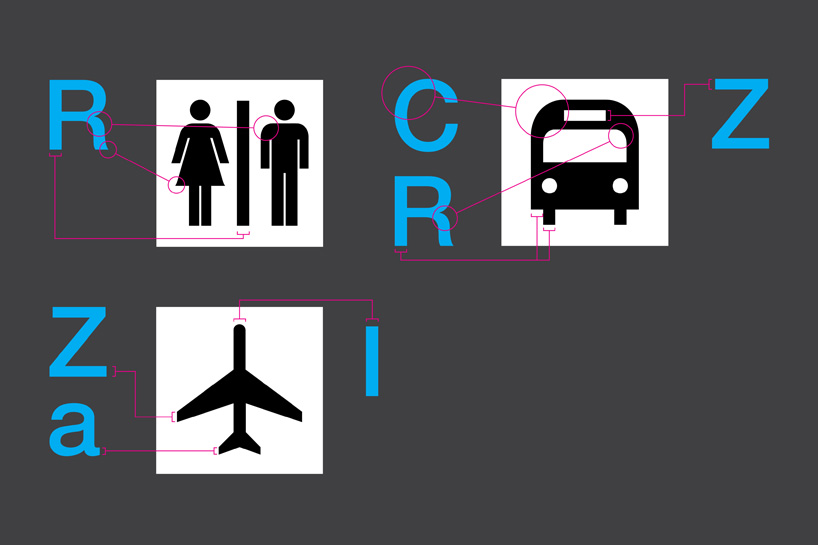 icons designed by pentagram for the program were drawn to match details in 18 pt. helvetica DOT.
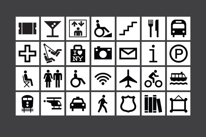 a selection of the new icons.
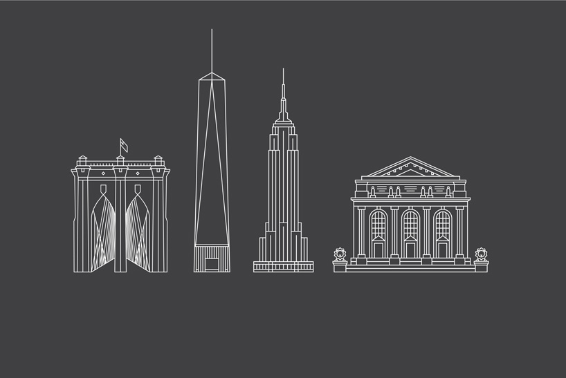 illustrations of landmarks created for the maps.
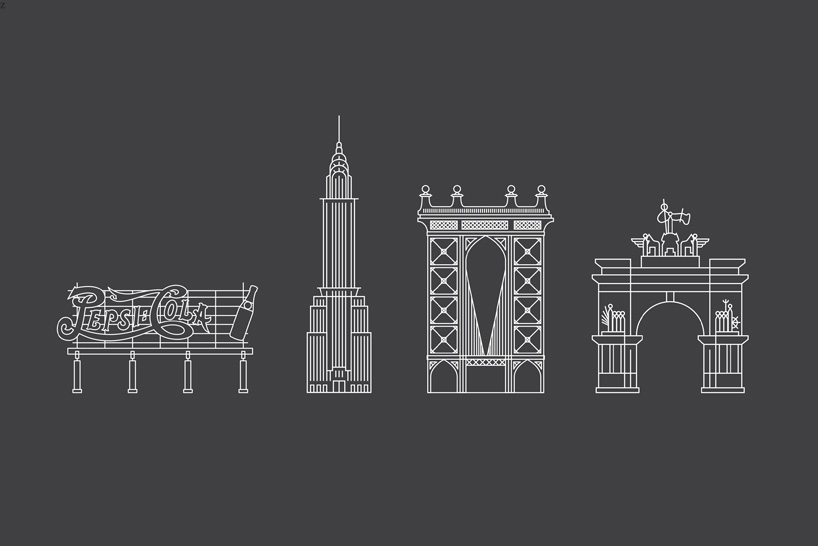 icons for the pepsi-cola sign, the chrysler building, manhattan bridge and the soldiers and sailors memorial arch.
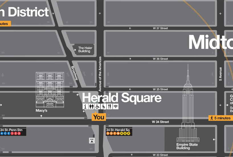 the landmarks are layered into other information on the map. subways are indicated by tabs that resemble station signs.
 ‘you’ icon that locates the user on the map.
 the color palette is inspired by the colors of the city.
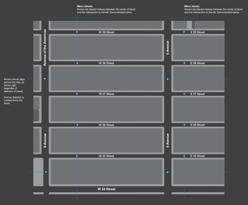 how information is arranged on the maps.
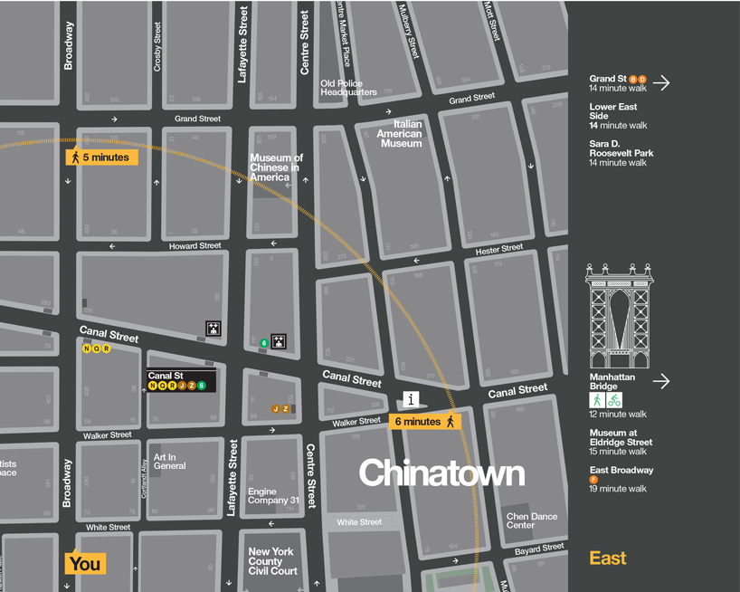 some
some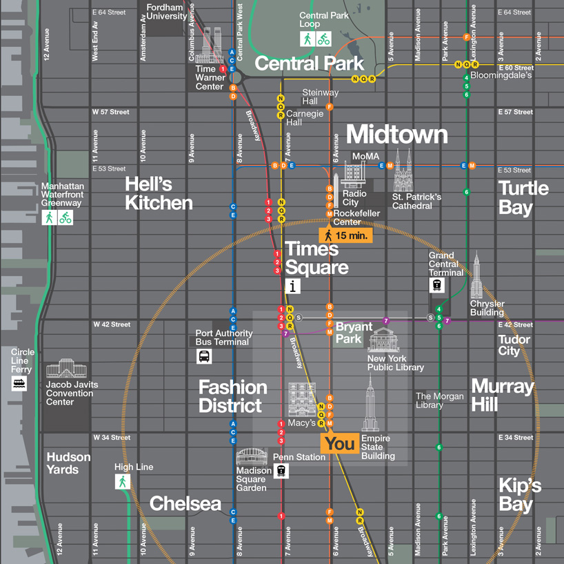
 WalkNYC logo
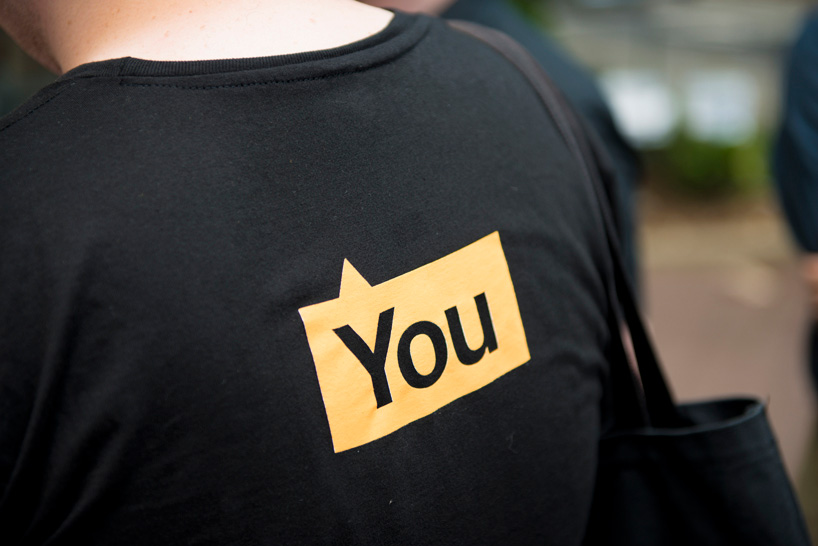 ‘you’ icon on the back of a t-shirt.