kasper-florio interview
we interview larissa kasper and rosario florio of the swiss graphic design studio kasper-florio.
kasper-florio interview
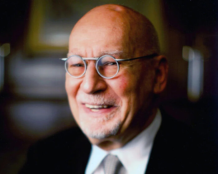
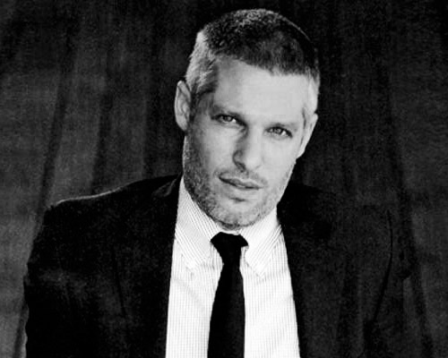
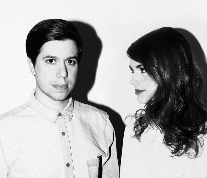
top image: rosario florio and larissa kasper
we talk to larissa kasper and rosario florio of the swiss graphic design studio kasper-florio.
DB: please could you tell us briefly about the evolution of your studio?
KF: we met about twelve years ago while we were doing apprenticeships, rosario as a typographer and larissa as a graphic designer. then we both started studying graphic design in different places and during that time we started collaborating on projects which helped us develop our working process.
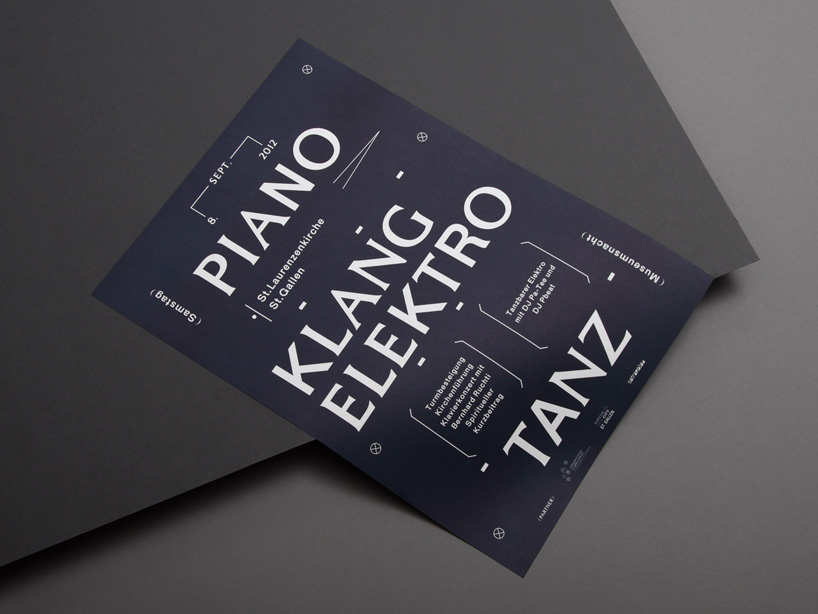
A5 flyer and poster announcing a party playing minimal techno and organ concerts in an old church in st. gallen.
DB: how did you end up working on the type of projects you work on now?
KF: being firmly anchored in the cultural activities in and around st.gallen brought us into contact with interesting people and projects over the past years. as our portfolio and exposure has grown new opportunities have followed such as commissions in austria, germany, italy, england and france.
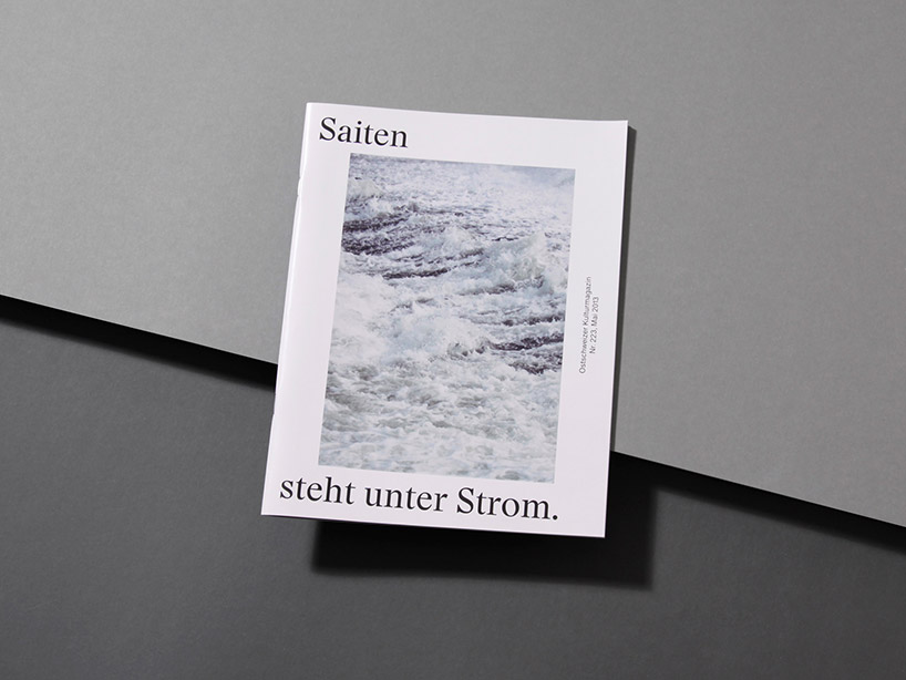
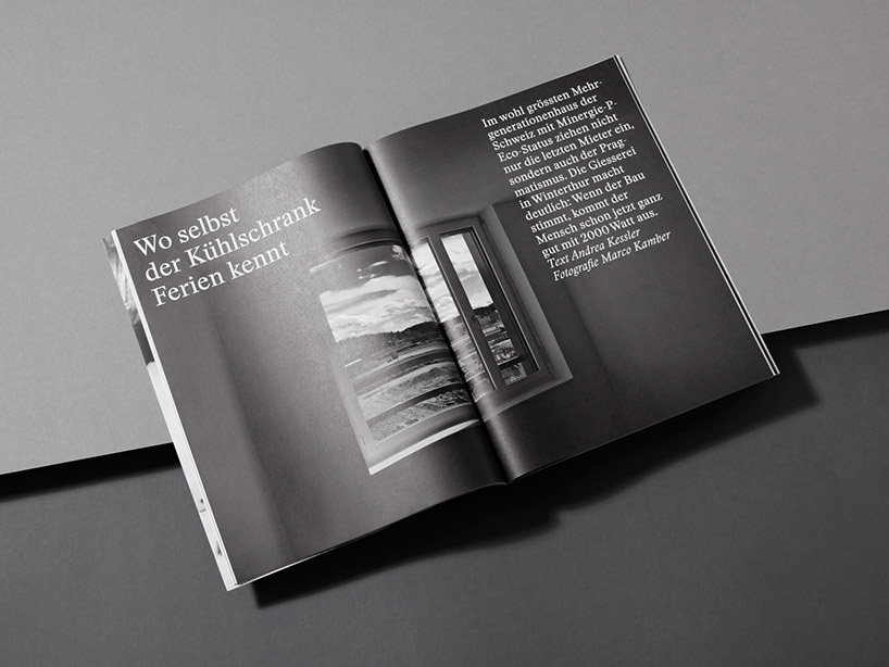
saiten magazine
DB: is kasper-florio just the two of you?
KF: yes, currently it’s the two of us working at our studio but we share a big office space with a couple of friends and fellow designers.
DB: how do you share your workload between each other?
KF: we usually work together right from the beginning of a new project. the starting ritual is set by a big discussion about the problem we have to solve, which hopefully results in finding the right questions and the right solution. it’s always a back and forth between thoughts that join together and lead us to a result.
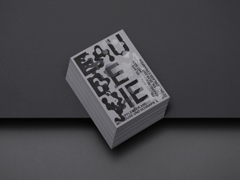
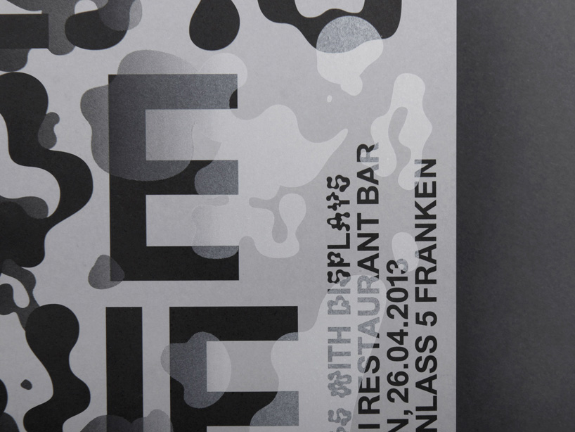
flyer announcing the 6th edition of the ‘eau de vie’ party
DB: how would you describe your work to someone who hasn’t seen it before?
KF: simplicity is an important approach of our work. the abstraction and simplicity of elements, forms and language evoke different associations for every viewer, which we find particularly interesting. we like this very direct yet open way of communication. we put a lot of dedication and diligence in the execution of the typographical layout, which for us should reflect in the quality of a work.
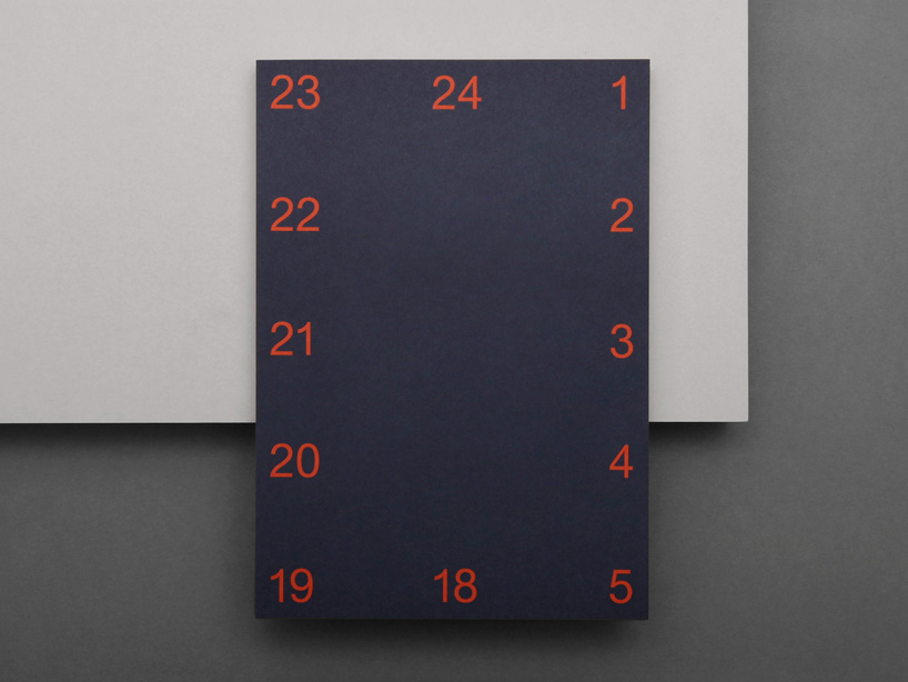
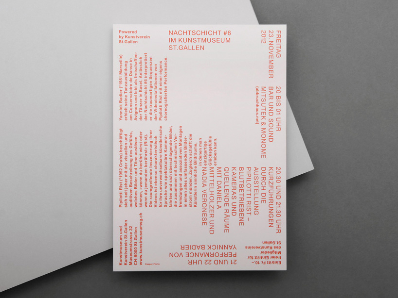
flyer announcing an open night at the st. gallen museum of the arts.
DB: what is the attraction of designing identities for you?
KF: building systems that need to to work across a variety of applications. a system with a simple but clever set of elements and that can produce interesting compositions. like karl gerstner said: ‘the highest amount of constants with the greatest possible variability.’
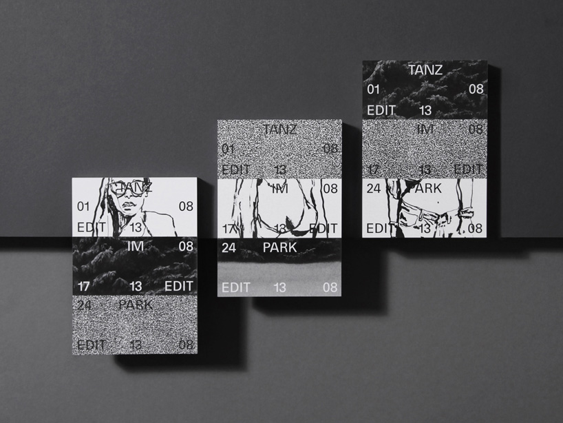
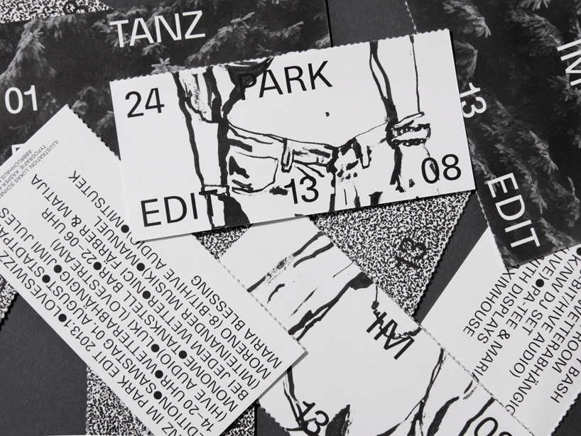
flyer announcing the party series tanz im park.
DB: is there a particular project you’ve worked on that you enjoyed more than others?
KF: most of all the redesign and art direction of the monthly published cultural magazine ‘saiten’, in collaboration with our studio mate samuel bänziger (bänziger hug).
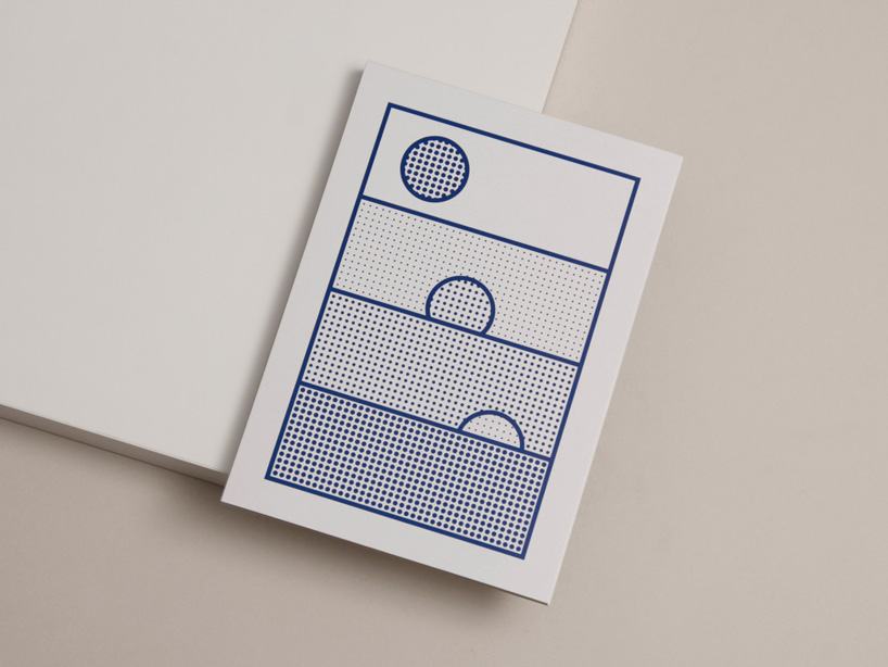
flyer announcing an open night at the st. gallen museum of the arts.
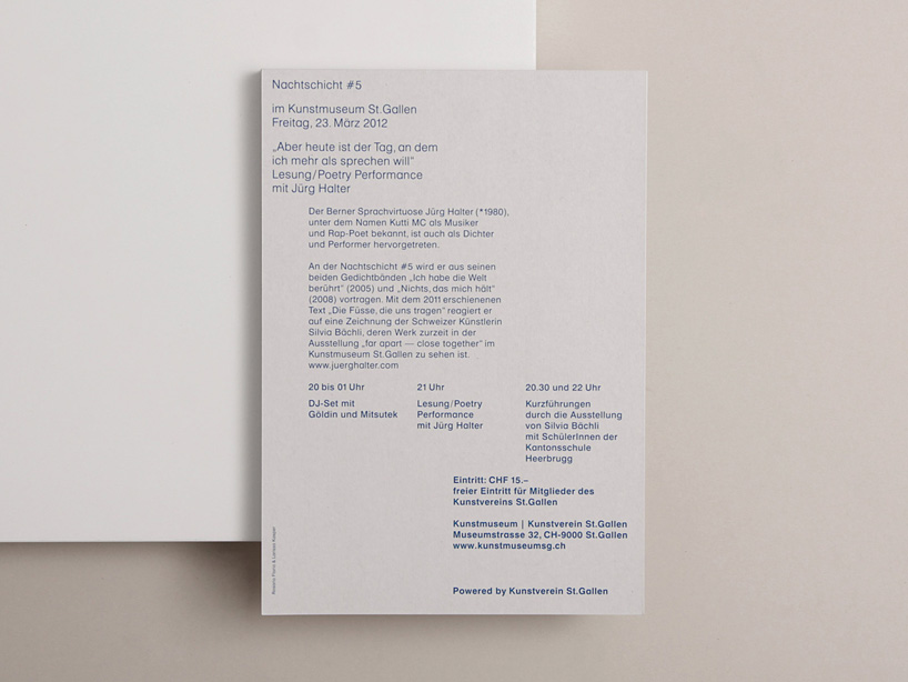
DB: do you prefer print to screen-based work?
KF: it’s always a question of finding the right way and medium to communicate what you need. we’re very intrigued by the physical qualities of the printed matter but at the same time we don’t want to miss the knowledge and possibilities of the digital world and its new ways of communication. screen-based work is part of almost all our projects but mostly as an addition to the printed communication.
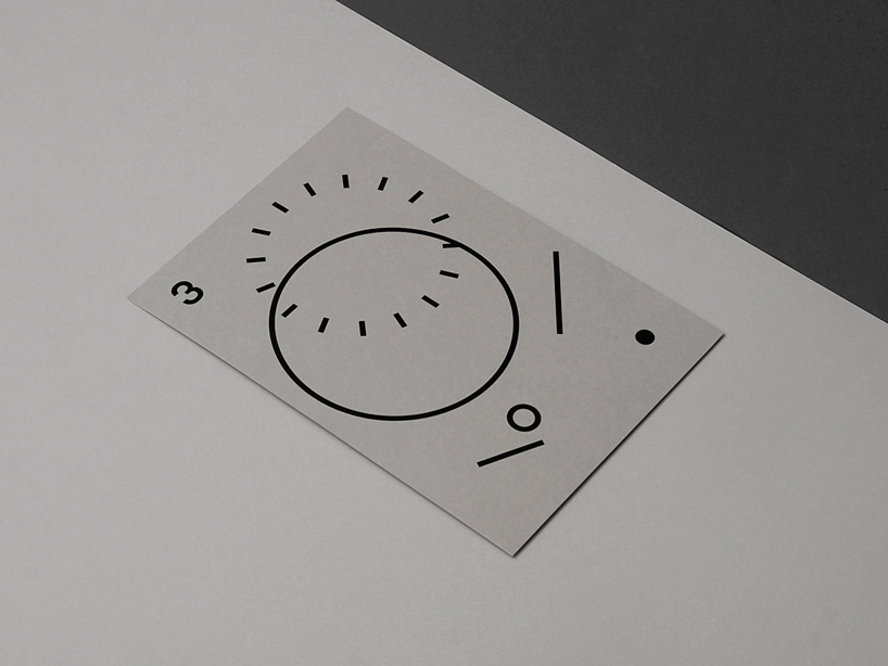
invitation card announcing the 30th birthday of a friend.
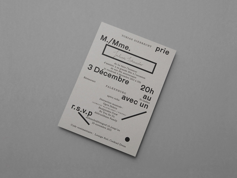
DB: what would be your ideal client or project be?
KF: we like to push our boundaries and develop ourselves and our skills. to do commissioned work with these goals you need an open-minded client with the same ideas and ambitions. any client with those attributes could be the ideal one.
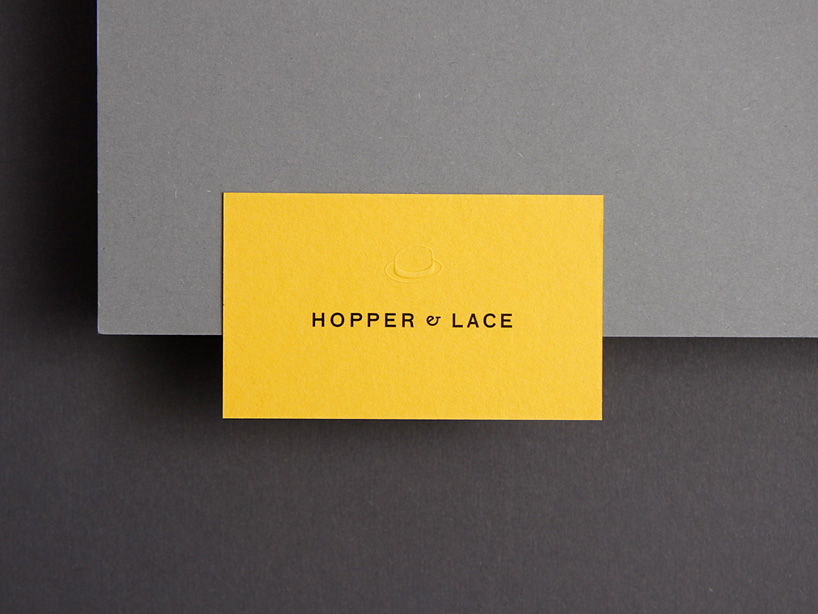
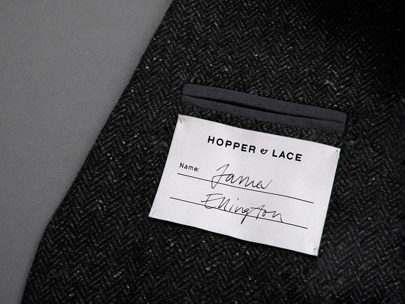
corporate identity for menswear label hopper & lace.
DB: do you think it’s important for a graphic designer to be able to draw?
KF: definitely. while drawing you learn to look really carefully at the things surrounding you and all their details. whether it’s the strange shape of your teachers eyebrows, the coloured pattern of your cat’s fur or the number of petals on a flower. this kind of intense and frequent observation is very important in our work and it increases our curiosity. it may be more about the practice than how good or talented you actually are at drawing. our work is strongly typographic but the ability to draw something to explain yourself is very needful in our collaboration, even if our drawing skills are not amazing.
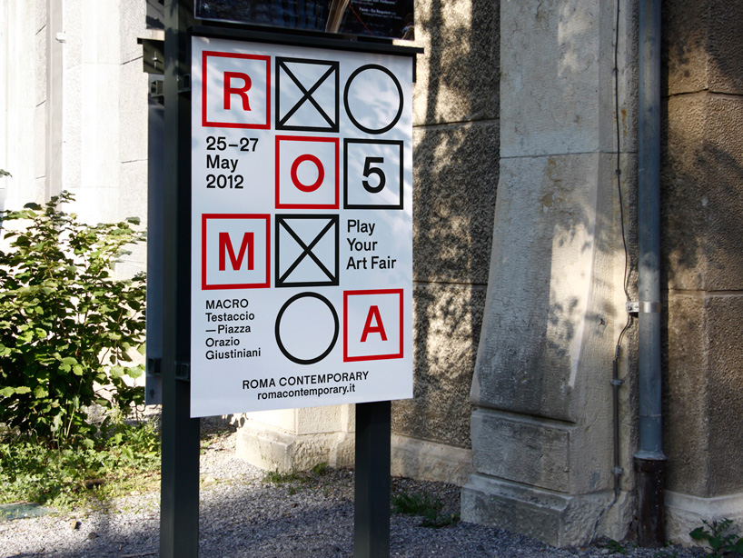
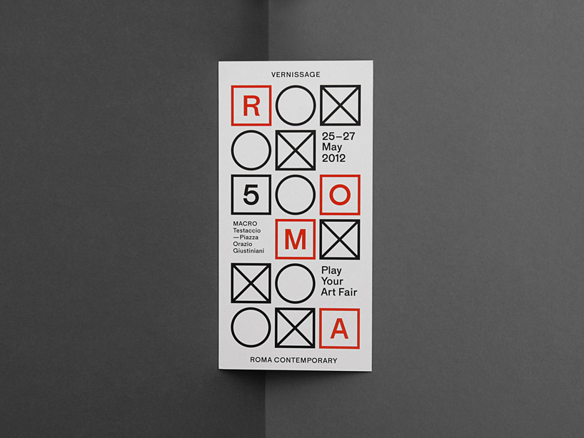
corporate identity the art fair ‘roma contemporary’ in rome, italy.
DB: how do you think the popularity of online design resources has influenced design being produced today?
KF: it has a big influence on contemporary design and its exchange. both in a good and bad way. for young studios like us, located in a really small city, it can provide a good opportunity to reach a lot of people worldwide and in the best way being seen by potential clients. one of our biggest commissions happened through the publication of our work in an online journal. it can encourage you and make you aware of the wide and versatile development of design history, but it can also narrow your search for new and original solutions.
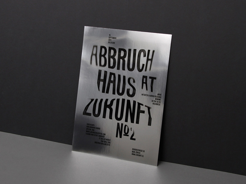
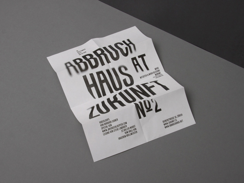
flyer announcing a party at the club zukunft in zurich, using kasper-florio’s typeface ‘kasparov’.
DB: besides design, what are you passionate about?
KF: language; reading and talking.
music; listening and DJing.
art; exploring and wondering.
movies; watching and falling asleep.
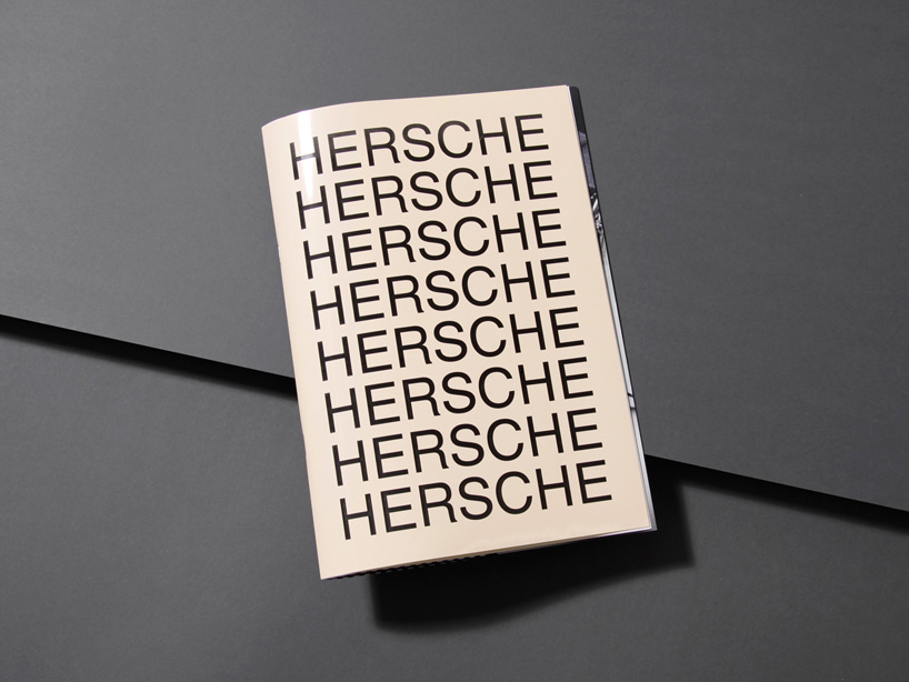
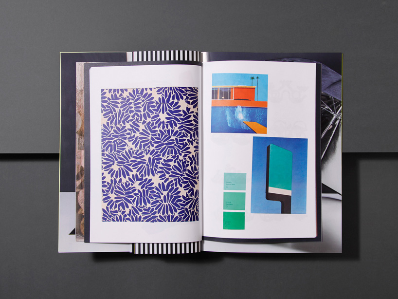
documentation journal for the spring summer 2014 collection of christian hersche.
DB: what is the best piece of advice you have ever been given?
KF: you should do it in black and white.
DB: what is the worst piece of advice you have ever been given?
KF: did you try it in that friendly tone of pink yet?
shop
your own online design shop — no sales commission collected