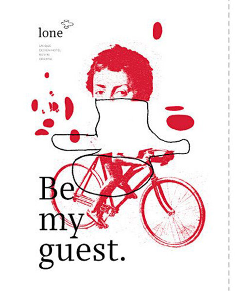
bruketa&zinic om: visual identity of hotel lone
based on the form and volume of the public spaces, the logo and illustrations communicate the atmosphere and intent of the newly opened modern hotel.
[FEATURED]
‘visual identity for lone hotel’ by bruketa&zinic om advertising agency
all images coutesy of burketa&zinic
croatian advertising agency bruketa&zinic om has created a visual identity for ‘hotel lone’ designed by
croatia-based architecture studio 3lhd. the graphics are based on the communal space located in the center of the complex.
the main facilities, stretching the height of the building, all branch out of the core, making it the ‘heart’ of the hotel.
the vast internal volume was studied from different angles and abstracted to create the logo.
croatia-based architecture studio 3lhd. the graphics are based on the communal space located in the center of the complex.
the main facilities, stretching the height of the building, all branch out of the core, making it the ‘heart’ of the hotel.
the vast internal volume was studied from different angles and abstracted to create the logo.
the two dimensional symbol was applied to a series of twelve fragmented illustrations which, when combined,
stretch eight meters in length. the images portray the abstracted icon in its many potential interpretations,
whether it be a vase, a deer head, or a log. the strategic use of color, combined with the layering of graphic content
and technique conveys the atmosphere of the project and is a representation of the art and design present in the
eastern european community.
stretch eight meters in length. the images portray the abstracted icon in its many potential interpretations,
whether it be a vase, a deer head, or a log. the strategic use of color, combined with the layering of graphic content
and technique conveys the atmosphere of the project and is a representation of the art and design present in the
eastern european community.
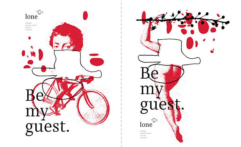
logo combined with visuals
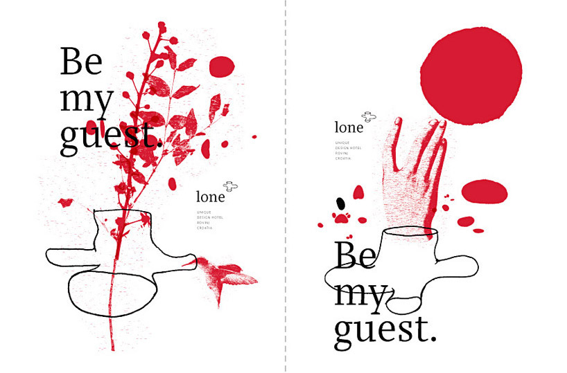
examples of graphics
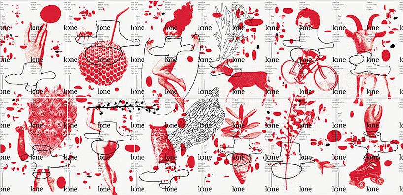
all the graphics used around the hotel combine to create one complete image

stationary

door handle sign

menus

cup tops and messages incorporating logo
video by bruketa&zinic om
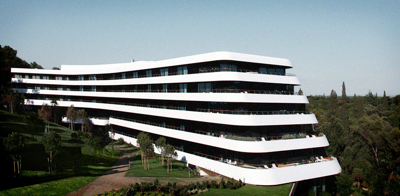
facade of hotel lone

info-graphics incorporated into structure

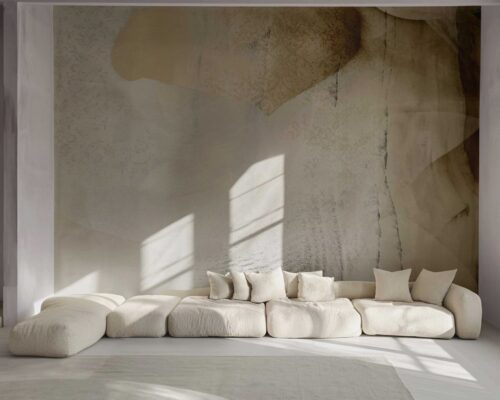
the lobby space was the inspiration for the logo and visuals

the shape volume of the ‘heart’ of the hotel
designboom has received this project from our ‘DIY submissions’ feature, where we welcome our readers to submit their own work for publication.
shop
your own online design shop — no sales commission collected