BVD: apotek hjärtat
a new graphic identity for a swedish pharmacy that creates a balance between knowledge, credibility, cordiality and service.
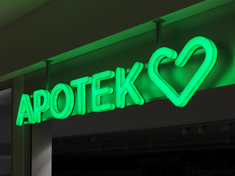
identity and signage
bvd has created a new graphic identity for apotek hjärtat, the largest independent actor on the swedish pharmacy market which was deregulated in 2009 after being a government owned monopoly. the graphic design was applied to different identity carriers as store concept, website, packaging design for their own series, bags, printed matters, exterior signage, posters, receipts etc.
the challenge was to build a completely new brand from nothing and launch it on a mature market. the aim was to find a balance between knowledge and credibility on one hand, and cordiality and service on the other. the green traffic-light iconic heart symbol is unique because of its opening in the centre and gives a feeling of openness and welcome. it was created to win the heart of the swedish people.
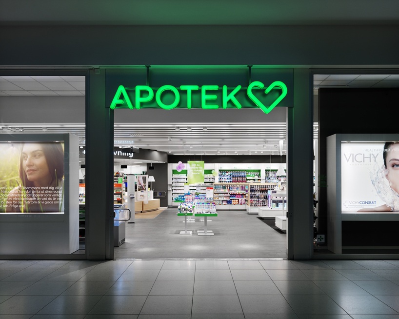 retail concept
 retail concept
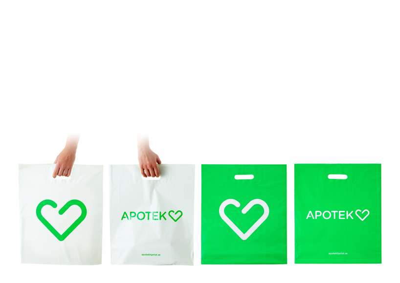 bags
bags
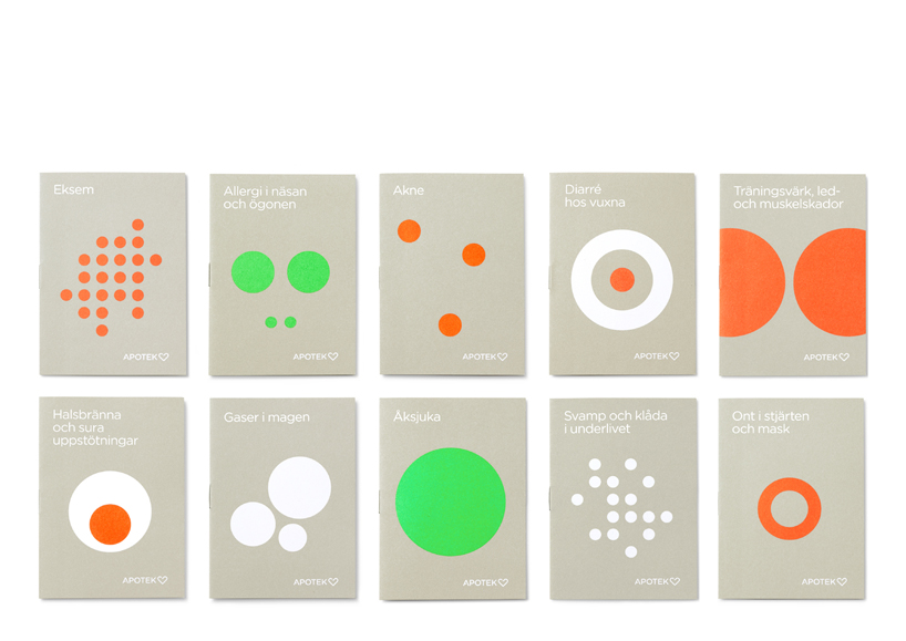 brochures physical malfunction
 pictograms
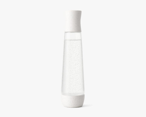
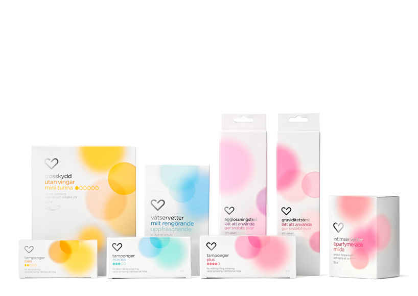 own brand products
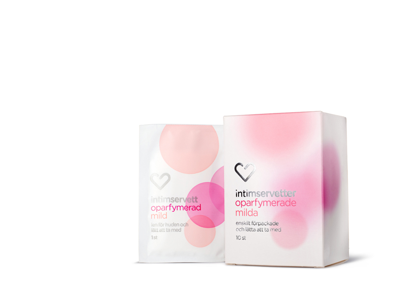 own brand products
 own brand products
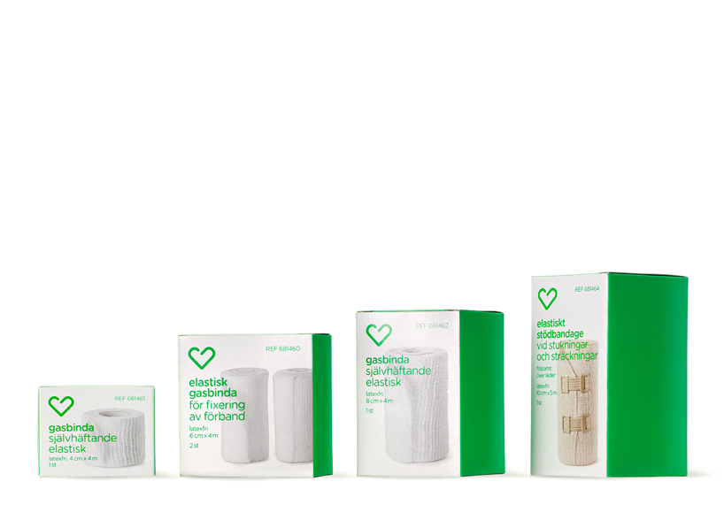 own brand products, medical consumer goods
http://www.facebook.com/bvd.se
designboom has received this project from our ‘DIY submissions’ feature, where we welcome our readers to submit their own work for publication. see more project submissions from our readers here
shop
your own online design shop — no sales commission collected