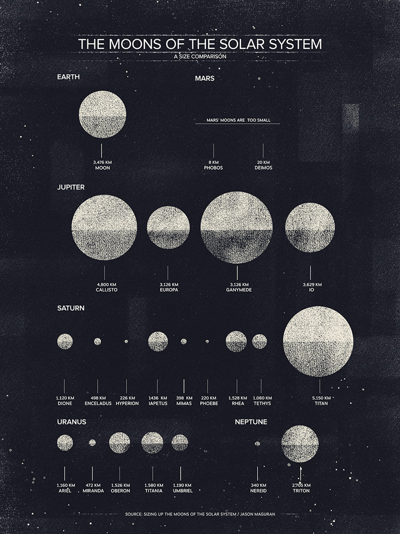
data + design project: the bubble charts of march
an on-going collaboration with designers and illustrators to create visual data and news to showcase how beautiful statistics can be.
dan matutina www.twistedfork.me
as an offshoot of column five media, we are ardent supporters of the union between data and design, so in february we started curating the data + design project gallery as a way to show how flexible and beautiful data visualizations can actually be. each month, a few designers are invited to create a data visualization piece, using data about a subject which interests them. last month the theme was bubble charts, a style of graphics which plots data using points of varying sizes and locations to visually represent a value. we’re very excited about the beautiful, interesting and informative results we’ve received from this months designers: dan matutina, matt naylor, nate luetkehans and matt chase. check out the designs contributed for "bubble chart march" below, then see the main data + design project page for full-sized versions. you can always find the project through the link on our menu bar. http://www.visualnews.com/2012/04/17/data-design-project-the-bubble-charts-of-march/
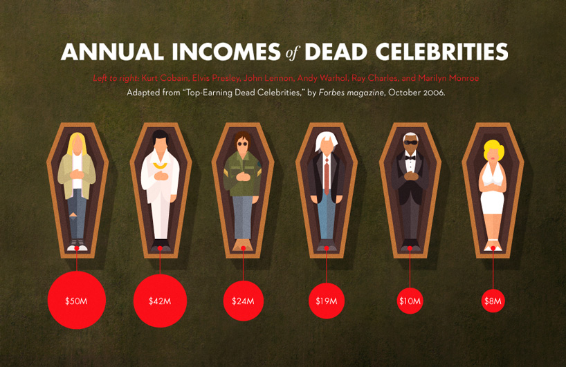 matt naylor www.matt-naylor.com
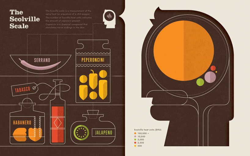 nate luetkehans www.nateluetkehans.com
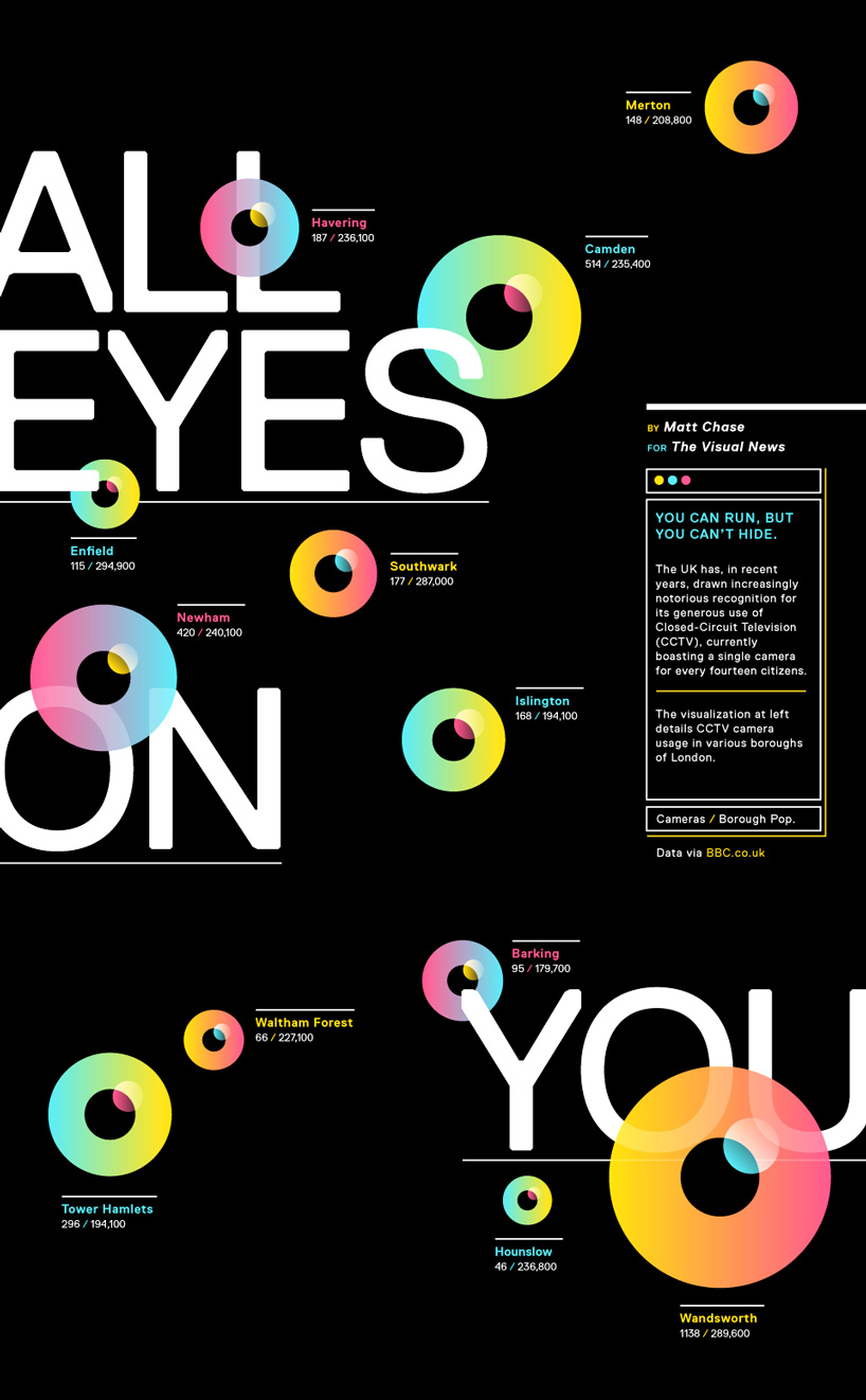 matt chase www.chasematt.com
http://www.visualnews.com/2012/04/17/data-design-project-the-bubble-charts-of-march/
designboom has received this project from our ‘DIY submissions’ feature, where we welcome our readers to submit their own work for publication. see more project submissions from our readers here
shop
your own online design shop — no sales commission collected