reachin’ identity by karoshi
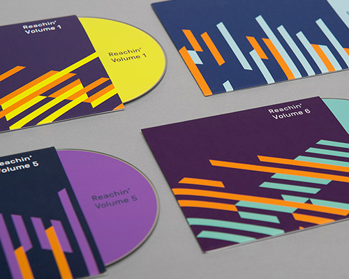
karoshi have designed this bold identity for reachin’ – a fundraising event in aid of myeloma UK.
karoshi have designed the identity for reachin’ – a fundraising event in aid of myeloma UK. reachin’ is hosted at the turner contemporary in margate and the new identity drew inspiration from the venue architecture by david chipperfield. myeloma UK’s primary orange features as a constant ‘hero color’ to reference the charity and is paired with a unique event palette. the identity has been applied to on and off-line marketing collateral, event graphics, projection animations and merchandise.
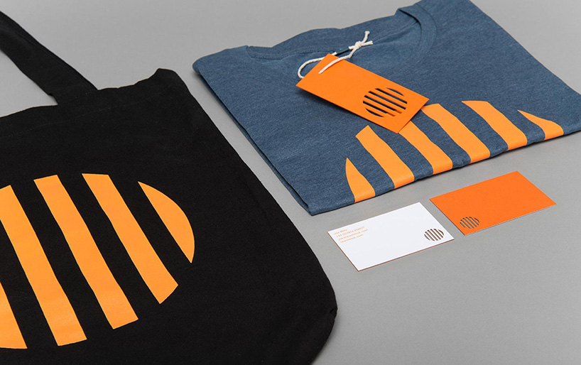
various applications of the identity

reachin’ logo
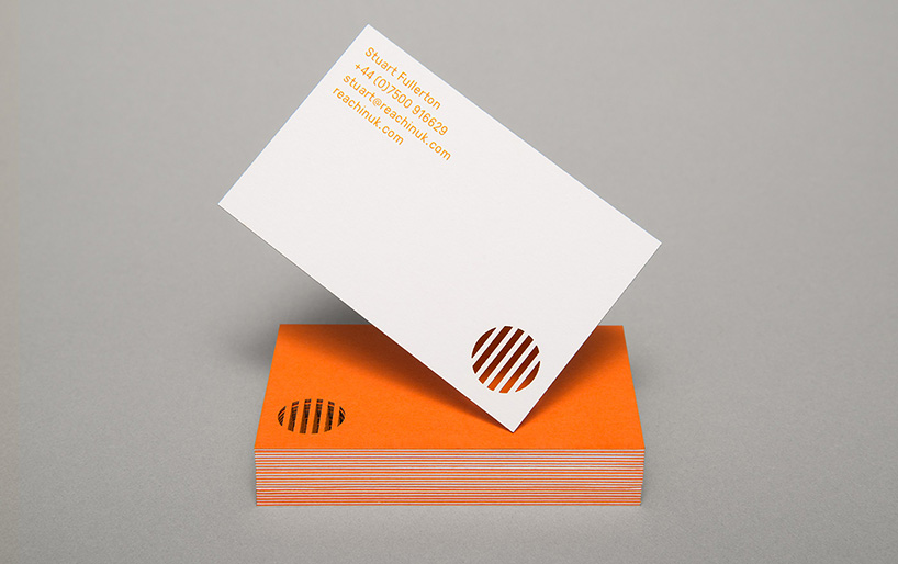
business cards
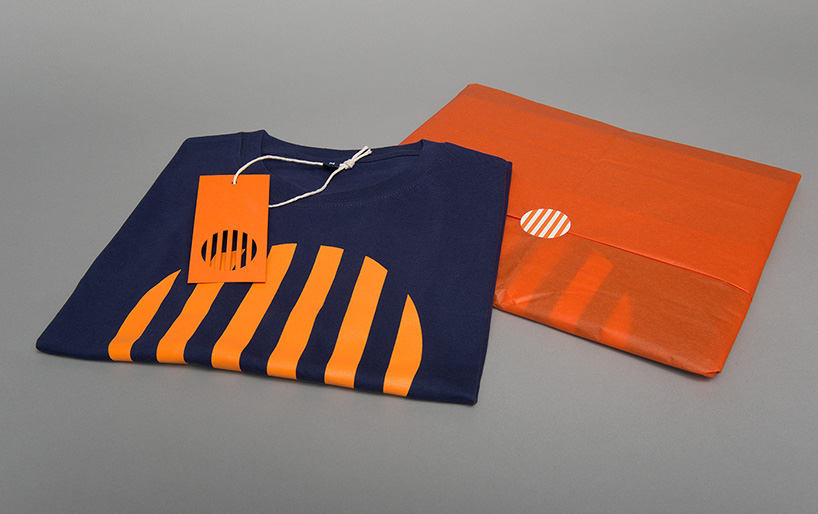
t-shirts
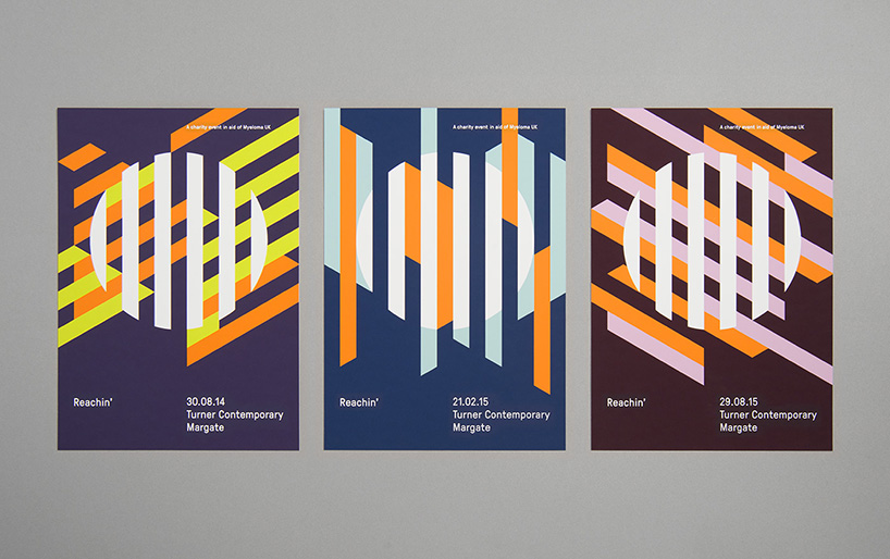
flyers
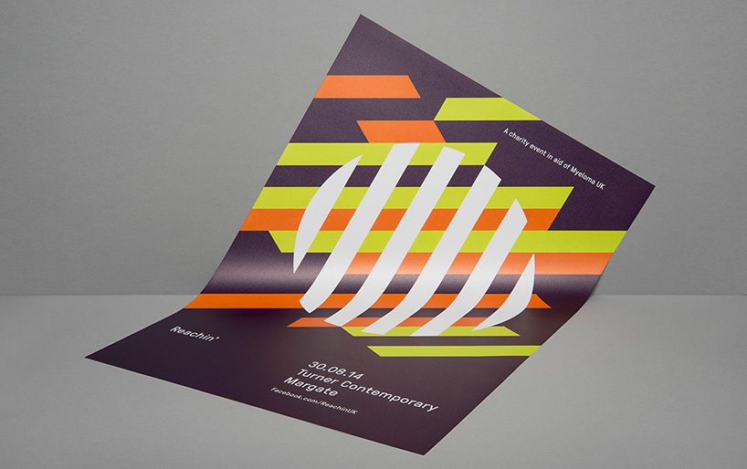
poster
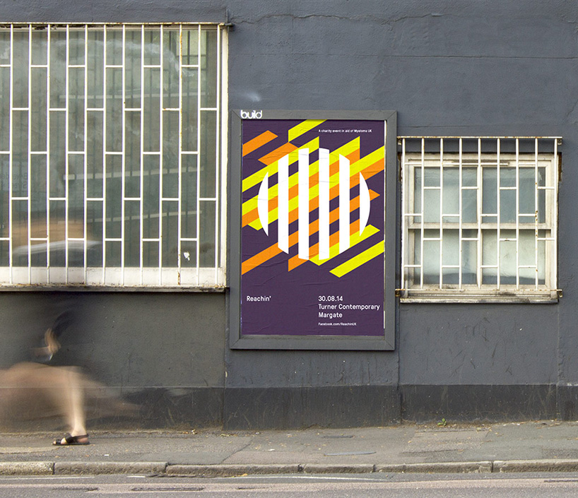
poster
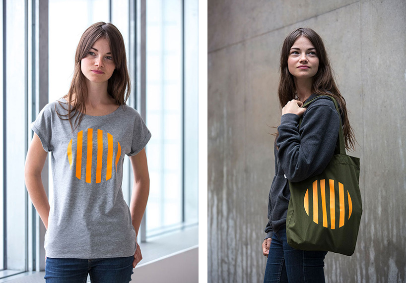
t-shirt and bag