brinkworth collaborates with michael marriott to design bird restaurant in london
the second edition of bird has a playful use of materials and glowing neon signs juxtaposed against rough urban materials and an exposed old interior.
prefer designboom on google
brinkworth collaborates with michael marriott to design bird restaurant in london
all images courtesy of brinkworth
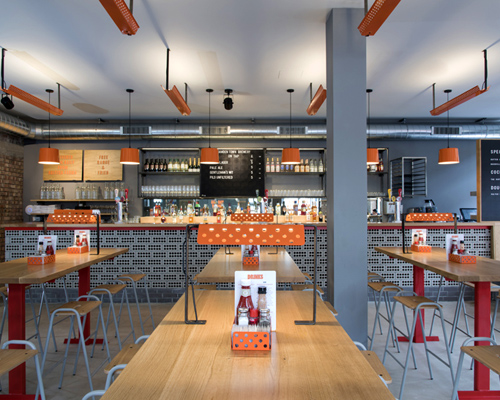
located within a classic 1930’s pub in north london, designer michael marriott has collaborated with brinkworth to design the second BIRD restaurant. the team followed the ‘free range fried’ ethos developed by the founders, found in the food, identity and graphic design. intense colors, playful use of materials and glowing neon signs are juxtaposed against rough urban materials, emphasizing the concept.
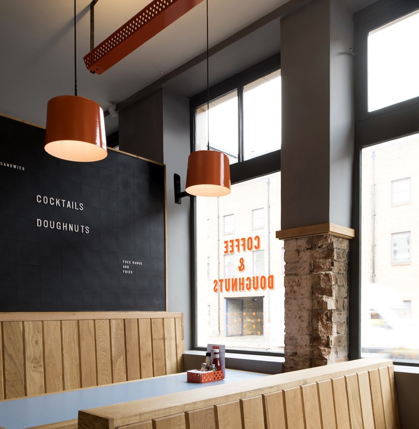
the blue formica branded table-tops are set between the oak banquette seating
stripping back the old interiors exposed an unexpected delight that became the key to the overall design. michael marriott says, ‘the patchy, mismatched brick wall to the rear of the space was a perfectly contrasting backdrop to the bright white neon bird logo. the brick adds a rich layer of texture and life to the venue.’
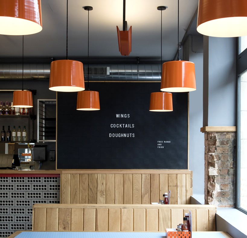
new materials were introduced to the original palette include
new materials were introduced to contrast with the original ones like perforated grey bricks that formed the bar while following the dotted pattern of the brand. blue-formica branded tabletops were placed between oak banquette seating, an arrangement that had in mind the customers that often come after football matches, thanks to the proximity of the restaurant to the stadium.
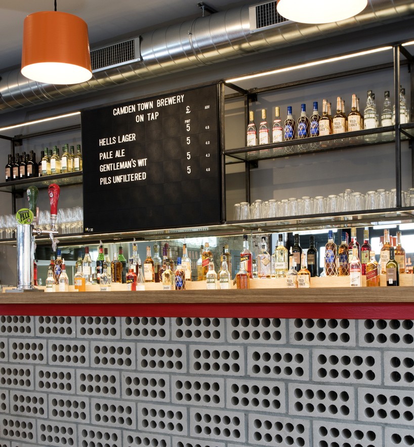
perforated grey bricks form the main bar continuing with the graphical dotted patterns seen throughout the design
sonny cant, director at brinkworth says, ‘it was a great process, working together with michael on the product development and prototyping for the new tables and lights. we have dialed up the use of the signature orange perforated steel, coupled with the new perforated brick, to create a strong brand aesthetic across the whole space.’
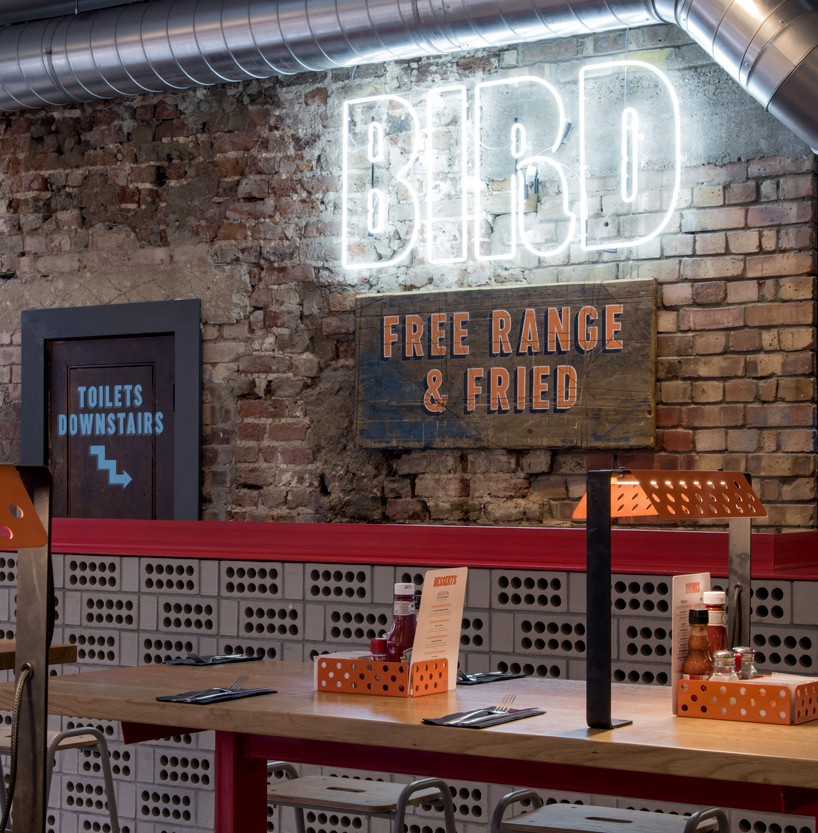
the mismatched brick wall is a perfectly contrasting backdrop to the bright white neon BIRD logo
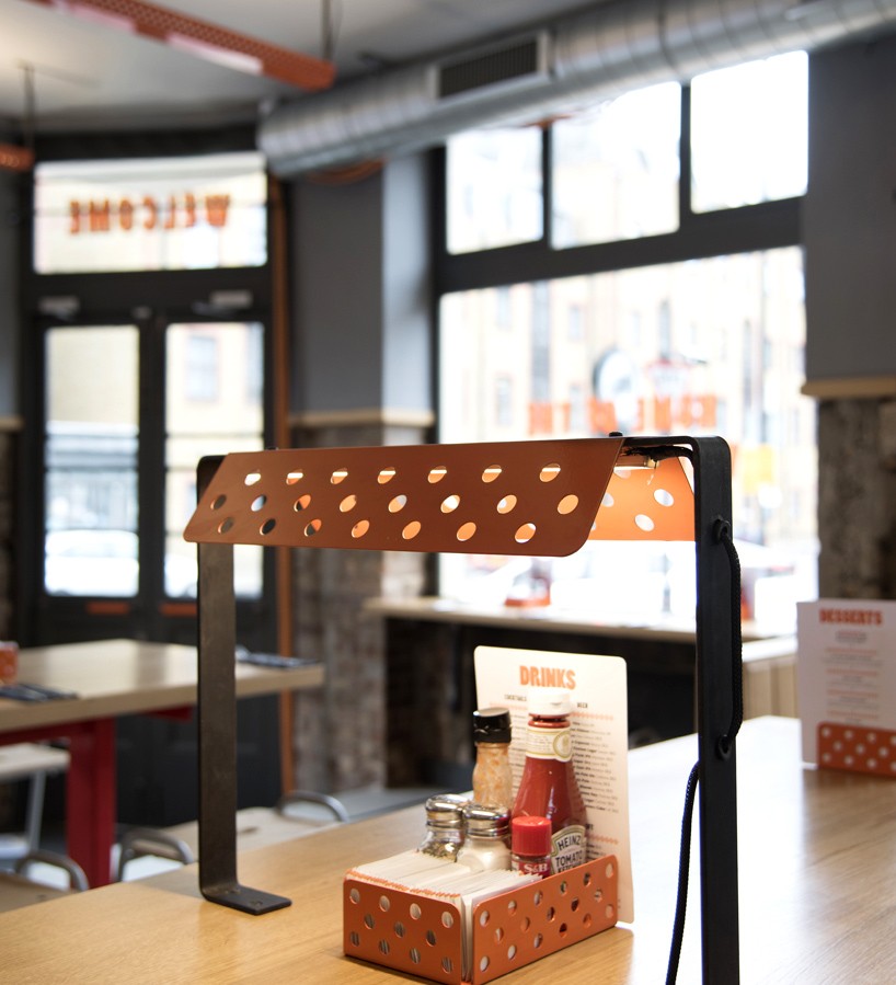
brinkworth worked with michael on the product development and prototyping for the new tables and lights
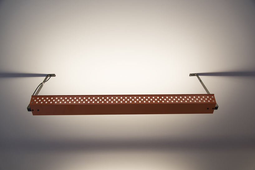
the signature orange perforated steel creates a strong overall brand aesthetic
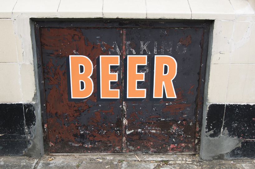
the façade has been restored to reveal the original architecture and then overlaid with crisp sign writing

the branding of the restaurant has been juxtaposed against urban materials
designboom has received this project from our ‘DIY submissions‘ feature, where we welcome our readers to submit their own work for publication. see more project submissions from our readers here.