hubert roguski reimagines modern cities with retro maps
rogeski uses mellow creams, bright reds and 70s patterns to recreate modern cities with an old-timey feel.
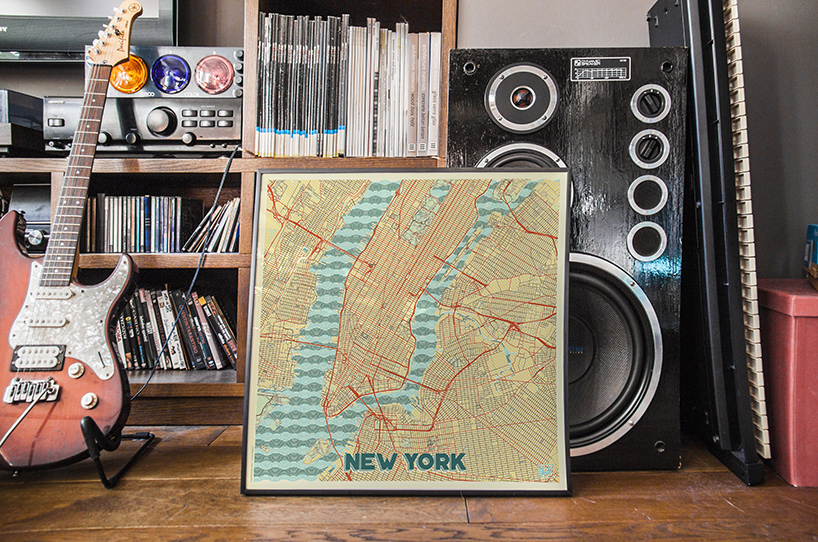
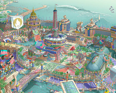
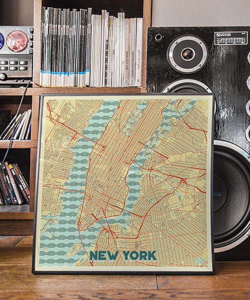
blisteringly intricate, the maps of architect and graphic designer hubert roguski look at contemporary cities with old eyes. recreating modern day maps as retro posters, roguski’s guides aim to alter the way we think about the urban space around us.
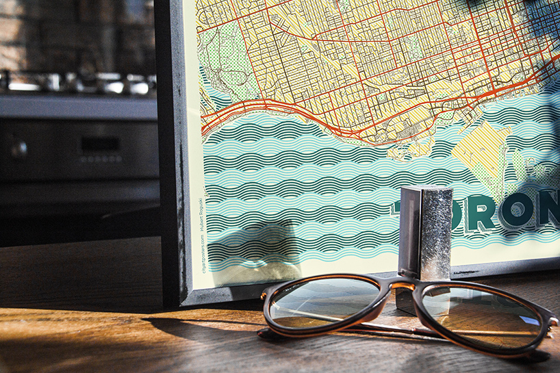 blisteringly intricate, the maps looks at modern cities with older eyes
‘each layer is carefully selected patterned and a particular color is picked for it. firstly all colors are based on a retro style color palette. all colors together gives an amazing juxtaposition that reminds of some old style posters,’ says roguski. each street, alley and park is painstakingly outlined with its own old-timey hue. the maps make use of worn creams, vibrant reds and a wave pattern straight from the 70s to create that feeling of a map found hidden in grandad’s glove compartment.
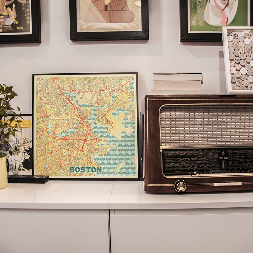 roguski hopes to alter the way we think about the urban spaces we live in
hubert roguski began making maps during his studies in tokyo, where he was tasked with documenting the streets of world cities as part of his research. his creative side found cartography to be a stimulating creative pursuit, and compelled him to treat maps as abstract pieces of work — not representative of streets or paths but simply lines and colors in and of themselves. recently his work in the field has become more advanced, as he mixes patterns, color sets and moods as he strives to create a map that does more than just show the way. ‘there are much more details in this design, including background, street details and edges of each layer are separately designed,’ he says. ‘I used to make map posters but this time, it’s different.’
roguski’s retro posters are available to purchase at cityartposters.com
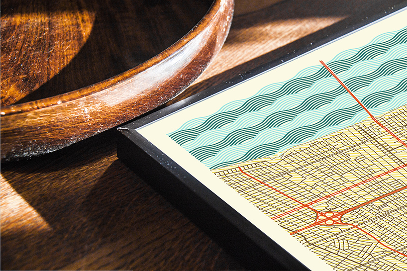
each layers has a carefully selected pattern and particular colour
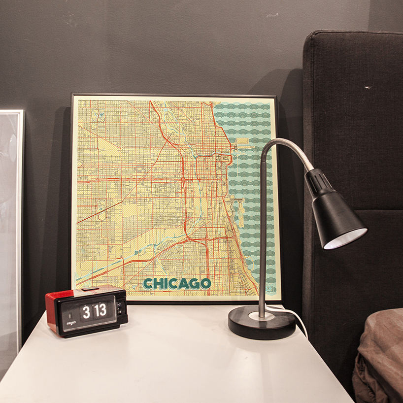
each street, alley and park is painstakingly outlined with its own old-timey hue
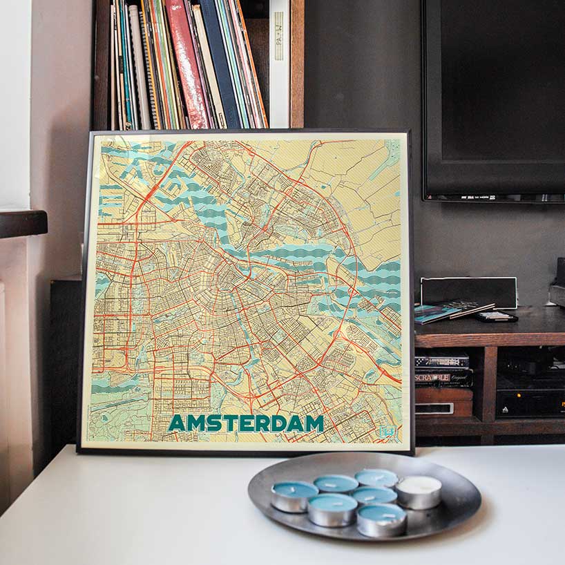
the maps make use of worn creams, vibrant reds and a wave pattern straight from the 70s
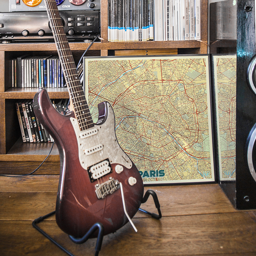
his creative side compelled him to treat maps as abstract pieces of work
designboom has received this project from our ‘DIY submissions‘ feature, where we welcome our readers to submit their own work for publication. see more project submissions from our readers here.
shop
your own online design shop — no sales commission collected