‘hellvetica’ is a terrible take on an iconic typeface created to scare graphic designers
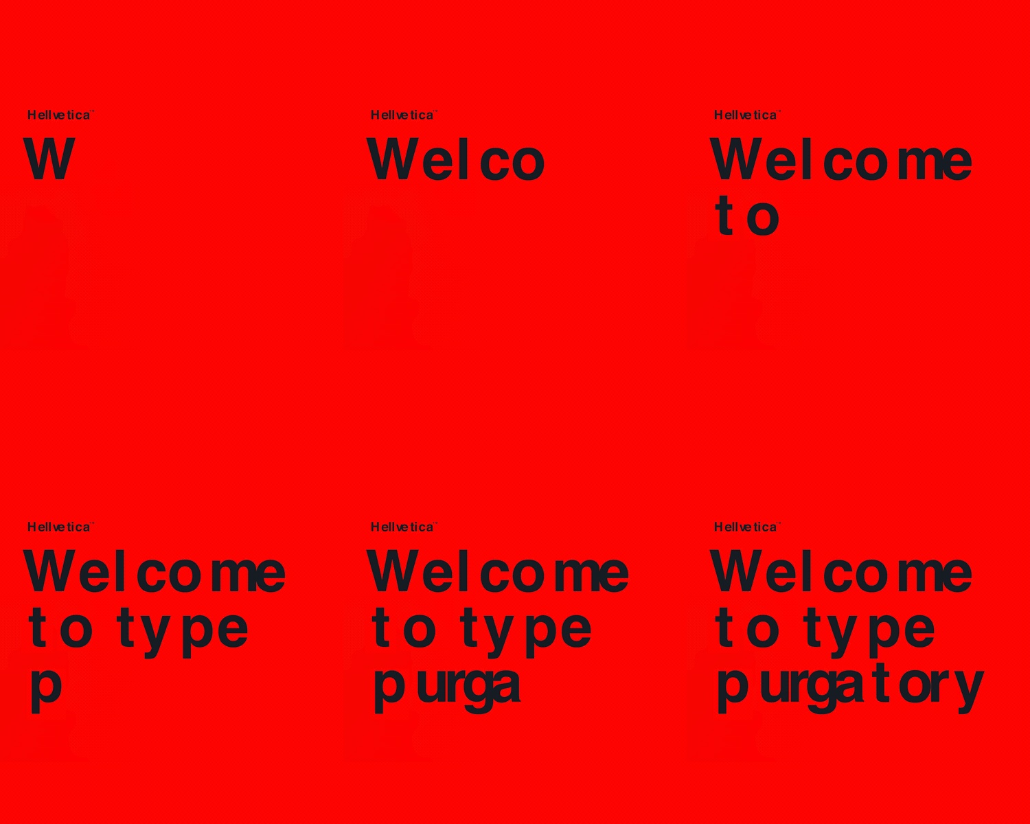
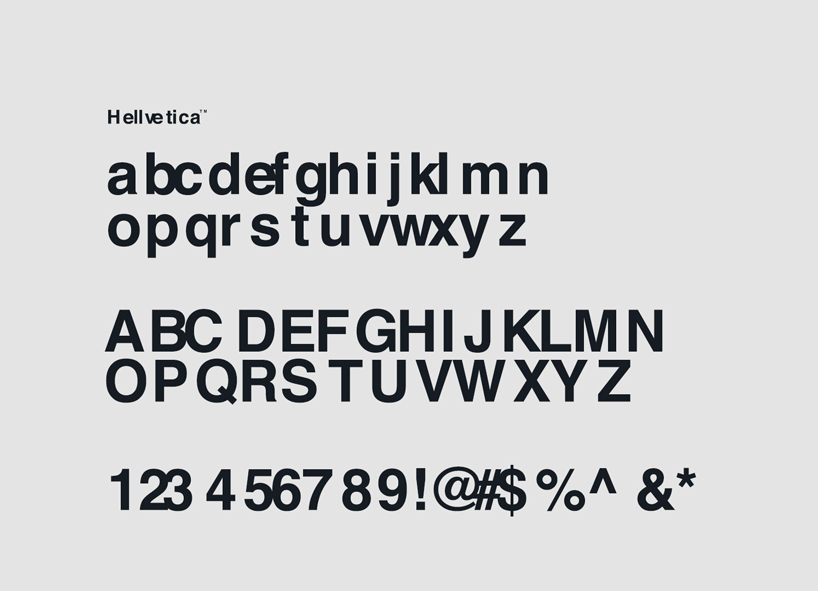
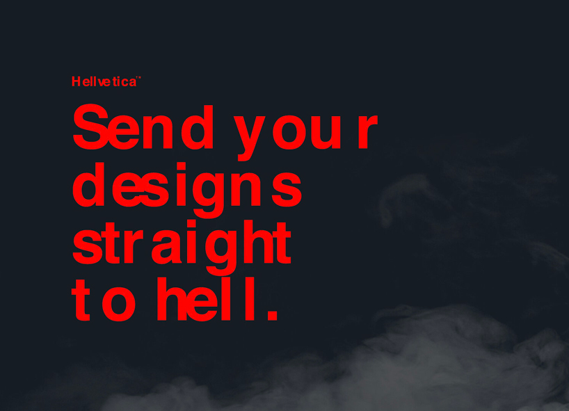
kern in hell: the updated design features questionable spacing intended to irritate graphic designers on the occasion of halloween.
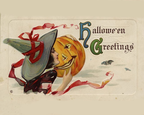
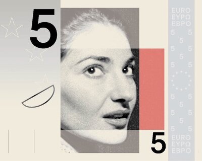
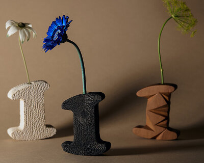
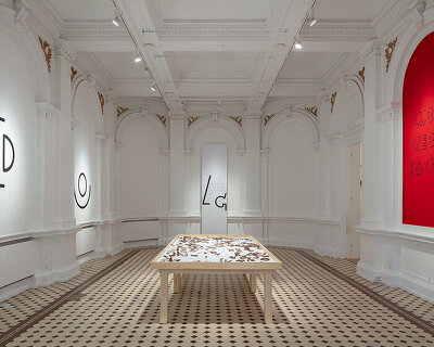
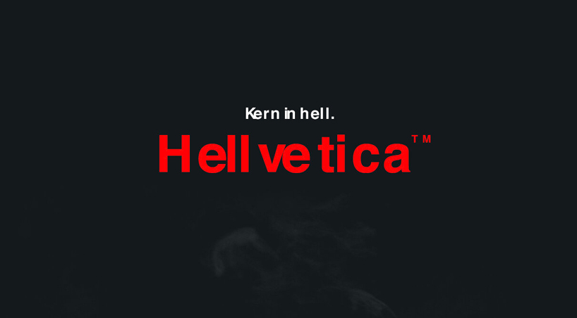
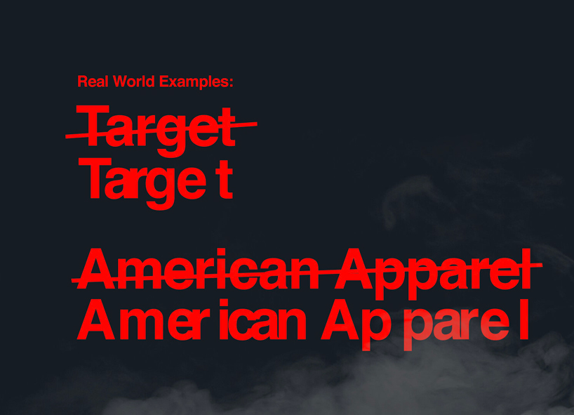
creative directors zack roif and matthew woodward have released a deliberately bad version of the helvetica typeface family. called ‘hellvetica’, the updated design features questionable kerning properties specifically created to irritate graphic designers on the occasion of halloween.
images courtesy of zack roif and matthew woodward
kerning, which adjusts the spaces between letters based on how they’re shaped, is usually applied to make the text more pleasing. however, hellvetica uses it to distort words, making text difficult to read by randomizing the spaces between characters.
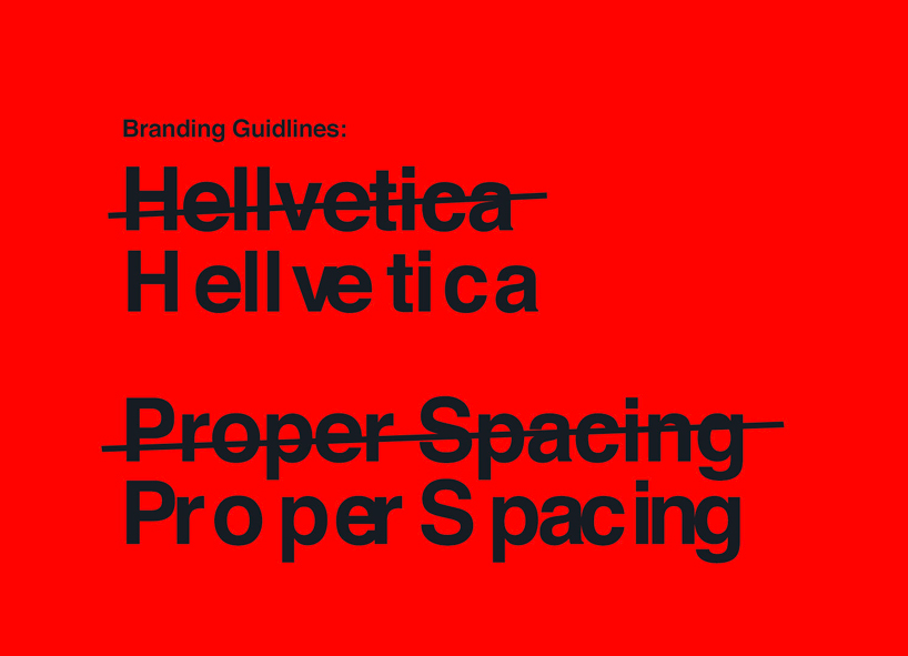
what makes it worse is roif and woodward have chosen helvetica, a widely used sans-serif typeface praised for its clean, clear and neutral characteristics. otherwise known as neue haas grotesk, it was developed in 1957 by swiss typeface designer max miedinger and has since been used worldwide by countless brands and companies.
the typeface was renamed helvetica in 1960, which in latin means ‘swiss.’ miedinger, who created the font with input from eduard hoffman, the director of the haas type foundry where miediner once worked, wanted to create a typeface that had great clarity, no intrinsic meaning in its form, and could be used on a wide variety of signage.
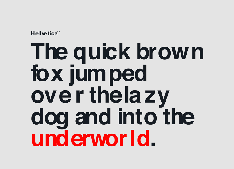
earlier this year, monotype updated the classic typeface, introducing a new family of fonts that were carefully re-drawn for the modern era. disregarding that care completely, roif and woodward have released a downloadable version of their recklessly kerned ‘hellvetica’ in a bid to give designers everywhere a timely spook just in time for halloween.
project info
designers: zack roif, matthew woodward
name: hellvetica