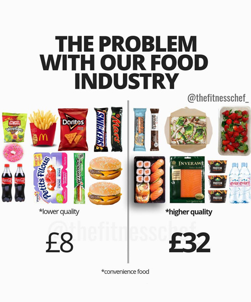
these myth-busting nutrition infographics may help you make better food choices
the straight-talking charts visualize simple facts, such calories in snacks that are deemed 'healthy' versus those considered 'evil'.
graeme tomlinson, also known as ‘the fitness chef’, has been sharing nutrition infographics on instagram to help people understand how to make better food choices. his straight-talking, myth-busting charts communicate in a clear way the difference between snacks that are deemed ‘healthy’ versus those that are considered ‘evil’; as well as the varying calories in different nutritional properties in the members of a particular food group. 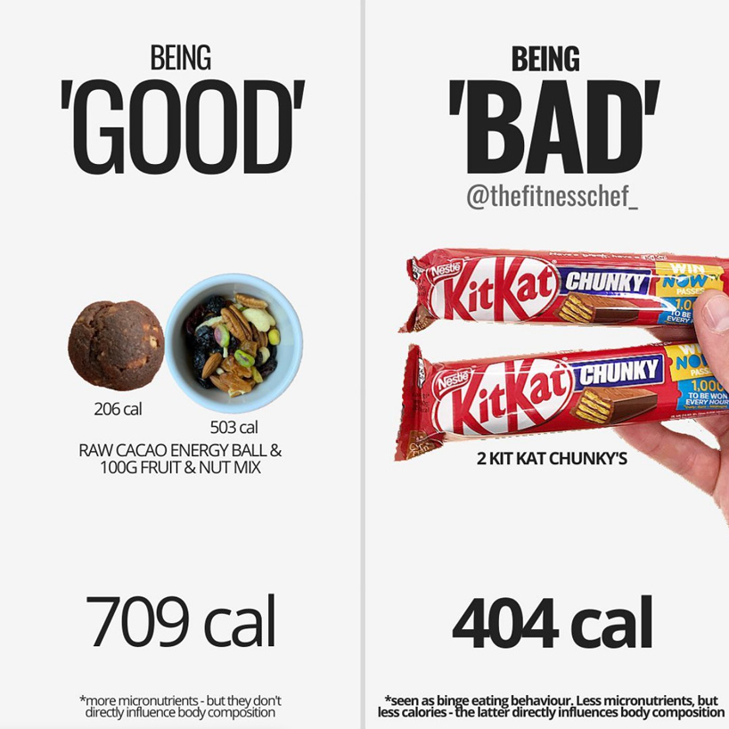 all images courtesy of the fitness chef
the calories in ‘good’ versus ‘bad’ snack options
helping people understand the misconceptions that lead to poor daily eating habits, the fitness chef has already amassed over half a million followers on his instagram profile. the clear, straight-talking nutrition infographics are easy to understand simply by looking at them, though each post comes with a lengthy text description that backs up image. by visualizing popular food trends against their notorious counterparts, tomlinson strives to educate his followers on the correct nutritional intake of different food groups. simple facts, such as the calories of a certain ice cream brand versus another, offer an easy ‘cheat-sheet’ to achieve one’s fitness goals, or just maintain a healthy diet.
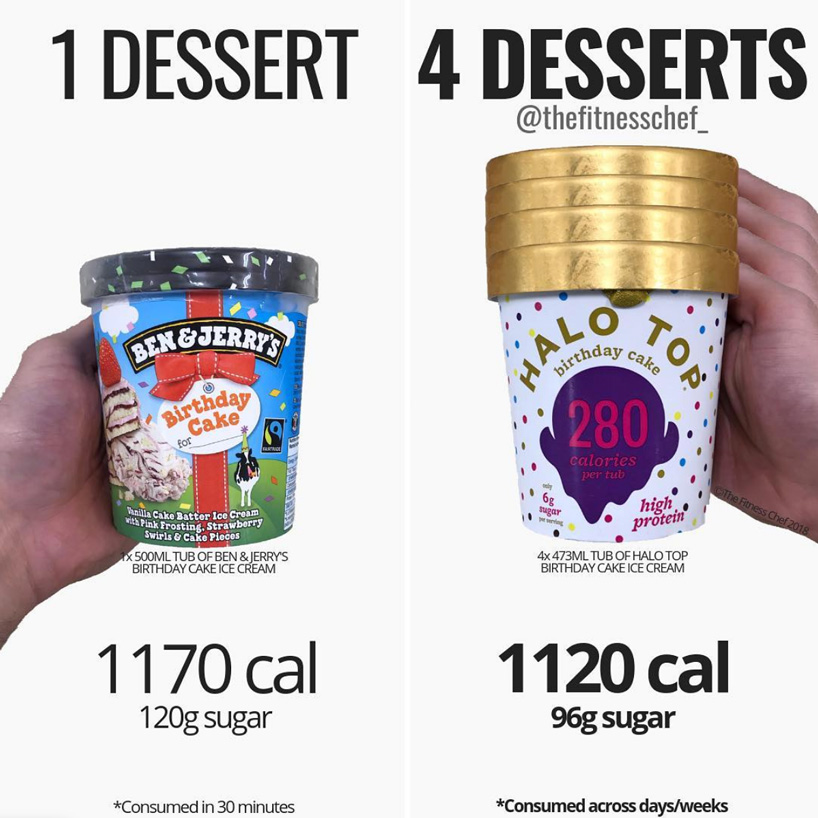 calories in a single ben & jerry’s ice cream tube vs those in four halo tops
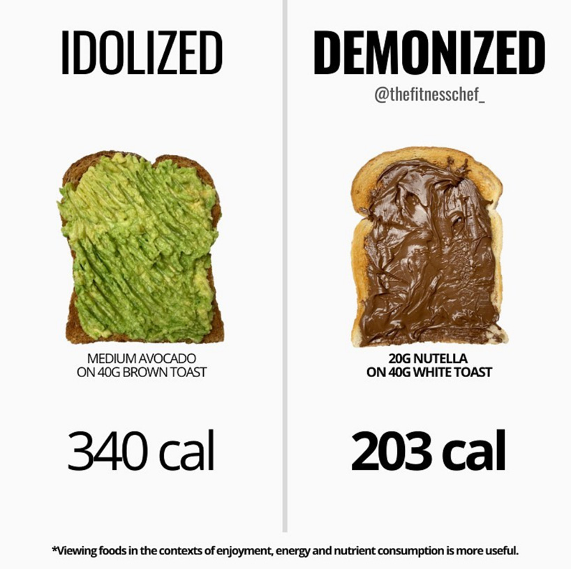 avocado toast vs nutella toast
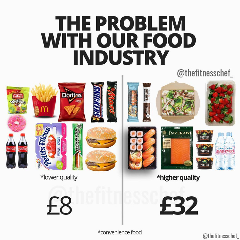 visualizing the problem with our food industry
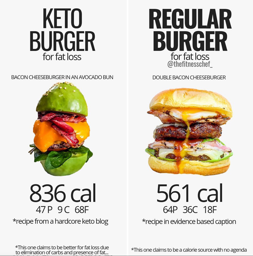 a fat-loss keto burger vs a regular burger
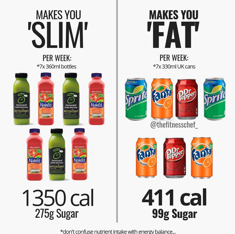 ‘healthy’ drinks that make you ‘slim’ vs those that make you ‘fat’
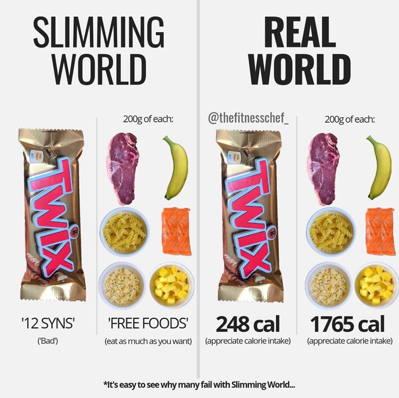 debunking the ‘evil’ food myth with calorie facts
  visualizing 500 calories with different foods
 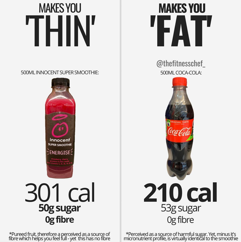 drinks that make you ‘thin’ vs those that make you ‘fat’
 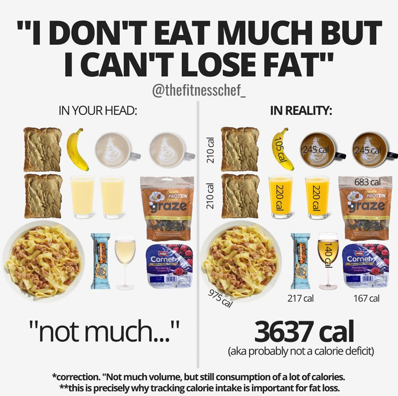 tracking calorie intake may help you make better food choices according to your goals
shop
your own online design shop — no sales commission collected