nendo visualizes acuo powder gum packagingphoto © masayuki hayashiall images courtesy of nendo
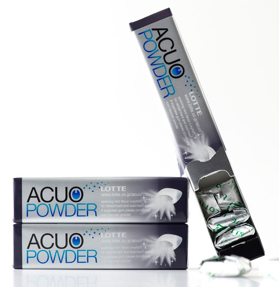
nendo designed the packaging for a new ‘mint-flavoured powder’ addition to the acuo gum family, which is sold in japan. the packaging emphasizes the promise of a gum that ‘bursts in the mouth for a moment of clean refreshment’ while maintaining acuo’s signature style.
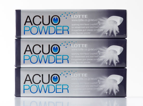 photo © masayuki hayashi
‘we chose the dull silver as the base colour as it gives the transparent film and sliding packaging a solid feel, like a bar of pure metal and the black gradations suggest this strength and solidity. the transparent film slides off, transforming the packaging into a simple carrying case for the gum.’
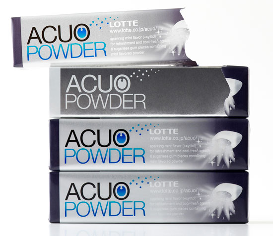 photo © masayuki hayashi
the overall feel of the package is a continuation of the branding that nendo came up with previously for lotte’s acuo gum range: ‘we based the logo on helvetica, a standard typeface, and put a shape in the centre of the ‘O’ that could be either an open mouth or a drip to show a feeling of freshness expanding into the mouth. we consciously chose to avoid both all-too-common ‘sizzle’ and overdone expressions in gum packaging.’
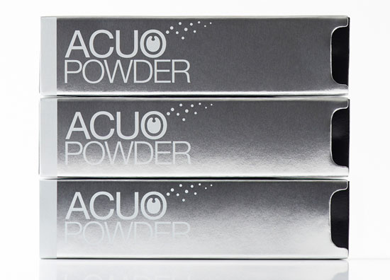 photo © masayuki hayashi
‘instead, we used the placement of the graceful letterforms to suggest pharmaceutical functionality. we wanted a clear channel of communication, so the visual merchandising for stores and the advertising graphics were an extension of the packaging. this was our suggestion for a design to visually represent ‘flavour’ an invisible quality.’
design-aerobics: graphic design in 2010 course now open for enrolment designboom is pleased to announce that enrollment for our online design education course ‘graphic design in 2010’ is now open. the course will offer practical information and useful advice to help beginners and non-graphic designers communicate themselves more effectively.
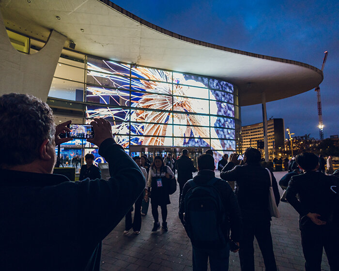
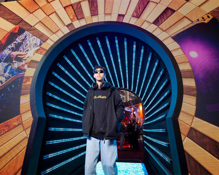
happening now! ISE 2026 showcases how high-performance sound and smart technologies transform residential spaces into stress-reducing environments.
nendo (275)
 Dec 12, 2025
 Apr 14, 2025
 Mar 14, 2025
 Jan 21, 2025
 Jun 06, 2024
packaging design (117)
 Feb 05, 2026
 Dec 08, 2025
 Oct 23, 2025
 Oct 19, 2025
 Oct 03, 2025
 Jan 28, 2026
 Jan 02, 2026
 Dec 28, 2025
 Dec 17, 2025